Grid Pattern
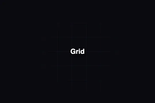
Two crossed linear-gradients draw an indigo grid on a dark background; a ::before radial pseudo-element fades the edges so the eye converges naturally to the center.
Updated
This effect is part of Effect.Labs — 840 vanilla effects, some free, some premium. Backgrounds has 55 effects, including 7 free. Explore the category →
3 usage examples


How it works
The grid is built from two stacked linear-gradients in background-image: the first draws 1 px horizontal lines (rgba(99, 102, 241, .1), then transparent), the second rotates 90° for vertical columns. Both share background-size: 50px 50px — the intersections form a uniform square grid repeated infinitely.
The central vignette is a ::before pseudo-element at inset: 0 covering the full container. Its background is a radial-gradient(circle, transparent 0, #0a0a0f 70%): transparent at the center, opaque background color at 70% of the radius. It progressively masks the lines toward the edges without altering the underlying grid — the result is a centered light beam.
The code also includes a dots mode via the body.bg-grid rule: background-image becomes radial-gradient(rgba(255,255,255,.08) 1px, transparent 1px) repeated on 30 × 30 px cells. A single CSS rule change switches from a line grid to a diffuse dot pattern.
The effect is 100% CSS, zero JavaScript — no canvas, no requestAnimationFrame, no external dependency. It applies to any container in position: relative; GPU cost equals that of an ordinary gradient background.
Accessibility
- No animation: the effect is static — prefers-reduced-motion does not apply, nothing to adapt.
- The grid is purely decorative. Mark the container
aria-hidden="true"or apply it via a parent pseudo-element so it stays invisible to screen readers. - Grid lines are at 10% opacity (
rgba(99,102,241,.1)) — they carry no information and have no WCAG contrast requirement. - The
.bg-labelin the demo is a positioned<span>; if overlay text is meaningful, use a semantic element (<h1>–<h6>,<p>) and verify a contrast ratio ≥ 4.5:1 over the#0a0a0fbackground. - No keyboard or mouse interaction is defined by the effect: keyboard navigation stays entirely within the overlay elements you add.
Browser compatibility
Requires multi-value background-image and linear-gradient / radial-gradient CSS — unprefixed syntax universal since 2013.
Without CSS gradient support, the container shows its solid background color (#0a0a0f) — no JS errors, layout is unaffected.
The code
HTML structure to paste into your page (the CSS + JS come with Premium):
<div class="bg-grid">
  <!-- ::before pseudo-element: radial vignette (pure CSS, z-index auto) -->

  <!-- Overlay content: use z-index ≥ 1 to appear above the vignette -->
  <span class="bg-label">Your content</span>
</div>The full HTML + CSS + JS of Grid Pattern, ready to paste — plus all 840 effects. Or $299 once, lifetime access.
Customize
Options passed to the API or data-* attributes:
| Option / property | Default | Effect |
|---|---|---|
| background-size: 50px 50px | 50px 50px | Grid cell size. Reduce to 30–40 px for a dense mesh, increase to 80–120 px for an open, airy network. |
| rgba(99, 102, 241, .1) | rgba(99,102,241,.1) | Color and opacity of lines — present twice, in both linear-gradients. Change the color for your brand palette; reduce alpha to 0.05 for near-invisible lines. |
| radial-gradient stop 70% (::before) | 70% | Vignette radius. Reduce to 50% for a very tight center beam, increase to 90% to keep the grid edges nearly visible. |
| #0a0a0f (background-color + vignette) | #0a0a0f | Background color — present twice: in background-color of .bg-grid and in the terminal stop of the radial-gradient of ::before. Change both to match your theme. |
| rgba(255,255,255,.08) — dots mode | rgba(255,255,255,.08) | Color and opacity of dots in the dots mode (body.bg-grid rule). Increase alpha to 0.2 for visibility on a light background. |
| background-size dots mode: 30px 30px | 30px 30px | Cell size in dots mode. Reduce to 20 px for a tight pattern, increase to 50 px for spaced dots. |
FAQ
.bg-grid and .bg-grid::before rules to any container with position: relative. If the container has border-radius, add overflow: hidden so the ::before pseudo-element does not overflow.#0a0a0f with your light background color in both places: background-color of .bg-grid and the terminal stop of the radial-gradient in ::before. Set the line color to rgba(99,102,241,.15) or a darker shade so lines remain visible on a white background.requestAnimationFrame. The ::before vignette is composited once on the initial repaint and triggers no animation.


