Dot Grid Pattern
CSS radial-gradient dot grid — color, opacity, radius, and spacing in a single property, zero JavaScript.
Updated

This effect is part of Effect.Labs — 840 vanilla effects, some free, some premium. Backgrounds has 55 effects, including 7 free. Explore the category →
3 usage examples

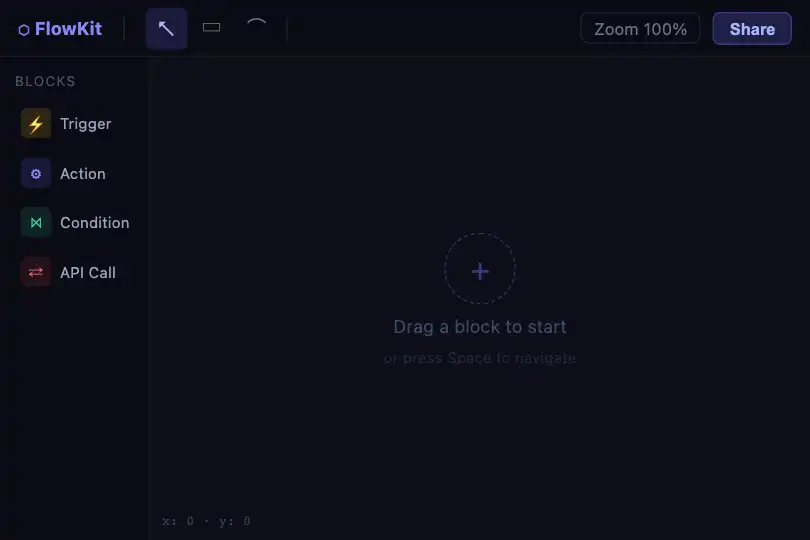

How it works
The pattern relies on a single property: background-image: radial-gradient(circle, rgba(99,102,241,.4) 1px, transparent 1px). The browser draws a circular gradient from 0 to 1 px (solid color) then transparent beyond — tiled according to the step set by background-size: 30px 30px. Each tile produces one isolated dot, pixel-perfectly positioned, with no rendering artifacts.
Dot opacity is encoded in the rgba alpha channel (0.4 by default): dots let the background or the content behind them show through. background-color: #0a0a0f fills the space between dots; it can be transparent to inherit from the parent and overlay the grid on any background.
No JavaScript, no canvas, no SVG: rendering is fully delegated to the CSS engine. The grid is therefore hardware-accelerated through the compositing layer, with zero CPU cost at display time and no paint recalculation on scroll.
Accessibility
- No animation: prefers-reduced-motion is not applicable — the pattern is purely static, no RAF loop.
- The
.bg-dot-griddiv is decorative but does not carryaria-hidden="true"in the provided code — add it if the grid is purely ornamental and contains no meaningful content. - No interactive elements in the base pattern — keyboard navigation is unaffected.
- Decorative contrast: the default setting (rgba(99,102,241,.4) on #0a0a0f) gives a ratio of ≈ 1.6:1, below WCAG text thresholds — but this pattern is a background, not textual content.
- Any text or links overlaid on the grid must meet WCAG AA ratios (≥ 4.5:1 for body text) against the composite background color.
Browser compatibility
Requires CSS radial-gradient — supported since Chrome 26, Firefox 16, Safari 6.1, Edge 12. Zero JavaScript.
Without radial-gradient support (very old browsers), only background-color renders — a solid background with no dots, no JS errors.
The code
HTML structure to paste into your page (the CSS + JS come with Premium):
<div class="bg-dot-grid">
  <!-- Overlay content (text, components)
       in position: relative or absolute -->
</div>The full HTML + CSS + JS of Dot Grid Pattern, ready to paste — plus all 840 effects. Or $299 once, lifetime access.
Customize
Options passed to the API or data-* attributes:
| Option / property | Default | Effect |
|---|---|---|
| Dot color | rgba(99, 102, 241, .4) | First stop of the radial-gradient in .bg-dot-grid — replace the rgba value to change the hue. E.g. rgba(16,185,129,.5) for emerald green. |
| Dot opacity | .4 | 4th component of rgba (0 = invisible, 1 = opaque). Lower to .15–.20 for a very subtle grid, raise to .7–.9 for a bold pattern. |
| Dot radius | 1px | First size stop in the gradient: radial-gradient(circle, color 1px, transparent 1px). Change this 1px — 0.5px = micro-dots, 2px = medium dots, 3px = large dots. |
| Grid spacing | 30px 30px | background-size in .bg-dot-grid. Decrease (16px) to densify, increase (60px) to open up. Unequal values (40px 20px) create a rectangular grid. |
| Background color | #0a0a0f | background-color in .bg-dot-grid — fill between dots. Use transparent to inherit from the parent, or #ffffff for a light theme. |
| Light theme | — | background-color: #fafafa + rgba(79,70,229,.22) for dots: subtle indigo grid on white, ideal for a light-mode dashboard. |
FAQ
background-image: radial-gradient(…). It works in an inline <style> tag, a CSS file, or a style attribute — no dependencies, no asynchronous loading.background-color: #0a0a0f with #fafafa or #ffffff, and lower dot opacity to .2–.3 — the grid remains perceptible without saturating the light background. Pair with @media (prefers-color-scheme: light) for automatic switching.@keyframes drift { from { background-position: 0 0; } to { background-position: 30px 30px; } } gives an infinite diagonal drift. For scroll parallax, drive background-position or transform: translateY() with JS — the pattern follows without triggering a paint recalculation.


