Frosted
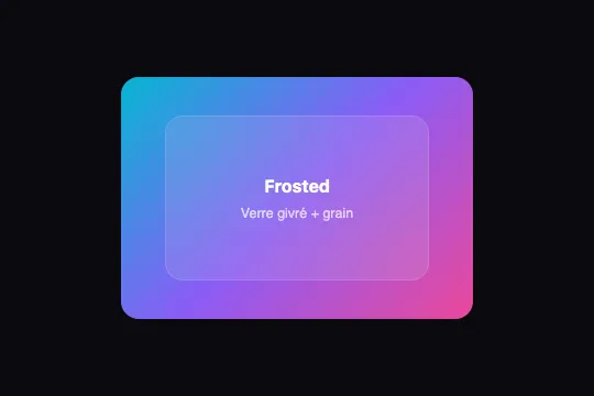
Realistic glassmorphism in pure CSS: backdrop-filter, luminous border, and fractal SVG grain overlay — zero JavaScript.
Updated
This effect is part of Effect.Labs — 840 vanilla effects, some free, some premium. Backgrounds has 55 effects, including 7 free. Explore the category →

3 usage examples


How it works
Frosted glass is achieved by combining two CSS properties on .ng-frosted-glass: backdrop-filter: blur(16px) blurs everything painted behind the element in compositing order, while background: rgba(255,255,255,.08) adds the faint milky opacity that distinguishes ground glass from a plain transparent overlay.
The grain texture — the "Noise" in the name — comes from the ::after pseudo-element: an SVG feTurbulence filter encoded as a data URI generates fractal noise with type="fractalNoise", baseFrequency="0.8", and 4 octaves. The grain is composited with mix-blend-mode: overlay at opacity: .12, burning subtly into the surface without crushing the background colors.
The scene (.ng-frosted-scene) holds a three-stop linear gradient whose position is animated by @keyframes ngFrostedShift — background-position shifts from 0 50% to 100% 50% over 6 seconds in alternate mode. Adding background-size: 200% 200% on the scene amplifies this into a visible chromatic drift.
The luminous border — border: 1px solid rgba(255,255,255,.15) on a border-radius: 16px — simulates the specular reflection visible on real frosted glass held against a light source. This detail gives the component its tangible material appearance rather than a simple blur overlay.
Accessibility
- prefers-reduced-motion not handled in the code: the
ngFrostedShiftanimation runs unconditionally. On a real page, add@media (prefers-reduced-motion: reduce) { .ng-frosted-scene { animation: none } }to stop the drift. - Content inside
.ng-frosted-glass(h3,p, and any native HTML) is readable by screen readers without extra markup — noaria-hiddenis applied. - No keyboard interaction is required (100% CSS component) — no
tabindexor focus management needed on the effect itself. - Text contrast depends on the animated gradient beneath. Add
text-shadow: 0 1px 8px rgba(0,0,0,.5)on text elements or lower background brightness (filter: brightness(.85)on.ng-frosted-scene) if the gradient includes light saturated stops. - If
.ng-frosted-glassis a standalone meaningful component (modal, alert, region), addrole="dialog"orrole="region"and a descriptivearia-label.
Browser compatibility
Relies on backdrop-filter, CSS animations, and SVG filters as data URIs — supported in all modern browsers since 2022.
Without backdrop-filter support (Firefox < 103, older Android), the card displays its semi-transparent white background (rgba(255,255,255,.08)) without frosting — still readable and visually coherent.
The code
HTML structure to paste into your page (the CSS + JS come with Premium):
<div class="ng-frosted-scene">
  <!-- Background: animated gradient (or image/video positioned absolutely behind) -->

  <div class="ng-frosted-glass">
    <!-- Card content: h3, p, button… -->
    <!-- The SVG grain layer is injected automatically via ::after -->
  </div>
</div>The full HTML + CSS + JS of Frosted, ready to paste — plus all 840 effects. Or $299 once, lifetime access.
Customize
Options passed to the API or data-* attributes:
| Option / property | Default | Effect |
|---|---|---|
| backdrop-filter: blur(…) | blur(16px) | Frosting blur intensity. blur(8px) = thin transparent glass; blur(28px) = thick, heavily frosted. Above 30 px, artifacts may appear on some browsers. |
| rgba(255,255,255, .08) — .ng-frosted-glass background | .08 | Card fill opacity. Raise to .18 for more opaque glass; drop to .04 for near-invisible glass. |
| rgba(255,255,255, .15) — border | .15 | Luminous rim intensity. Between .10 (subtle) and .35 (very prominent), depending on contrast with the background. |
| opacity: .12 — ::after (grain) | .12 | Grain texture strength. .06 = barely visible grain; .22 = pronounced photographic grain. |
| mix-blend-mode — ::after (grain) | overlay | Grain blend mode. overlay = natural contrast; soft-light = softer, less contrasty grain; multiply = dark grain only. |
| .ng-frosted-scene gradient | linear-gradient(135deg, #06b6d4, #8b5cf6, #ec4899) | Animated background colors. Swap in your brand palette — 2 to 4 stops produce clean results. |
| animation duration (6s) | 6s | Chromatic drift speed. 4s = dynamic; 12s = slow barely-perceptible glide; animation: none for a static background. |
| border-radius: 16px | 16px | Card corner rounding. 8px = standard card; 24px = rounded pill; 0 = full-width angular card. |
FAQ
.ng-frosted-scene in a component; the effect touches nothing outside its own elements..ng-frosted-scene with any container set to position: relative; overflow: hidden holding an image or video in position: absolute; inset: 0; object-fit: cover. Place .ng-frosted-glass on top with a higher z-index — backdrop-filter automatically blurs the media painted behind it in the same stacking context.backdrop-filter has been natively supported since Firefox 103 (July 2022), covering roughly 94% of active Firefox sessions. On Firefox < 103, the card displays its semi-transparent background (rgba(255,255,255,.08)) without frosting — still readable and functional. No -webkit- prefix is needed for modern browser targets.


