Gradient Morph
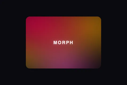
A blurred radial-gradient mesh cross-fades between two opposing color palettes — a complete chromatic shift every few seconds.
Updated
This effect is part of Effect.Labs — 840 vanilla effects, some free, some premium. Backgrounds has 55 effects, including 7 free. Explore the category →
3 usage examples

How it works
Each palette is an absolutely positioned div layer with inset: -25% — it bleeds 25% past each edge of the container so the gradients cover the corners uniformly. The layer is filled with four radial-gradient() spots at specific coordinates (top-left, top-right, bottom-center, bottom-left corner) and flattened by filter: blur(30px), which blends the colored halos into a seamless mesh with no visible edges.
The palette swap relies on a CSS opacity 2s ease-in-out transition applied to both layers simultaneously: the entering layer rises from 0 to 1 while the exiting layer drops from 1 to 0 — a true cross-fade with no visible artifact. The .active and .inactive classes are toggled by a short JS interval (setInterval) every ~3.5 seconds.
The warm palette (scheme-a) combines bright red, orange, magenta, and yellow; the cool palette (scheme-b) answers with sky blue, teal, violet, and navy. The two palettes share no colors — the maximal chromatic gap makes the transition spectacular even at a slow pace.
The effect uses neither <canvas> nor requestAnimationFrame: two <div> elements and native CSS properties suffice. The GPU cost is limited to blur filter compositing and opacity transitions — no paint loop runs outside the active transitions.
Accessibility
- prefers-reduced-motion not present in the provided code — no CSS rule or JS branch detects the system preference. For accessible use, add
@media (prefers-reduced-motion: reduce) { .morph-mesh-layer { transition: none } }and stop thesetIntervalif reduced. - The
.morph-meshcontainer has noroleoraria-labelin the base code — addrole="img" aria-label="…"if this element is the main visual identity of the area. - The
.morph-mesh-labelspan (text 'MORPH') is purely decorative in the demo; in production, addaria-hidden="true"or remove it. - No keyboard interaction or focus management in the code: no
tabindexto handle. - Text contrast on top: verify per active palette. A semi-transparent scrim (ratio ≥ 4.5:1 WCAG AA) is recommended whenever text rests on the mesh.
Browser compatibility
Requires CSS radial-gradient, filter: blur, and opacity transitions — supported in all modern browsers. Zero external dependencies.
Without JS, the warm palette (scheme-a) stays visible statically — the colored background is present, only the swap disappears. Without filter: blur support (very old browsers), gradients appear sharp but remain colorful.
The code
HTML structure to paste into your page (the CSS + JS come with Premium):
<div class="morph-mesh" id="morphMesh" role="img" aria-label="Blurred gradient mesh background cycling between two color palettes">
  <div class="morph-mesh-layer scheme-a active" aria-hidden="true"></div>
  <div class="morph-mesh-layer scheme-b inactive" aria-hidden="true"></div>
  <!-- Optional: overlay content -->
</div>The full HTML + CSS + JS of Gradient Morph, ready to paste — plus all 840 effects. Or $299 once, lifetime access.
Customize
Options passed to the API or data-* attributes:
| Option / property | Default | Effect |
|---|---|---|
| .morph-mesh-layer.scheme-a { background } | red, orange, magenta, yellow | 4 radial-gradient() making up the warm palette — replace the rgba() values with your brand warm tones. |
| .morph-mesh-layer.scheme-b { background } | sky blue, teal, violet, navy | 4 radial-gradient() making up the cool palette — replace with your brand cool tones or a second brand variant. |
| .morph-mesh-layer { filter: blur(…) } | blur(30px) | Blur intensity: reduce to 12 px for a sharper mesh, increase to 50 px for an even softer atmospheric fade. |
| .morph-mesh-layer { inset: … } | -25% | Layer bleed past the container — increase to -40% for denser corner coverage, reduce to -10% for a more centered mesh. |
| .morph-mesh-layer { transition: opacity … } | opacity 2s ease-in-out | Duration and easing of the cross-fade: 0.8 s for a snappy switch, 4 s for a near-imperceptible fade. |
| setInterval(toggle, delay) | ~3 500 ms | Palette swap frequency — adjust the delay in ms to your desired rhythm (6 000 ms = slow & contemplative, 1 500 ms = energetic & dynamic). |
| .morph-mesh { border-radius } | 16px | Container corner radius: 0 for full-bleed edge-to-edge, 50% for a circular blob (e.g. avatar or badge). |
FAQ
scheme-a) stays displayed statically via opacity: 1 in the CSS — the colored background is present. Only the swap disappears: it requires a short script (~10 lines) that toggles the .active/.inactive classes via setInterval.<div class="morph-mesh-layer scheme-c"> with its own radial-gradient() values, initialize it at opacity: 0, then cycle the JS through 3 states (A→B→C→A…). The CSS transition applies identically to each layer..morph-mesh to position: absolute; inset: 0; width: 100%; height: 100% inside a position: relative; overflow: hidden container. Set border-radius to 0 and layer inset to -30% or more so the gradients cover the corners at every viewport size.


