Gradient Spotlight

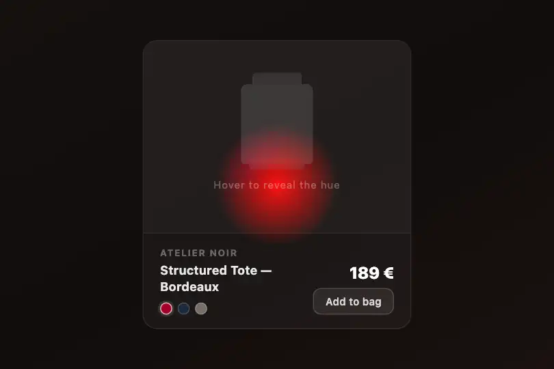
A radial CSS mask follows the cursor and reveals a vibrant oklch palette under a muted surface — GPU-composited, zero canvas, zero dependencies.
Updated
This effect is part of Effect.Labs — 840 vanilla effects, some free, some premium. Backgrounds has 55 effects, including 7 free. Explore the category →
3 usage examples


How it works
The effect stacks two layers inside .spotlight-container: .spotlight-muted is a dark grey gradient background visible at rest, and .spotlight-vibrant is a multicolor layer positioned absolute inset:0 on top. The vibrant layer is invisible at rest — its mask-image restricts it to a disc centered at the default 50 %, 50 %, effectively hiding it until the pointer moves.
JavaScript listens to mousemove on each [data-spotlight] container and computes the pointer's relative position as a percentage ((clientX - rect.left) / width * 100, same for Y). These values are injected into the CSS custom properties --mx and --my directly on the element. The rule mask-image: radial-gradient(circle 80px at var(--mx, 50%) var(--my, 50%), black 30%, transparent 100%) then reveals the vibrant layer within an 80 px radius around the cursor — black in the mask means opaque, transparent means masked. On mouseleave, the properties reset to 50 % to re-center the disc.
The gradient linear-gradient(135deg, oklch(.7 .3 30), oklch(.6 .28 150), oklch(.65 .32 280), oklch(.7 .25 60)) uses the oklch color space (perceptually uniform lightness). Unlike HSL, where yellow is visibly brighter than blue at the same lightness, oklch keeps perceived luminance constant regardless of hue H — the revealed gradient is balanced without muddy patches or oversaturated spikes.
Rendering is entirely GPU-composited: mask-image triggers layer promotion on the graphics card. The browser updates only two CSS properties per mousemove — no requestAnimationFrame, no pixel reading, no canvas. The transition: background .3s on .spotlight-muted leaves the door open for an animated muted-background change.
Accessibility
- prefers-reduced-motion absent: the code does not query this media feature. The effect follows the cursor continuously with no reduced-motion guard — add one manually if you target users sensitive to motion.
cursor: nonehides the native cursor inside the effect area. This can disorient keyboard users or assistive technology users who move the pointer. Remove this rule if accessibility is a priority.- The demo
.spotlight-labelusescolor: rgba(255,255,255,.5)on a dark grey background — contrast ratio ≈ 2.5:1, below the WCAG AA threshold of 4.5:1. Switch tocolor: #e2e8f0to meet the AA level. - No
aria-labelorrole="img"is present in the base markup. Add them if the container carries meaningful content (page background, banner) rather than pure decoration. - On touch screens, the spot remains centered at 50 %, 50 % by default — the effect is mouse-only. Add a
touchmovelistener mirroring themousemovehandler to support mobile devices.
Browser compatibility
Requires CSS mask-image, oklch, and custom properties — supported in all modern browsers since 2022–2023. Zero external dependencies.
On a browser without mask-image, the .spotlight-vibrant layer is fully visible (no mask applied) — the vibrant palette shows permanently. On a browser without oklch, gradient color stops are ignored and the layer renders white. In both cases, no fatal JS error.
The code
HTML structure to paste into your page (the CSS + JS come with Premium):
<div class="spotlight-container" data-spotlight=""
     role="img" aria-label="Interactive color-reveal background — move your mouse">

  <div class="spotlight-muted">
    <!-- Your content (heading, paragraph, button) here.
         Add position:relative; z-index:1 to your elements
         so they remain visible above the vibrant layer. -->
  </div>

  <div class="spotlight-vibrant" aria-hidden="true"></div>
</div>The full HTML + CSS + JS of Gradient Spotlight, ready to paste — plus all 840 effects. Or $299 once, lifetime access.
Customize
Options passed to the API or data-* attributes:
| Option / property | Default | Effect |
|---|---|---|
| circle 80px | 80px | Spotlight radius in the mask-image rule of .spotlight-vibrant. Increase (120–200 px) for a wide halo, decrease (40–60 px) for a focused torch. |
| black 30% | 30% | Position of the first transparent stop in the mask gradient. At 0%, fully soft edge (smooth fade); at 50%, a well-defined hard disc. |
| background (.spotlight-vibrant) | 4 oklch colors | Replace the linear-gradient(135deg, oklch(…) …) of .spotlight-vibrant with your brand palette to adapt the revealed colors to your visual identity. |
| background (.spotlight-muted) | #2a2a3a / #1a1a2a | Color of the muted surface at rest. Change to match your page's global background (pure black, deep brown, indigo…). |
| cursor: none | present | Set on .spotlight-container. Remove it to keep the native cursor — recommended when accessibility or a custom cursor is a priority. |
| --mx / --my | 50% / 50% | CSS properties injected by JS. Assign them manually (el.style.setProperty('--mx','30%')) to position the spot from code, or to drive the spotlight automatically without user interaction. |
FAQ
querySelectorAll('[data-spotlight]') and attaches an independent mousemove listener to each container. Add as many data-spotlight elements as needed — each manages its own spot without interfering with the others.touchmove listener inside the existing loop: e.addEventListener('touchmove', function(ev){ var t=ev.touches[0]; var r=e.getBoundingClientRect(); e.style.setProperty('--mx',(((t.clientX-r.left)/r.width)*100).toFixed(1)+'%'); e.style.setProperty('--my',(((t.clientY-r.top)/r.height)*100).toFixed(1)+'%'); }, {passive:true}). The spot then follows the finger on touch screens.


