Halftone Effect
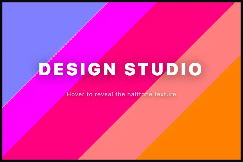

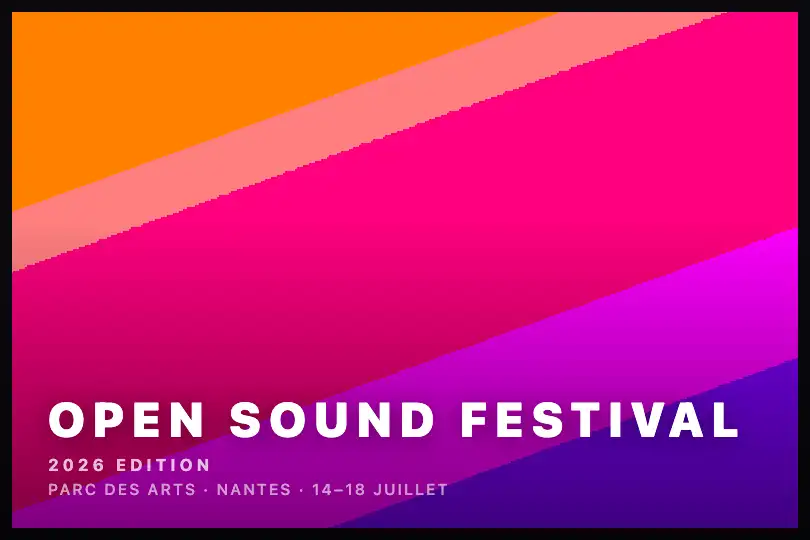
Pure two-state SVG filter: smooth gradient at rest, halftone pattern via posterisation and erosion on hover — fluid transition, zero JavaScript.
Updated
This effect is part of Effect.Labs — 840 vanilla effects, some free, some premium. Backgrounds has 55 effects, including 7 free. Explore the category →
3 usage examples
How it works
The effect is entirely declarative — zero JavaScript. A hidden off-screen <svg> element defines two named <filter> elements, and CSS switches between them on hover via filter: url(#halftone-filter) (rest) and filter: url(#halftone-filter-hover) (hover).
feComponentTransfer with feFuncR/G/B type="discrete" quantizes each colour channel into discrete steps. At rest, 6 values (0 0.2 0.4 0.6 0.8 1) lightly posterize the gradient into bands. On hover, 3 values (0 0.5 1) reduce the spectrum to three sharp colour blocks — each pixel snaps to black, mid-tone, or full colour.
feMorphology operator="erode" then erodes the coloured regions inward by radius pixels. With radius="1" at rest the effect is barely noticeable. With radius="5" on hover, erosion carves spaces between the posterized blocks: on a 135° gradient, bands shrink into isolated lines or dots, producing the visible halftone pattern.
The visual transition is handled by transition: filter .4s in pure CSS. Both <filter> elements coexist in the DOM, and the browser interpolates the render between rest and hover states without any script.
Accessibility
- No prefers-reduced-motion support in the provided code — the
filter .4stransition fires on hover without checking the OS preference. For accessible projects add@media (prefers-reduced-motion: reduce) { .halftone-content { transition: none } }. - No automatic looping animation: the effect is only active while the user hovers — no
requestAnimationFrameor timer runs in the background. - The base code exposes no ARIA attributes on the container. If the background is purely decorative, add
aria-hidden="true"to the filter<svg>and the.halftone-container; if it is semantic, userole="img"andaria-label. - White text contrast on the default violet–pink–amber gradient exceeds 4.5:1 on dark areas (violet) but may drop below that on light areas (amber) — check with a contrast tool before changing the palette.
- The SVG filter creates no spurious focusable elements: the tab order remains intact.
Browser compatibility
Requires SVG Filter Effects (feComponentTransfer, feMorphology) — natively supported in all modern browsers since 2015.
If filter: url(#id) is not recognised (IE11), the gradient renders without the halftone effect — no JS errors, the page stays functional.
The code
HTML structure to paste into your page (the CSS + JS come with Premium):
<svg aria-hidden="true" style="position:absolute;width:0;height:0">
  <defs>
    <filter id="halftone-filter"><!-- feComponentTransfer discrete + feMorphology erode radius="1" --></filter>
    <filter id="halftone-filter-hover"><!-- feComponentTransfer discrete + feMorphology erode radius="5" --></filter>
  </defs>
</svg>
<div class="halftone-container">
  <div class="halftone-content">
    <!-- text overlay or empty (gradient only) -->
  </div>
</div>The full HTML + CSS + JS of Halftone Effect, ready to paste — plus all 840 effects. Or $299 once, lifetime access.
Customize
Options passed to the API or data-* attributes:
| Option / property | Default | Effect |
|---|---|---|
| background (CSS .halftone-content) | linear-gradient(135deg, #6366f1, #ec4899, #f59e0b) | Gradient colours and angle. Replace with your brand palette or with background-image: url(…) — the SVG filter applies to the final rendered output regardless of the background type. |
| 135deg (gradient angle) | 135deg | Gradient direction and therefore the orientation of halftone bands: 0° = top→bottom, 90° = left→right, 45° = reverse diagonal. |
| tableValues (feComponentTransfer — rest) | "0 0.2 0.4 0.6 0.8 1" | Posterisation steps at rest. 6 values = fine bands, subtle effect. Add intermediate values for more refinement; reduce for a bolder graphic look. |
| tableValues (feComponentTransfer — hover) | "0 0.5 1" | Steps on hover. "0 1" = full binarisation (black/white), very strong. "0 0.33 0.67 1" = 4 blocks, softer. Calibrate to the desired intensity. |
| radius (feMorphology — rest) | 1 | Erosion at rest in pixels. 0 is invalid (use 0.5+); 1–2 is nearly invisible; 3+ thins the bands even in the rest state. |
| radius (feMorphology — hover) | 5 | Erosion on hover. 3 = subtle halftone, 5–7 = well-separated bands or dots, 10+ = nearly invisible (avoid). Calibrate to the container size. |
| transition: filter .4s (CSS) | .4s | Duration and easing of the transition between states. .2s = near-instant response, .8s ease-in-out = progressive cinematic morphing. |
FAQ
filter: url(#halftone-filter) applies to the element's final rendered output regardless of source: <img>, background-image: url(…), or <video>. Replace background: linear-gradient(…) on .halftone-content with your image and the SVG filter applies identically.feMorphology erode with a decimal radius (e.g. 2.5) is rounded differently by each SVG engine. Use integer values (1, 2, 3…) for consistent cross-browser output. Minor quantisation differences in feComponentTransfer are normal and expected..halftone-container:hover .halftone-content { filter: url(#halftone-filter-hover) } and point the rest CSS directly at #halftone-filter-hover, or define a third <filter id="halftone-static"> with your desired permanent values and assign it to .halftone-content.


