HALFTONE
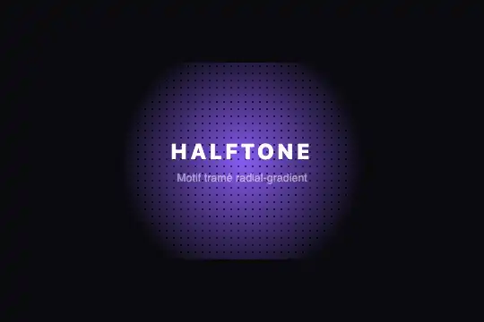
Pure CSS halftone: a repeated radial-gradient dot grid over a color gradient, blended with mix-blend-mode multiply — zero JS, zero image.
Updated
This effect is part of Effect.Labs — 840 vanilla effects, some free, some premium. Backgrounds has 55 effects, including 7 free. Explore the category →
3 usage examples
How it works
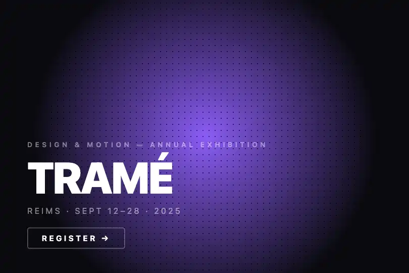
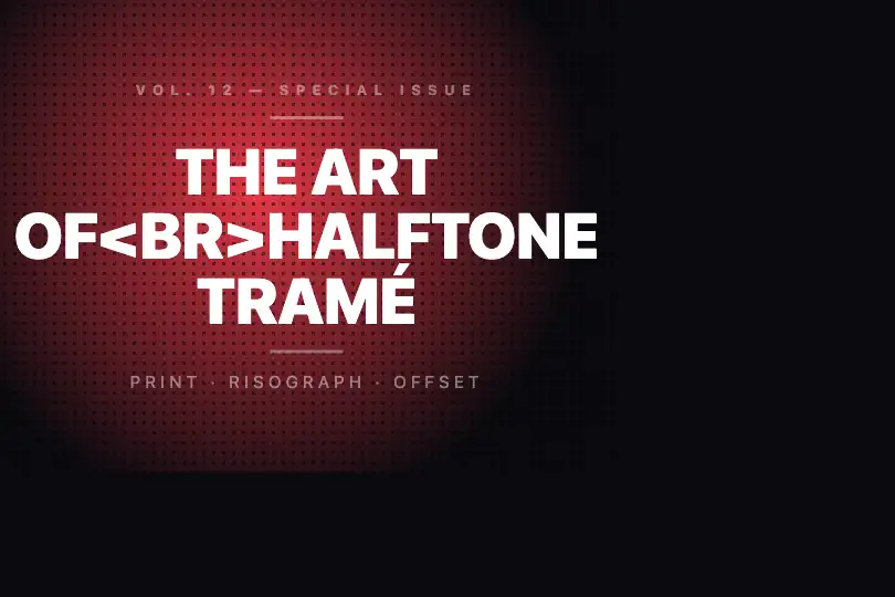
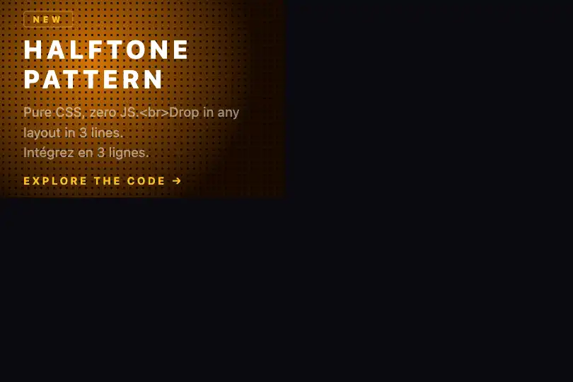
The halftone is generated entirely in CSS. .ng-halftone-pattern carries background-image: radial-gradient(circle, #000 1px, transparent 1px) combined with background-size: 8px 8px: the browser tiles this pattern, producing a regular grid of black dots with a 1 px radius spaced 8 px apart — the CSS equivalent of an offset printing plate. Changing the first value (1px) adjusts dot radius; changing background-size adjusts grid pitch.
The .ng-halftone-bg layer carries a radial-gradient(circle, #8b5cf6, #0a0a0f 70%): saturated purple at the center, black at the edges. The pattern layer sits on top with mix-blend-mode: multiply — black dots multiply the background color (result: darker), but on a near-black background the dots multiplied by near-zero become invisible. The effect produces apparent density modulation: dots are visible in the bright central area and fade toward the dark edges, mimicking the variable dot density of an offset-printed photograph.
opacity: 0.6 on .ng-halftone-pattern damps the overall intensity. The .ng-halftone-content layer sits above (position: relative; z-index: 1) to host text or components without interfering with the dot pattern.
Accessibility
- No animation — the effect is entirely static (pure CSS, zero JS). No
prefers-reduced-motioncheck is present in the code, nor is one needed. - The decorative layers (
.ng-halftone-bg,.ng-halftone-pattern) do not carryaria-hidden="true"in the delivered code — add it at implementation time, as these divs are purely visual. - Text contrast: the dark purple background leaves readable headroom, but the ratio varies by zone. Verify WCAG AA contrast of overlay text at the point of maximum density (purple center, background ~#4c1d95).
- No interactive elements in the effect — keyboard navigation is not a concern.
- The
.ng-halftone-scenecontainer can receiverole="img"and a descriptivearia-labelif the effect is the only visible content in the section.
Browser compatibility
Pure CSS: only radial-gradient and mix-blend-mode are required — zero JS dependency, zero external image.
Without mix-blend-mode support (IE 11), black dots render without blending — the grid is visible but without density modulation. Background and text remain legible.
The code
HTML structure to paste into your page (the CSS + JS come with Premium):
<div class="ng-halftone-scene" role="img" aria-label="CSS halftone dot-pattern background">
  <div class="ng-halftone-bg" aria-hidden="true"></div>
  <div class="ng-halftone-pattern" aria-hidden="true"></div>

  <!-- Optional: text content or component over the halftone -->
  <div class="ng-halftone-content">
    <h2>Your heading</h2>
    <p>Your subline</p>
  </div>
</div>The full HTML + CSS + JS of HALFTONE, ready to paste — plus all 840 effects. Or $299 once, lifetime access.
Customize
Options passed to the API or data-* attributes:
| Option / property | Default | Effect |
|---|---|---|
| background-size (.ng-halftone-pattern) | 8px 8px | Grid pitch. Drop to 5px for fine print halftone, raise to 16px for a loose retro-pop pattern. |
| dot radius (1st radial-gradient stop of .ng-halftone-pattern) | 1px | Dot radius in pixels. 0.5px = near-texture, 2px = comic dots, 3px = bold oversized dots. |
| opacity (.ng-halftone-pattern) | 0.6 | Overall pattern intensity. 0.3 = subtle background texture, 1.0 = maximum contrast, solid dots. |
| mix-blend-mode (.ng-halftone-pattern) | multiply | Blend mode. multiply on dark backgrounds (dark dots vanish into black); screen on light backgrounds (white dots vanish into white). |
| background (.ng-halftone-bg) | radial-gradient(circle, #8b5cf6, #0a0a0f 70%) | Background color and shape. Replace #8b5cf6 with your brand color; adjust 70% to widen or narrow the bright central zone. |
| dot color (1st radial-gradient parameter of .ng-halftone-pattern) | #000 | Dot color. Black with multiply on dark; white with screen on light; a vivid color for a chromatic two-tone halftone. |
FAQ
mix-blend-mode: multiply combined with the radial gradient: where the background approaches pure black (#0a0a0f), black dots multiplied by near-zero become invisible. Perceived density follows background luminance — exactly how offset printing works, where ink only shows where the substrate is light enough to reflect it.mix-blend-mode from multiply to screen on .ng-halftone-pattern and change the dot color from #000 to #fff. In screen mode, white dots lighten the background where it is darkest — the density modulation inverts, dots become visible in the dark zones.background-position of .ng-halftone-pattern: @keyframes ht-scroll { to { background-position: 8px 8px; } } with animation: ht-scroll 0.4s linear infinite creates a continuous grid scroll. No JS needed — remember to disable the animation via @media (prefers-reduced-motion: reduce) if you enable this mode.


