Network Lines
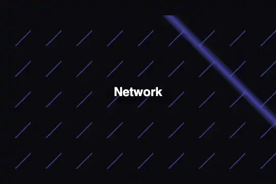
Pure CSS background: two sets of crossed diagonal tiles at 60 px and a 3 px radial node weave an indigo geometric network mesh on a dark base — zero JS, zero CPU cost.
Updated
This effect is part of Effect.Labs — 840 vanilla effects, some free, some premium. Backgrounds has 55 effects, including 7 free. Explore the category →
3 usage examples

How it works
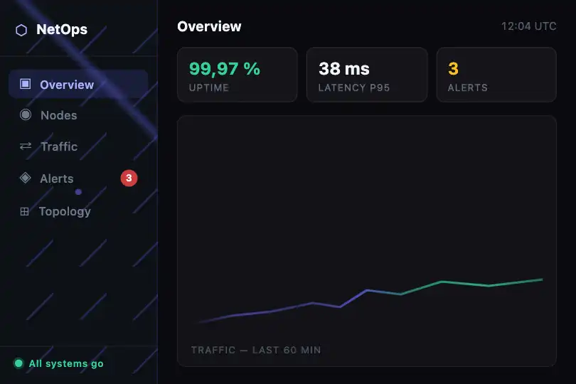
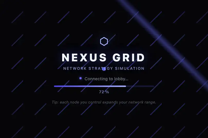
The effect relies entirely on the background property of a single <div>: no JavaScript, no canvas, no animation loop. The pattern is rendered directly by the browser's CSS engine via three stacked gradient layers in the background shorthand.
The first layer is a 135° linear gradient with near-transparent color bands: from 0% to 73% the tint is invisible, from 73% to 75% it rises to rgba(99, 102, 241, 0.6), from 75% to 77% it drops back to zero. This 2% gap produces a ~1.2 px hairline on the tile. The position 0 0 and size 60px 60px enable tiling (background-repeat: repeat by default): the browser repeats the tile across the full surface, creating a grid of parallel lines spaced 60 px apart running diagonally from top-left to bottom-right.
The second layer applies the same scheme at 45° (opposite direction) without an explicit background-size: the gradient stretches across the full box and draws one accent diagonal that crosses the grid, evoking a bidirectional connection mesh. The third layer is a radial-gradient(3px, …): a circle of radius 3 px in indigo at 80% opacity, centered by default, materialising a network intersection node. The final background-color #0a0a0f provides the dark base on which the semi-transparent lines composite.
Because the entire visual is carried by CSS, rendering is instant (no first JS tick, no deferred repaint), idle CPU cost is zero, and the effect applies to any element with a single CSS class without modifying its flow or positioning.
Accessibility
- No prefers-reduced-motion handling needed: the effect is fully static — no animation, no
requestAnimationFrame. Users who enable reduced motion are not affected. - The
<div class="bg-network">is decorative: addaria-hidden="true"if the element carries no text content meaningful to screen readers. - Overlay text (headings, labels) must be in visible HTML rather than in CSS — white text on
#0a0a0fexceeds WCAG AA contrast (ratio > 7:1). - The indigo lines on a very dark background are purely decorative (WCAG 1.4.11 exempts decorative non-text elements from non-text contrast requirements).
- No keyboard or pointer interaction is defined on the effect: no focus to manage, no added tab stops.
Browser compatibility
Three standard CSS properties — `linear-gradient`, `radial-gradient`, `background-size` — available in every browser for over a decade.
If the browser ignores linear-gradient (IE 9 without vendor prefix), the entire background property is skipped and the <div> renders in solid #0a0a0f — no JS error, the page stays functional.
The code
HTML structure to paste into your page (the CSS + JS come with Premium):
<div class="bg-network" style="position:relative;width:100%;min-height:300px;" aria-hidden="true">
  <!-- Optional overlay (text, buttons) -->
  <span class="bg-label">Your title</span>
</div>The full HTML + CSS + JS of Network Lines, ready to paste — plus all 840 effects. Or $299 once, lifetime access.
Customize
Options passed to the API or data-* attributes:
| Option / property | Default | Effect |
|---|---|---|
| rgba(99, 102, 241, .6) — in both linear-gradient layers | indigo, 60% opacity | Line color and opacity. Replace with your brand tint in both occurrences; lower opacity to 0.3 for a very subtle pattern or raise to 0.9 for prominent lines. |
| 73% and 77% — linear-gradient stops | 2% gap (≈ 1.2 px on 60 px) | Line thickness: narrow the gap to 1% to thin lines (~0.6 px), widen to 4% to thicken (~2.4 px). Update both gradient layers together. |
| 60px 60px — background-size of the first layer | 60 × 60 px | Grid spacing: 90 px for an airier network, 30 px for a dense mesh. Only the first layer (135°) is explicitly tiled. |
| rgba(99, 102, 241, .8) — in the radial-gradient | indigo, 80% opacity | Node color and opacity. Match the line tint or use an accent color to highlight the intersection point. |
| 3px — in radial-gradient(3px, …) | 3 px radius | Node radius: 5–8 px for a clearly visible dot, or remove the radial layer entirely to eliminate the node. |
| #0a0a0f — final background-color | #0a0a0f (near-black) | Base background: the only place to change the background tint without touching the gradients. `#030712` (very dark navy) or `#0f1117` (dark slate) give close tech feels. |
FAQ
@keyframes nw-scroll { to { background-position: 60px 60px, 100% 100%, center; } } and apply animation: nw-scroll 6s linear infinite to .bg-network. The first (tiled) layer scrolls visibly; the other two track their end positions. Add @media (prefers-reduced-motion: reduce) { .bg-network { animation: none; } } as soon as the animation is enabled.background-size: 60px 60px, 60px 60px, auto;. Both sets of parallels then cross at regular intervals, producing a proper diagonal grid rather than a grid plus one accent diagonal.


