Noise Texture
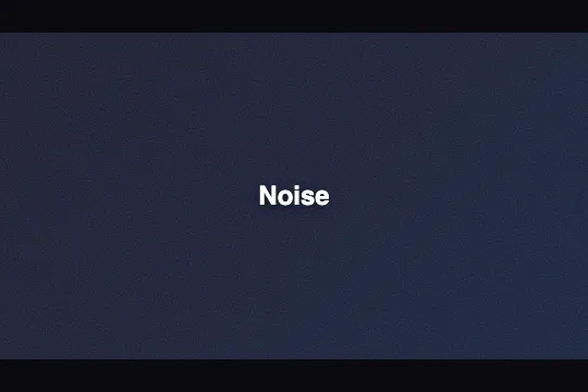
Cinematic grain in pure CSS — one pseudo-element, one inline SVG feTurbulence filter and any surface gains a film-like texture with zero JavaScript.
Updated
This effect is part of Effect.Labs — 840 vanilla effects, some free, some premium. Backgrounds has 55 effects, including 7 free. Explore the category →
3 usage examples


How it works
The effect relies on a CSS pseudo-element (::before or ::after) positioned position: absolute; inset: 0 on the container. Its background-image property receives an inline SVG encoded as a data URI containing a <feTurbulence> filter and a <rect> applying it across the full surface — the noise generator is entirely embedded in CSS, with no network request.
The feTurbulence primitive uses type='fractalNoise' (smooth Perlin noise, more organic than turbulence). baseFrequency controls grain density (0.65 → coarse grain, 0.9 → very fine). numOctaves stacks frequency layers (3–4) to enrich the texture. stitchTiles='stitch' seamlessly tiles the pattern across large surfaces without visible seams.
Three variants coexist in the CSS. .bg-noise uses ::before (frequency 0.8 / 4 octaves / opacity 0.15). .bg-noise-new uses ::after (frequency 0.65 / 3 octaves / opacity 0.15) — useful when ::before is already taken by another effect. Adding bg-noise directly to <body> generates a position: fixed overlay covering the whole page (frequency 0.9 / opacity 0.08 / z-index: 0).
The effect is entirely static — no requestAnimationFrame, no canvas, no JavaScript at all. Rendering is delegated to the browser's native SVG engine. The pseudo-element carries pointer-events: none on .bg-noise-new::after and body.bg-noise::after, ensuring it never intercepts clicks or touch events.
Accessibility
- prefers-reduced-motion: not applicable — the effect is static, no animation runs. No motion adaptation is needed or present in the code.
- The
::before/::afterpseudo-elements are purely decorative and invisible to screen readers; they emit no node in the accessibility tree. - No new focusable element is introduced: the grain does not affect keyboard navigation.
- Contrast: at
opacity 0.08–0.15, the grain does not significantly reduce the contrast ratio of content placed on top. Verify with a contrast tool if opacity exceeds 0.25. - The pseudo-element carries
pointer-events: none(.bg-noise-new::after,body.bg-noise::after) — clickable areas in the content are not obscured.
Browser compatibility
Requires CSS pseudo-elements and SVG data URIs — supported in all modern browsers for over a decade. Zero external dependency.
If CSS pseudo-elements are not supported (IE 9 and below), the element's plain background color shows without grain — no JS error, content stays intact.
The code
HTML structure to paste into your page (the CSS + JS come with Premium):
<div class="bg-noise">
  <!-- Content above the grain -->
</div>

<!-- Variant using ::after (when ::before is already taken) -->
<div class="bg-noise-new">
  <!-- Content -->
</div>

<!-- Full-page grain overlay: add class to body -->
<!-- <body class="bg-noise"> -->The full HTML + CSS + JS of Noise Texture, ready to paste — plus all 840 effects. Or $299 once, lifetime access.
Customize
Options passed to the API or data-* attributes:
| Option / property | Default | Effect |
|---|---|---|
| baseFrequency (SVG, .bg-noise::before) | 0.8 | Grain density for the main pseudo-element. < 0.5 = coarse paper-like texture, > 1.0 = ultra-fine film grain. |
| numOctaves (SVG, .bg-noise::before) | 4 | Number of stacked noise layers. 2 = smooth uniform grain, 5 = highly detailed texture (slightly heavier GPU cost). |
| opacity (.bg-noise::before) | 0.15 | Visible grain intensity on .bg-noise. 0.05 = barely perceptible, 0.30 = pronounced — keep below 0.40 to preserve readability. |
| baseFrequency (SVG, .bg-noise-new::after) | 0.65 | Variant .bg-noise-new: lower frequency for coarser grain — vintage paper or brushed-surface look. |
| numOctaves (SVG, .bg-noise-new::after) | 3 | Layers for the .bg-noise-new variant. Drop to 2 for very smooth grain, raise to 4 for more detail. |
| opacity (body.bg-noise::after) | 0.08 | Full-page overlay: very subtle by default. Raise to 0.12 for a more pronounced cinema look — check content legibility. |
| background (.bg-noise / .bg-noise-new) | linear-gradient(135deg,#1a1a2e,#16213e) | Visible background beneath the grain — swap in any color or gradient; the grain overlays any hue or image. |
FAQ
feTurbulence). You can drop it into an HTML email, a static site generator (Astro, Hugo, Eleventy), or any UI without a bundler — just paste the CSS.bg-noise class to <body> for the full-page overlay (position: fixed, opacity 0.08), and also apply .bg-noise or .bg-noise-new to individual elements for a stronger grain. Both pseudo-elements operate independently and combine without selector conflicts.stitchTiles='stitch' in the SVG filter: the browser recomputes tile edges so they join seamlessly, even across very large surfaces. The texture remains continuous regardless of the container size.


