Pastel Mesh

Pure CSS mesh background: two layers of blurred radial gradients drift in opposite directions to compose a soft atmosphere in lavender, mint, and peach — no JavaScript required.
Updated
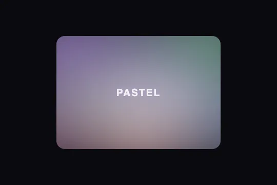
This effect is part of Effect.Labs — 840 vanilla effects, some free, some premium. Backgrounds has 55 effects, including 7 free. Explore the category →
3 usage examples


How it works
The entire effect relies on two CSS pseudo-elements (::before and ::after) layered on top of .pastel-mesh. Each carries a stack of positioned radial gradients using the at x% y% syntax: five color blobs on ::before (lavender, mint, peach, sky blue, pink) and two reinforcement blobs on ::after (light lavender, light mint). The blobs combine through transparency to create the mesh texture.
A filter: blur(35px) on ::before and blur(30px) on ::after melt blob edges into a smooth, homogeneous color wash. The pseudo-elements extend beyond the container (inset: -25% and -20%) so gradient hard edges never become visible — overflow: hidden on .pastel-mesh clips the overflow.
The @keyframes pastelFlow animation applies a slow drift (translate ±5%, scale ±3%, rotation ±2°) across five irregular keyframes. ::before runs on a 15s alternate cycle, ::after on 12s alternate-reverse: the two layers drift in opposite directions, creating depth and an organic feel without a hard loop reset.
The effect is 100% CSS, with no JavaScript and no external dependency. It works inside any position: relative; overflow: hidden container and adapts to any size by following the normal document flow.
Accessibility
- prefers-reduced-motion not handled: the code contains no
@media (prefers-reduced-motion: reduce)block — the animation runs at all times. Add this in production:@media (prefers-reduced-motion: reduce) { .pastel-mesh::before, .pastel-mesh::after { animation: none; } }. - No
aria-*attributes in the base markup. If the background carries visual meaning, addrole="img"andaria-labelon.pastel-mesh; otherwisearia-hidden="true"is preferred to keep the accessibility tree clean. - Overlay text contrast (
.pastel-mesh-label): white text at 85% opacity over a pastel gradient — ratio varies by zone. Check with a contrast tool targeting the lightest area of the gradient under the text. - No keyboard or pointer interaction — the effect is purely decorative and captures no events.
- Without CSS animation or
filtersupport, the container shows its solid dark background (#1a1520) — no JS errors, the page stays functional.
Browser compatibility
Pure CSS: requires radial-gradient, @keyframes, and filter: blur() — all supported in every modern browser since 2016.
Without filter: blur() (very old browsers), blobs render with hard edges but remain readable. Without @keyframes, the gradient is static — no fatal errors.
The code
HTML structure to paste into your page (the CSS + JS come with Premium):
<div class="pastel-mesh">
  <!-- Optional: overlay content -->
  <span class="pastel-mesh-label">Your text</span>
</div>The full HTML + CSS + JS of Pastel Mesh, ready to paste — plus all 840 effects. Or $299 once, lifetime access.
Customize
Options passed to the API or data-* attributes:
| Option / property | Default | Effect |
|---|---|---|
| ::before colors (5 blobs) | lavender #c8aaff, mint #aaffd2, peach #ffc8b4, sky blue #b4d2ff, pink #ffb4dc | Replace the rgba() values in the 5 radial-gradient calls of .pastel-mesh::before to change the palette. Keep opacities between 0.4 and 0.65 to preserve the soft look. |
| ::after colors (2 reinforcement blobs) | light lavender #dcc8ff (0.35), light mint #c8ffe6 (0.30) | These blobs add depth. Lower their opacities to 0.15–0.20 for a cleaner look; raise above 0.5 to intensify the central highlights. |
| filter: blur() on ::before | 35px | Blob softness. 20 px = more distinct blobs (tie-dye style); 60 px = near-solid wash. Adjust ::after proportionally (default 30 px). |
| animation-duration on ::before | 15s | Drift speed of the main layer. 8s = lively, 30s = nearly imperceptible. Adjust ::after independently (default 12s) to control phase offset between the two layers. |
| inset on ::before / ::after | -25% / -20% | How far pseudo-elements extend outside the container. Reduce to -10% if blur already hides the edges; increase to -40% if hard edges appear at some resolutions. |
| background on .pastel-mesh | #1a1520 | Base color showing through transparent gradient zones. Switch to an off-white (#faf8ff) for a bright, airy look; #0d0d1a deepens the nocturnal mood. |
| border-radius on .pastel-mesh | 16px | 0 for a full-bleed hero, 24px for a card, 50% for a circular background (avatar, badge). |
FAQ
.pastel-mesh in a component; it touches nothing outside its own DOM subtree.rgba() values in the radial-gradient declarations of .pastel-mesh::before (5 blobs) and ::after (2 blobs). Keep opacities between 0.4 and 0.65 — above 0.8 the colors saturate and lose the pastel quality.filter: blur() and CSS animations are GPU-accelerated on all modern mobile browsers since 2016. The overhead is negligible compared to an animated canvas. On very old devices, wrap the animations in @supports (filter: blur(1px)) { … } and serve the static gradient as a fallback.


