Vintage Photo
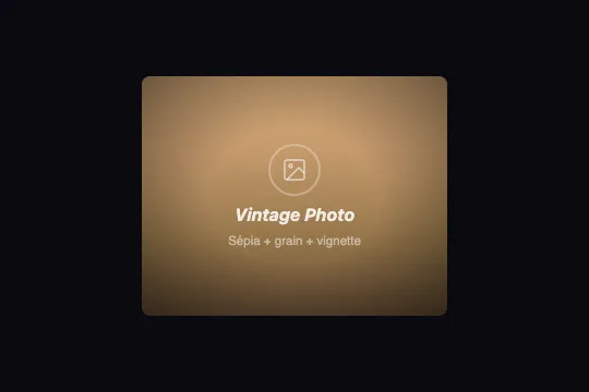
100% CSS retro photo treatment: sepia gradient, SVG fractal grain, radial vignette and vintage color overlay via mix-blend-mode — no JS, no dependency.
Updated
This effect is part of Effect.Labs — 840 vanilla effects, some free, some premium. Backgrounds has 55 effects, including 7 free. Explore the category →
3 usage examples
How it works
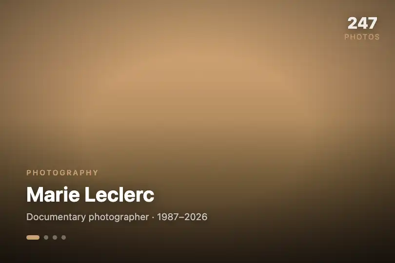
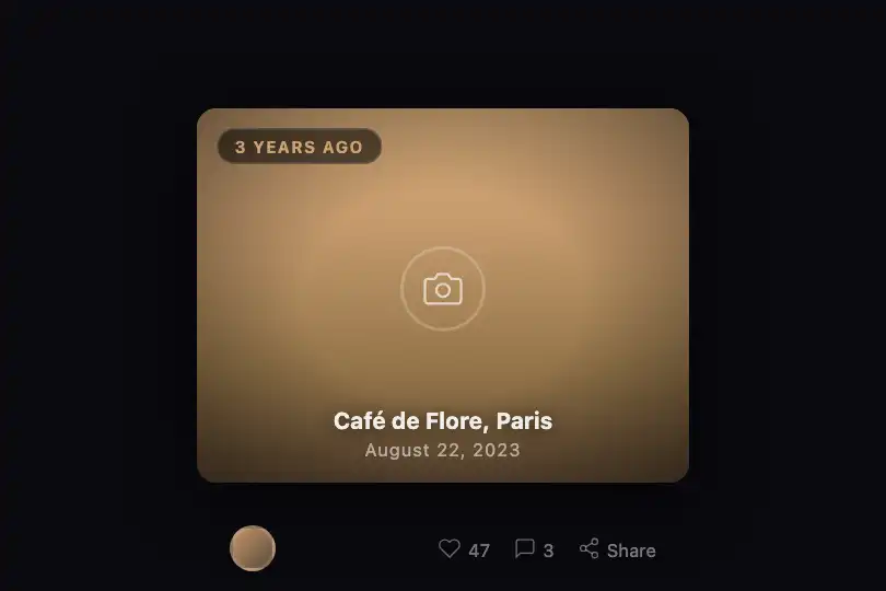
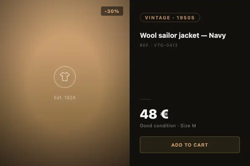
The sepia base is a four-stop linear gradient progressing from warm sand (#d4a574) to dark chocolate brown (#5a4a3a). It mimics the tonal range of an old silver-gelatin print without a real image — replace it with a background-image to apply the treatment to an actual photograph.
The photographic grain comes from the ::before pseudo-element: an inline SVG data URI containing a feTurbulence filter (type="fractalNoise", baseFrequency="0.8", numOctaves="6", stitchTiles="stitch") applied to a full-frame rect. Rendered at opacity: 0.2 with mix-blend-mode: overlay, the noise texture blends into the warm tones without obscuring content.
The vignette is the ::after pseudo-element: a radial-gradient transparent up to 40% from center, then black at 50% opacity at the edges. It darkens the corners and draws the eye toward the center, like a slightly stopped-down lens.
The div.ng-vintage-overlay layers a warm amber gradient in mix-blend-mode: color — only hue and saturation are applied over the existing luminosity, producing the yellow-brown vintage cast without flattening tonal values or crushing the vignette.
Accessibility
- No animation: the effect is 100% static CSS (no transitions, no keyframes).
prefers-reduced-motionis not implemented and is not needed. - The photo icon SVG (
.ng-vintage-icon svg) has noaria-labelorrole="img"in the delivered code — addaria-hidden="true"if decorative, or a<title>element if informative. - The
.ng-vintage-scenecarries no ARIA role in the base code — for an informative use, addrole="img"and anaria-labeldescribing the visual content. - The
h3text (rgba(255,255,255,0.85)) on the mid-brown gradient does not consistently reach the WCAG AA 4.5:1 ratio — add a darktext-shadowor raise opacity to 1 to ensure compliance. - No keyboard interaction: the effect is purely visual. CTA elements placed in the overlay must carry their own
:focus-visiblestyles.
Browser compatibility
Requires inline SVG data URI, feTurbulence, and mix-blend-mode — supported in all modern browsers since 2016.
Without mix-blend-mode (IE 11), overlays render in normal mode: the sepia gradient and vignette remain visible, only the vintage color cast disappears. The effect stays coherent.
The code
HTML structure to paste into your page (the CSS + JS come with Premium):
<div class="demo-preview">
  <div class="ng-vintage-scene">
    <!-- vintage color overlay (mix-blend-mode: color) -->
    <div class="ng-vintage-overlay"></div>
    <!-- centered overlay content -->
    <div class="ng-vintage-content">
      <div class="ng-vintage-icon">
        <svg viewBox="0 0 24 24" aria-hidden="true">…</svg>
      </div>
      <h3>Title</h3>
      <p>Subtitle</p>
    </div>
  </div>
</div>The full HTML + CSS + JS of Vintage Photo, ready to paste — plus all 840 effects. Or $299 once, lifetime access.
Customize
Options passed to the API or data-* attributes:
| Option / property | Default | Effect |
|---|---|---|
| .ng-vintage-scene background (base gradient) | #d4a574 → #5a4a3a | Base photo tones. Swap in faded greens for a cyanotype, cold blues for a silver-gelatin look, or switch to background-image to apply the treatment to a real photo. |
| ::before opacity | 0.2 | Grain intensity. 0.05 = near-invisible grain, 0.35 = heavy grain like 3200 ISO film. |
| feTurbulence baseFrequency (inside the SVG data URI) | 0.8 | Grain fineness: 0.3 = coarse pictorialist grain, 1.2 = very fine fast-film grain. |
| feTurbulence numOctaves (inside the SVG data URI) | 6 | Texture complexity: 3 = uniform simple grain, 8 = multi-scale realistic grain (slightly heavier initial render). |
| ::after background (radial vignette) | transparent 40%, rgba(0,0,0,.5) 100% | Vignette spread and opacity. Drop black to 0.25 for a subtle darkening, raise to 0.75 for a dramatic daguerreotype look. |
| .ng-vintage-overlay background | rgba(180,140,80,.2) → rgba(120,80,40,.3) | Vintage color cast. Swap in lavender for a retro violet look, or cool blue-green for a cyanotype treatment. |
| .ng-vintage-scene border-radius | 8px | Frame rounding. 0 = full-bleed photo with no border, 50% on a 1:1 ratio = round medallion style for cabinet portrait aesthetics. |
FAQ
img does not support ::before/::after pseudo-elements. The solution: wrap the image in a div.ng-vintage-scene and pass it as background-image with background-size: cover, or position an <img> with position: absolute; inset: 0; object-fit: cover inside the wrapper..ng-vintage-overlay background. For a blue cyanotype: rgba(80,120,180,.25) to rgba(40,70,120,.35). For a faded green: rgba(80,130,90,.2) to rgba(40,80,50,.3). The mix-blend-mode: color ensures the cast blends harmoniously with the vignette.feTurbulence filter is computed once at first render, then rasterized. The effect is entirely static — no JS runs, no requestAnimationFrame is launched, zero battery impact after the initial paint.


