3D Depth Press
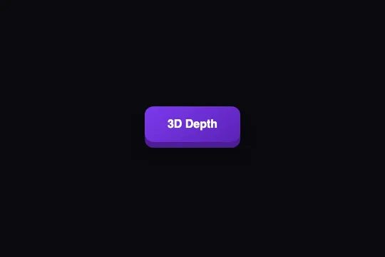
A purple gradient face sitting 4 px above a solid edge drawn by box-shadow: hover lifts it to 6 px, press brings it down to zero — the base never moves, 150 ms, pure CSS, no layout shift.
Updated
This effect is part of Effect.Labs — 840 vanilla effects, some free, some premium. Buttons has 27 effects, including 2 free. Explore the category →
3 usage examples



How it works
The depth is made of two box-shadows on .btn-3d-depth: a blur-free shadow, 0 6px 0 #4c1d95, which draws a dark purple edge under the face, and a soft shadow 0 8px 15px rgba(0,0,0,.3) which sets the whole thing on the surface. The face itself is a linear-gradient(145deg, #7c3aed, #5b21b6) — the diagonal gradient avoids a flat fill and suggests light from the top left.
At rest, the face is already offset: transform: translateY(-4px). It floats 4 px above its layout position, and the 6 px edge extends 2 px below that position. On :hover, translateY(-6px) and a 0 8px 0 edge; on :active, translateY(0) and a 0 2px 0 edge. In all three states, translation + edge thickness = 2 px: the bottom of the edge stays in exactly the same place. Measured in Chromium, the base's bottom edge sits at 177 px at rest, on hover and on press.
That is what sets this effect apart from 3D Press: here the edge is a shadow and the travel a transform, two properties that take no part in layout. The button is always 134 × 50 px to the browser, whatever the state, and neighboring elements don't move a pixel (verified with a sibling under the button). The soft shadow follows along: farther on hover (0 12px 20px, opacity .4), flat on press (0 3px 8px).
transition: .15s (all properties, ease curve) links the states; the travel from hover to press is 6 px, enough to be seen, short enough to feel instant. The border-radius: 12px inherited from .demo-btn applies to the face and, by construction, to the edge (a shadow follows the box's corners).
Accessibility
- Contrast: white text on the
#7c3aed → #5b21b6gradient = 5.7:1 and 9.0:1 — AA across the whole face, AAA on the dark half. One of the few buttons in the catalog shipped compliant with no adjustment. - prefers-reduced-motion not handled: the movements are 2 to 6 px over 150 ms. Add
@media (prefers-reduced-motion: reduce) { .btn-3d-depth { transition: none } }— the key jumps between positions instead of gliding, the relief remains. - Keyboard:
:activeapplies while Space is held, so the key sinks on the keyboard. Add.btn-3d-depth:focus-visible { transform: translateY(-6px); box-shadow: 0 8px 0 #4c1d95, 0 12px 20px rgba(0,0,0,.4) }so focus lifts like hover. The nativeoutlineis preserved; it follows the translated face. - Touch:
:activefires on touch — the face drops 4 px under the finger during the tap, good mobile feedback. On iOS the hover lift sticks after the tap (@media (hover: hover)). Target ≈ 50 px tall (56 px with the edge), above the 44 px minimum. - Findability: the
#4c1d95edge and the face stand out clearly on dark and light backgrounds alike (face at least 5.7:1 against the text, edge 1.8:1 against#0a0a0f— a decorative cue, the face draws the outline). No generated content: the accessible name is the label.
Browser compatibility
Requires CSS transitions on transform and box-shadow, multiple shadows and linear-gradient() — every browser since 2012. No JavaScript, zero dependencies.
Without transitions, the three states apply instantly: the face jumps 2 to 6 px instead of gliding; the relief and the fixed base remain intact.
The code
HTML structure to paste into your page (the CSS + JS come with Premium):
<button class="demo-btn btn-3d-depth">3D Depth</button>The full HTML + CSS + JS of 3D Depth Press, ready to paste — plus all 840 effects. Or $299 once, lifetime access.
Customize
Options passed to the API or data-* attributes:
| Option / property | Default | Effect |
|---|---|---|
| translateY (CSS — rest −4px / hover −6px / press 0) | −4 / −6 / 0 px | Height of the face above its base. Keep translation + edge thickness constant (here 2 px) so the base doesn't move. |
| Edge 0 Npx 0 #4c1d95 (CSS — 1st shadow, 3 states) | 6 / 8 / 2 px | Thickness of the solid edge. 10px = arcade key; 3px = flat key. Adjust the translations accordingly. |
| Edge color (CSS — #4c1d95, 3 occurrences) | #4c1d95 | Face darkened by about 25%. Too close to the face and the relief flattens; too dark and the edge reads as a drop shadow. |
| Soft shadow (CSS — 2nd shadow, 3 states) | 0 8px 15px .3 / 0 12px 20px .4 / 0 3px 8px .3 | Sets the button on the surface and emphasizes height. Remove it for a flat “cartoon” look, keeping only the edge. |
| transition (CSS — .btn-3d-depth) | .15s | Duration of all three transitions. .08s = crisp click; .25s = heavy key. |
| background (CSS — .btn-3d-depth) | linear-gradient(145deg, #7c3aed, #5b21b6) | Face. Contrast already passes AA; if you change the hue, recompute the edge (face −25%) and check the white text at 4.5:1. |
| Vertical reserve (context — margin) | 4 px above, 2 px below | At rest the face extends 4 px above its box and the edge 2 px below: allow margin-top: 4px in a tight stack so nothing overlaps. |
FAQ
transform: translateY(-4px) applies from rest: the face is drawn 4 px above its layout position, while the edge extends 2 px below it. In a row of buttons, this one therefore looks shifted upward. Compensate with margin-top: 4px (or translate on the container), or, if you want an aligned face, set the rest translation to 0 and shift the other two states by the same amount (−2 px on hover, +4 px on press with an edge going to 0).border-bottom: the border is part of the box, so neighbors shift by 2 px on each state. Here the edge is a box-shadow and the travel a transform — neither enters layout, nothing moves around. In return, shadows aren't clipped by a parent's overflow: hidden as cleanly as a border is: keep 15 px of margin under the button for the soft shadow..btn-3d-depth:hover rule. Rest (−4 px, 6 px edge) and press (0, 2 px edge) are enough: the face drops 4 px toward a motionless base. That is the behavior touch users already see, since hover doesn't exist for them.


