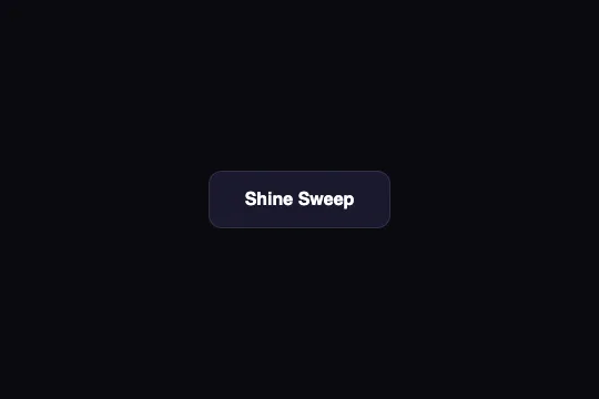
Border Draw
On hover, four 2 px strokes draw an indigo frame around the button: top and bottom in 300 ms, then both sides in another 300 ms. Two pseudo-elements, two spans, not a line of JavaScript.
Updated

This effect is part of Effect.Labs — 840 vanilla effects, some free, some premium. Buttons has 27 effects, including 2 free. Explore the category →
3 usage examples



How it works
The .btn-border-draw button is transparent (background: 0 0), with indigo #6366f1 text and a border: 2px solid transparent that reserves 2 px all around. The four sides of the frame are four separate boxes: ::before (top, top: 0; left: 0) and ::after (bottom, bottom: 0; right: 0) are 2 px tall and 0 wide; the two <span>s in the HTML, .border-left (left: 0; bottom: 0) and .border-right (right: 0; top: 0), are 2 px wide and 0 tall. A button only has two pseudo-elements: the spans supply the two missing boxes.
On :hover, the pseudo-elements go to width: 100% and the spans to height: 100%. The sequencing comes from the transitions: transition: width .3s on the horizontal strokes, transition: height .3s .3s on the vertical ones — same duration, but a 300 ms delay equal to the first phase. The top draws left to right and the bottom right to left (0 → 300 ms), then the right side top to bottom and the left side bottom to top (300 → 600 ms): the frame is drawn clockwise, two opposite sides at a time. Default ease curve.
Measured in Chromium on the shipped button (164 × 54 px): the horizontal strokes reach 160 px and the vertical ones 50 px — the padding box. All four boxes are positioned against it, so they sit 2 px inside the outer edge, within the transparent border. And since .demo-btn sets border-radius: 12px and overflow: hidden, the rounded clip (inner radius 10 px) trims the ends of the straight strokes: they never meet, all four corners stay open by about 6 px. That is how the shipped version renders; with border-radius: 0 the frame closes.
When the cursor leaves, the same transitions replay in reverse with their delays: the horizontal strokes retract at once, the vertical ones 300 ms later — the frame erases in the same order it was drawn, not backwards. Nothing else changes: no background, no shadow, no text color, no :active. The motion runs on width and height, two layout properties recalculated every frame — harmless for four 2 px boxes, but not GPU-composited the way transform: scaleX() would be.
Accessibility
- Insufficient contrast at rest: the
#6366f1text on the demo background#0a0a0fmeasures 4.42:1, below the 4.5:1 AA threshold for 16 px — and 4.47:1 on white, just as short. The button background is transparent: your page decides. On a dark background use#818cf8(6.6:1); on a light one,#4f46e5(6.3:1). The strokes reuse the same color: above 3:1 in both cases, the frame stays perceivable (WCAG 1.4.11). - prefers-reduced-motion not handled: add
@media (prefers-reduced-motion: reduce) { .btn-border-draw::before, .btn-border-draw::after, .btn-border-draw .border-left, .btn-border-draw .border-right { transition: none } }— the frame appears in one go on hover, the information is kept. - Keyboard: no
:hoverwhen tabbing. Duplicate the two hover rules onto:focus-visible(.btn-border-draw:focus-visible::before, .btn-border-draw:focus-visible::after { width: 100% }and theheightequivalent for the spans): the frame being drawn becomes a focus indicator, on top of the nativeoutlinethe code doesn't remove. - Screen readers: the two
<span>s only contain line breaks, no text — the accessible name stays the label. To be safe, addaria-hidden="true"to each so no assistive technology stops on empty boxes. - Touch: no hover on mobile; the frame draws on tap and stays (iOS) — use
@media (hover: hover)to avoid it. A transparent button at rest reads like a link: keep it for secondary actions. Target 54 px tall (16 px padding, 18 px text, 2 × 2 px border), above the 44 px minimum, and no layout shift on hover thanks to the transparent border already reserved.
Browser compatibility
Requires CSS transitions on width/height, the ::before/::after pseudo-elements and absolute positioning — every browser since 2012. No JavaScript, zero dependencies.
Without transitions, the frame appears and disappears at once on hover; without pseudo-elements (prehistoric browsers), only the two sides carried by the spans are drawn.
The code
HTML structure to paste into your page (the CSS + JS come with Premium):
<button class="demo-btn btn-border-draw">
  Border Draw
  <span class="border-left"></span>
  <span class="border-right"></span>
</button>The full HTML + CSS + JS of Border Draw, ready to paste — plus all 840 effects. Or $299 once, lifetime access.
Customize
Options passed to the API or data-* attributes:
| Option / property | Default | Effect |
|---|---|---|
| Color #6366f1 (CSS — color + background of the 4 strokes) | #6366f1 | Five occurrences to change together. Set background: currentColor on the four strokes: the text color drives everything, and one declaration handles branding or contrast (#818cf8 on dark, #4f46e5 on light). |
| transition: width .3s (CSS — ::before, ::after) | .3s | Duration of the first phase (top and bottom). If you change it, align the sides' delay with it, otherwise the phases overlap or leave a gap. |
| transition: height .3s .3s (CSS — .border-left, .border-right) | .3s duration, .3s delay | The delay is the sequencer. 0s: all four sides draw at once (300 ms total). .15s: the sides start halfway through the horizontal strokes, smoother. |
| Thickness height: 2px / width: 2px (CSS — the 4 strokes) | 2 px | 1 px: hairline; 3 to 4 px: bold frame. Set the button's transparent border to the same value so the stroke keeps the same distance from the edge. |
| border-radius (CSS — .demo-btn) | 12px | Decides the corners. 0: the strokes meet, closed frame. Above 12 px the open corners widen — a style in itself (a “cut-corner” frame). |
| left/right and top/bottom anchors (CSS — position of each stroke) | top: left 0 · bottom: right 0 · left: bottom 0 · right: top 0 | The anchor sets the drawing direction. Put right: 0 on ::before and left: 0 on ::after, top: 0 on .border-left and bottom: 0 on .border-right: the frame draws counter-clockwise. |
| border: 2px solid transparent (CSS — .btn-border-draw) | transparent | Replace transparent with rgba(99, 102, 241, .25): a ghost frame is visible at rest, which the strokes then underline on hover — easier to read as a button for a transparent element. |
FAQ
overflow: hidden clips them along the button's border-radius: 12px (10 px inside the border). At the corners the arc moves more than 2 px away from the edges: the stroke is trimmed at an angle over about 6 px and never meets its neighbor. Three ways out: border-radius: 0 for a closed frame, own the open corners as a signature, or switch to an <svg> with a <rect rx="12"> animated through stroke-dashoffset if you want a stroke that truly follows the curve.::before carries border-top and border-right, ::after carries border-bottom and border-left, each going from width: 0; height: 0 to 100%. Two boxes are then enough, at the cost of drawing two symmetric Ls rather than four sequenced sides. The shipped code keeps the spans to control each side separately.::before with transition: width .15s, .border-right with height .15s .15s, ::after with width .15s .3s, .border-left with height .15s .45s. The stroke chains top → right → bottom → left in 600 ms, like a pen that never lifts — the shipped anchors already fit: the bottom starts from the right (right: 0) and the left side starts from the bottom (bottom: 0).