3D Press
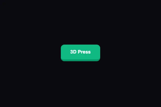
A green key resting on a darker 4 px edge: on hover the face rises 2 px and the edge thickens, on press it sinks 2 px and the edge thins — in 100 ms, pure CSS.
Updated
This effect is part of Effect.Labs — 840 vanilla effects, some free, some premium. Buttons has 27 effects, including 2 free. Explore the category →
3 usage examples
How it works
The “depth” is a plain border-bottom: 4px solid #059669 on a #10b981 button: .demo-btn sets border-style: none on all four sides, then .btn-3d restores only the bottom one. The 4 px dark band under the face reads as the side of a keyboard key. No box-shadow, no pseudo-element, no JavaScript.
On :hover, two simultaneous changes: transform: translateY(-2px) lifts the face, and border-bottom-width: 6px thickens the edge. Since the box grows 2 px downward while being translated 2 px upward, the bottom edge does not move: only the face lifts, which gives the illusion of a key peeling off its base.
On :active, the reverse: translateY(2px) and border-bottom-width: 2px. The box loses 2 px, the translation compensates, the bottom edge stays put and the face drops 4 px relative to the hover state — the travel of a real key. The three states are linked by transition: .1s (all properties, ease curve), short enough for the press to feel instant.
Measured in Chromium: 54 px tall at rest, 56 px on hover, 52 px on press. Because the border is part of the layout box, elements following the button shift by 2 px — down on hover, up on press (an inline text line: 54 → 56 px; a sibling in a column: moved ±2 px). That is the trade-off of the border technique; the catalog's 3D Depth Press variant avoids the shift with a box-shadow.
Accessibility
- Insufficient contrast as shipped: white text on
#10b981= 2.54:1, below the 4.5:1 AA threshold and even below the 3:1 large-text threshold. Switch the face to#047857(5.5:1) with a#065f46edge, or to#065f46(7.7:1) with a#064e3bedge. - prefers-reduced-motion not handled: the movement is only 2 to 4 px over 100 ms, but add
@media (prefers-reduced-motion: reduce) { .btn-3d { transition: none } }— the states remain, they switch without sliding. - Keyboard:
:activeapplies while Space is held (Chrome, Firefox, Safari): the key sinks on the keyboard just as with the mouse. Hover does not exist on the keyboard;.btn-3d:focus-visible { transform: translateY(-2px); border-bottom-width: 6px }gives Tab navigation the same lift. - Focus: the code sets
border-style: nonethen a single border, without touchingoutline— the native focus ring stays visible. If you redraw it, preferoutline-offset: 3pxso it doesn't blend with the edge. - Touch:
:activefires on touch (the key sinks under the finger during the tap); on iOS the:hoverstate sticks after the tap until the next touch — wrap the hover rule in@media (hover: hover). Target ≈ 54 px tall, above the 44 px minimum.
Browser compatibility
Requires CSS transitions on transform and border-bottom-width — every browser since 2012. No JavaScript, zero dependencies.
Without transitions, the three states apply instantly: the key jumps 2 px instead of sliding; relief and press remain readable.
The code
HTML structure to paste into your page (the CSS + JS come with Premium):
<button class="demo-btn btn-3d">3D Press</button>The full HTML + CSS + JS of 3D Press, ready to paste — plus all 840 effects. Or $299 once, lifetime access.
Customize
Options passed to the API or data-* attributes:
| Option / property | Default | Effect |
|---|---|---|
| background (CSS — .btn-3d) | #10b981 | Face color. For AA contrast with white text: #047857 or darker. Change the edge at the same time. |
| border-bottom (CSS — .btn-3d) | 4px solid #059669 | Edge thickness and color at rest. The color should be the face darkened by about 15%; 8px gives an arcade key, 2px a flat key. |
| translateY / border-bottom-width (CSS — :hover) | -2px / 6px | Lift on hover. Keep |translateY| = hover thickness − rest thickness so the bottom edge stays fixed. |
| translateY / border-bottom-width (CSS — :active) | 2px / 2px | Travel on press. Same rule: translation = rest − press (4 − 2 = 2). 4px / 0 flattens the key completely. |
| transition (CSS — .btn-3d) | .1s | Duration of all three transitions. .06s for a crisper click; beyond .2s the key feels mushy. |
| border-radius (CSS — .demo-btn) | 12px | Rounding of the key, edge included. 6px = keyboard key; 999px = pill with an edge. |
| Layout-shift compensation (CSS — to add) | none | The border moves the layout by ±2 px. To cancel it: .btn-3d:hover { margin-bottom: -2px } .btn-3d:active { margin-bottom: 2px } — or reserve 2 px of margin under the button. |
FAQ
border-bottom-width, which is part of the layout box: on hover the button is 2 px taller, on press 2 px shorter, and everything after it shifts by the same amount (measured: a text line goes from 54 to 56 px). Compensate with a negative margin on the same states (margin-bottom: -2px on hover, 2px on press), or draw the edge with box-shadow: 0 4px 0 #059669, which takes no part in layout..btn-3d:hover rule. Rest (4 px edge) and press (translateY(2px), 2 px edge) are enough for the illusion: the face drops 2 px toward a base that doesn't move. It's also the setting to keep for touch, where hover doesn't exist.display: inline-block or block: transform and border-bottom-width have no effect on a pure inline element. For a square key with no text (an icon), set width and height, use padding: 0 and center the content with display: inline-flex.


