Shine Sweep
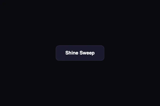
On hover, a white band at 20% opacity sweeps across the button from left to right in 500 ms — and sweeps back the other way when the cursor leaves. One pseudo-element, one transition, no JavaScript.
Updated
This effect is part of Effect.Labs — 840 vanilla effects, some free, some premium. Buttons has 27 effects, including 2 free. Explore the category →
3 usage examples

How it works
.btn-shine is a solid button: #1a1a2e background, white text, 1 px border in 10% white. The shine is its ::before: an absolutely positioned box the exact size of the button (width: 100%; height: 100%; top: 0), filled with linear-gradient(90deg, transparent, rgba(255,255,255,.2), transparent) — a soft vertical band, 20% white at its center, transparent at its edges — parked off-screen at left: -100%, i.e. entirely to the left of the button.
On :hover, left goes to 100%: the box travels two button widths under transition: left .5s, default ease curve. Measured in Chromium on the shipped button (163 px wide): left runs from −163 to +163 px; the band's center enters the button around 125 ms and exits around 375 ms, faster in the middle than at the ends. The overflow: hidden on .demo-btn clips everything that spills: outside the button, nothing shows.
The transition is symmetric: when the cursor leaves, left returns from 100% to −100% in 500 ms and the shine sweeps back across the button from right to left. A brief hover reverses the motion midway. That isn't a bug but a consequence of the transition living on the rest state — the Customize tab shows how to keep only the outbound pass.
The ::before is a positioned box: it paints above the button's background and its text. Since the text is white, the band's pass only alters the background; legibility is untouched (see Accessibility). The motion animates left, a layout property recalculated every frame on the main thread — harmless for one button, less so for a grid: transform: translateX() would make the same trip on a composited layer. No :active, no shadow, no lift: the shine is the only feedback.
Accessibility
- Contrast: white text on
#1a1a2e= 17:1, AAA level. As the shine passes, the background under the letters brightens at most to#1a1a2e+ 20% white (≈#484857): still 9:1. Shipped compliant, no retouch needed — one of the few buttons in the catalog in that case. - prefers-reduced-motion not handled: add
@media (prefers-reduced-motion: reduce) { .btn-shine::before { transition: none } }. The band then jumps from one side to the other unseen — the button has no hover feedback left; provide a static alternative, e.g..btn-shine:hover { border-color: rgba(255,255,255,.35) }. - Keyboard: no
:hoveron focus..btn-shine:focus-visible::before { left: 100% }triggers one pass of the shine when focus arrives via Tab — the band then stays parked on the right, invisible, until the next focus. The nativeoutlineis untouched and remains the real indicator. - Screen readers:
content: "", nothing is announced; the accessible name is the label of the native<button>, activatable with Enter and Space. - Spotting the button: the
#1a1a2efill contrasts at 1.16:1 with the demo page#0a0a0fand its 10% white border at 1.25:1 — the text outlines the button, not its shape. On a surface of the same shade the button vanishes: raise the border to 20–25% white or lighten the fill. Target 52 px tall (16 + 18 + 16 + 2 × 1), above the 44 px minimum.
Browser compatibility
Requires the CSS transition of left, pseudo-elements and linear-gradient() — every browser since 2012. No JavaScript, zero dependencies.
Without transitions, the band jumps instantly from −100% to 100%: nothing is visible, the button stays an ordinary solid button. Without gradients, the pseudo-element is transparent: same result.
The code
HTML structure to paste into your page (the CSS + JS come with Premium):
<button class="demo-btn btn-shine">Shine Sweep</button>The full HTML + CSS + JS of Shine Sweep, ready to paste — plus all 840 effects. Or $299 once, lifetime access.
Customize
Options passed to the API or data-* attributes:
| Option / property | Default | Effect |
|---|---|---|
| transition: left .5s (CSS — ::before) | .5s | Speed of the pass, out and back. .3s: a flash; .8s: slow, almost liquid shine. |
| rgba(255,255,255,.2) (CSS — central gradient stop) | 20% white | Shine intensity. .35 shows on a mid-tone fill; above .5 the white text melts into the band as it passes. |
| Gradient stops (CSS — transparent, .2, transparent) | 0% / 50% / 100% | Band width. transparent 40%, rgba(...) 50%, transparent 60%: a narrow streak; add transform: skewX(-20deg) to the ::before for the slanted shine of glossy buttons. |
| linear-gradient(90deg, …) (CSS — angle) | 90deg | 110deg: slanted band without skew. 180deg: the band becomes horizontal and moving left no longer makes it cross — combine with a top movement instead. |
| background: #1a1a2e (CSS — .btn-shine) | #1a1a2e | Any dark or saturated fill suits the white shine. On a light fill, switch the band to rgba(0,0,0,.08): 20% white over light tones is invisible. |
| One-way pass (CSS — transition moved onto :hover) | out and back | Set transition: none on .btn-shine::before and transition: left .5s on .btn-shine:hover::before: on exit the band jumps back to its start unseen — a single pass per hover. |
| left → transform (CSS — ::before) | left: -100% → 100% | Composited version: keep left: -100% fixed, replace the hover rule with transform: translateX(200%) and the transition with transform .5s. Same trip, off the main thread. |
FAQ
left returns from 100% to −100% with the same duration, and the band crosses the button in reverse. For a one-way pass, move the transition onto the :hover state (see Customize): the return becomes an instant jump, invisible since it happens outside the clipped frame.#f3f4f6, say) barely changes its luminance: the band passes unseen. Three answers: a dark band (rgba(0,0,0,.08)), a band in the brand color at 25%, or mix-blend-mode: overlay on the ::before so the white actually brightens the fill.@keyframes shine { from { left: -100% } to { left: 100% } } and .btn-shine::before { animation: shine 2.5s ease-in-out infinite } — the shine passes every 2.5 s, and the reset to the start happens off-screen, so it's never seen. Keep it to one button per screen and switch it off under prefers-reduced-motion: an animation running longer than 5 s must be stoppable (WCAG 2.2.2).


