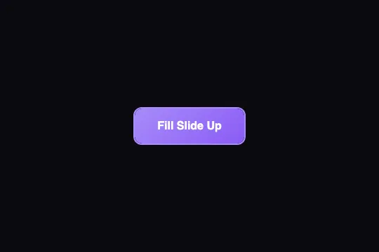
Fill Slide Up
Light-purple outline button: on hover, a gradient pseudo-element rises from the bottom and fills the box in 600 ms on an ease-in-out curve while the text turns white — pure CSS, with a press that snaps without transition.
Updated
This effect is part of Effect.Labs — 840 vanilla effects, some free, some premium. Buttons has 27 effects, including 2 free. Explore the category →
3 usage examples


How it works
At rest, .btn-fill-slide is hollow: background: transparent, border: 2px solid #a78bfa, color: #a78bfa. It carries position: relative and z-index: 1 — the stacking context that lets its ::after at z-index: -1 paint between the button's background and its text, instead of falling behind the page.
The fill is that ::after: position: absolute; bottom: 0; left: 0; width: 100%; height: 0, linear-gradient(135deg, #a78bfa, #8b5cf6) background, border-radius: 10px (the inner radius: the button's 12 px minus the 2 px border). On :hover, height goes to 100% — from 0 to 50 px on the demo button (54 px minus both borders) — in .6s cubic-bezier(.65, 0, .35, 1), a quartic ease-in-out curve: slow at the start, fast in the middle, braking at the end. overflow: hidden on .demo-btn clips the pseudo-element to the rounded corners.
The text follows the same curve and duration: transition: color .6s, from #a78bfa to #fff. Measured in Chromium at 300 ms: the fill reaches 57% of the height and the text is #dacefd — a very pale purple sitting on a purple background, 1.8:1 contrast. Since the letters occupy the middle third of the height, they are covered by the gradient between ≈ 230 and 400 ms while the text isn't white yet: the label is unreadable for about 150 ms on every hover.
On :active, transform: scale(.95). But the transition only covers color (and height for the pseudo-element): the squash is instant, no glide — measured at +20 ms, the scale is already 0.95. Release is just as abrupt. Add transform .15s to the list if you want a cushioned press.
Accessibility
- Contrast at rest:
#a78bfaon#0a0a0f= 7.3:1, AAA. On hover, insufficient contrast: white text on the#a78bfa → #8b5cf6gradient = 2.7:1 and 4.2:1, below the 4.5:1 AA threshold. Darken the fill —linear-gradient(135deg, #7c3aed, #6d28d9)gives 5.7:1 and 7.1:1 — while keeping border and resting text at#a78bfa. - Readability during the transition: the text goes through 150 ms of unreadability (1.2 to 1.8:1) when the gradient covers it before it turns white. Give the text a shorter transition than the fill (
transition: color .2s, or.25swith a.15sdelay) so it is white when the wave reaches it. - Dark background required: on a light page,
#a78bfaon white = 2.7:1 at rest. For a light theme, use#6d28d9for the border and resting text. - prefers-reduced-motion not handled: the fill is a 50 px movement over 600 ms. Add
@media (prefers-reduced-motion: reduce) { .btn-fill-slide, .btn-fill-slide::after { transition: none } }— the button snaps from outline to solid, white text included. - Keyboard and touch: no
:hoveron the keyboard — duplicate both hover rules under:focus-visibleand:focus-visible::after; the nativeoutlineis preserved. On iOS the filled state sticks after a tap (@media (hover: hover)). Target ≈ 54 px tall, above the 44 px minimum.
Browser compatibility
Requires CSS transitions on color and height with cubic-bezier(), a positioned pseudo-element and a negative z-index — every browser since 2012. No JavaScript, zero dependencies.
Without transitions, the fill appears at once on hover, white text included: the button stays usable and readable, only the 600 ms rise is gone.
The code
HTML structure to paste into your page (the CSS + JS come with Premium):
<button class="demo-btn btn-fill-slide">Fill Slide Up</button>The full HTML + CSS + JS of Fill Slide Up, ready to paste — plus all 840 effects. Or $299 once, lifetime access.
Customize
Options passed to the API or data-* attributes:
| Option / property | Default | Effect |
|---|---|---|
| transition-duration (CSS — .btn-fill-slide and ::after) | .6s | Duration of the fill and of the text color change. .35s = responsive; .9s = very slow, for a large isolated button only. |
| cubic-bezier(.65, 0, .35, 1) (CSS — transition) | quartic ease-in-out | Slow start and end, fast middle. cubic-bezier(.22, 1, .36, 1) (ease-out) starts the wave faster; linear gives a mechanical fill. |
| Direction (CSS — ::after: bottom / height) | bottom to top | Replace bottom: 0 with top: 0 to fill downward; for left to right, animate width (0 → 100%) with a fixed height: 100%. |
| background (CSS — ::after) | linear-gradient(135deg, #a78bfa, #8b5cf6) | Fill color. For AA contrast with white text: #7c3aed → #6d28d9. A solid color works too. |
| color (CSS — :hover) | #fff | Text color once filled. Dark text (#1e1b4b) on the original light purple gives 5.9:1 without changing the gradient. |
| border / color (CSS — .btn-fill-slide) | 2px solid #a78bfa / #a78bfa | Outline and text at rest. Match them to the gradient's light color so the wave seems to grow out of the border. On a light background, darken both. |
| transform (CSS — :active) | scale(.95), no transition | Press squash, instant. Add transform .15s to the button's transition list to cushion it, or remove the rule. |
FAQ
transition: color .2s), a delayed-then-fast text (transition: color .25s .15s) so it turns white as the wave reaches it, or a darker fill (#7c3aed → #6d28d9), which contrasts with the intermediate pale purple as well as with the final white.left: 0; top: 0; height: 100% and animate width: 0 → 100%. From the center: left: 50%; width: 0 with translateX(-50%), then width: 100% on hover — or, lighter for rendering, transform: scaleX(0) → scaleX(1) with transform-origin: center, which triggers no layout recalculation.z-index: -1. Without a stacking context of the button's own, it would paint behind the page background and the fill would be invisible. position: relative; z-index: 1 creates that context: the ::after paints above the button's transparent background but below its text. If you place the button inside a parent that already has isolation: isolate, the z-index: 1 is still needed.


