Gradient Border Animated
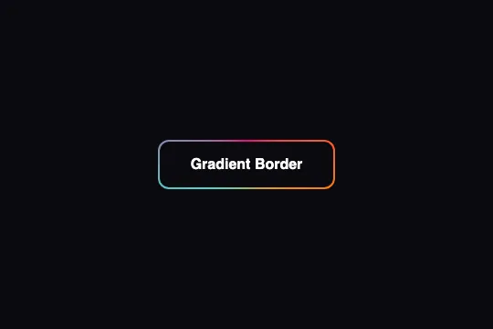
A 2 px ring in a pink → orange → turquoise conic gradient whose start angle is animated from 0 to 360° in 3 s. One often-forgotten condition: the @property declaration that makes the --angle variable animatable — without it, the ring stands still.
Updated
This effect is part of Effect.Labs — 840 vanilla effects, some free, some premium. Buttons has 27 effects, including 2 free. Explore the category →
3 usage examples


How it works
Three layers, like Rotating Border: the .btn-gradient-border-anim button (background: #0a0a0f, position: relative; z-index: 1, overflow: hidden; border-radius: 12px via .demo-btn), a ::before at z-index: -2 carrying the gradient (inset: -3px; border-radius: 15px) and an ::after at z-index: -1 redrawing the face (inset: 2px; background: #0a0a0f; border-radius: 10px). The 2 px gap between the button's edge and the face is the visible ring.
The difference from Rotating Border lies in what rotates. Here the box doesn't move: the gradient is conic-gradient(from var(--angle, 0deg), #ff0080, #ff8c00, #40e0d0, #ff0080) and the rotateGradientAnim animation (3s linear infinite) varies --angle from 0deg to 360deg. Since the ::before always covers the whole button, the ring should stay continuous at every instant — that's the right principle, the one that avoids gaps on the flanks.
But a custom property is only interpolable if it is registered with @property. Without that declaration, --angle is a string to the browser, animated discretely — 0deg for the first half of the cycle, 360deg for the second. And 0° and 360° draw the same gradient. Measured in Chromium with the CSS alone: --angle is 0deg at 0, 375, 750 and 1,125 ms, 360deg at 1,500 ms, and the ring's pixels are identical at all those instants — the button is static. That is the symptom of a forgotten @property.
The essential rule — @property --angle { syntax: '<angle>'; inherits: false; initial-value: 0deg }, once in the stylesheet — changes everything: the angle passes through 45° at 375 ms and 90° at 750 ms, the colors travel along the ring and the gradient makes a full turn every 3 s without ever breaking. Make sure it travels with the CSS you paste. No :hover or :active rule: the animation runs permanently.
Accessibility
- Text contrast: white on
#0a0a0f= 19.8:1, AAA. The face is opaque: the page color behind it changes nothing. - Ring contrast (WCAG 1.4.11, 3:1 threshold for a component's boundary): on
#0a0a0f,#ff0080= 5.2:1,#ff8c00= 8.5:1,#40e0d0= 12:1 — the 2 px outline is perceptible at every point of the cycle, and it is continuous, unlike Rotating Border. - prefers-reduced-motion not handled: the gradient spins permanently. Add
@media (prefers-reduced-motion: reduce) { .btn-gradient-border-anim::before { animation: none } }— the ring remains, frozen at 0°, complete and readable. - Screen readers: both pseudo-elements have
content: "", nothing is announced, the accessible name is the label. The button remains a native<button>; the animation doesn't depend on hover. - Focus:
outlineis untouched, the native focus ring stays visible and is not clipped byoverflow: hidden. Target ≈ 54 px tall (18 px padding + text), above the 44 px minimum.
Browser compatibility
Requires @property, conic-gradient() with from var(), the inset shorthand and the animation of a custom property. No JavaScript, zero dependencies.
Without @property — Firefox before 128, Safari before 16.4, or if the rule was left out — the gradient ring is present but motionless: a button with a fixed conic border, readable and complete. Without inset (Safari before 14.1, Firefox before 66), the pseudo-elements have neither size nor position and only the white text on the face remains.
The code
HTML structure to paste into your page (the CSS + JS come with Premium):
<button class="demo-btn btn-gradient-border-anim">Gradient Border</button>The full HTML + CSS + JS of Gradient Border Animated, ready to paste — plus all 840 effects. Or $299 once, lifetime access.
Customize
Options passed to the API or data-* attributes:
| Option / property | Default | Effect |
|---|---|---|
| @property --angle (CSS — essential, once per stylesheet) | angle type, initial value 0deg | @property --angle { syntax: '<angle>'; inherits: false; initial-value: 0deg } makes the variable interpolable. Without it, no rotation. Chrome 85+, Safari 16.4+, Firefox 128+. |
| animation-duration (CSS — ::before, rotateGradientAnim) | 3s | Length of a full turn. 2s = brisk; 8s = slow, almost a breath. The rotation is continuous, unlike Rotating Border. |
| conic-gradient(from var(--angle), #ff0080, #ff8c00, #40e0d0, #ff0080) (CSS — ::before) | pink → orange → turquoise → pink | Ring colors. Repeat the first one last to avoid a hard seam. Two colors are enough for a spinning two-tone ring. |
| inset (CSS — ::after) | 2px | Ring thickness: the gap between the button's edge and the face. 1px = hairline; 3px = frame. Adjust the face's border-radius (12 − inset). |
| background (CSS — ::after) | #0a0a0f | Face color. Same as the catalog's background; on another page, match your surface or lighten it for a clean edge. |
| border-radius (CSS — .demo-btn 12px / ::before 15px / ::after 10px) | 12 / 15 / 10 px | Rounding of the three layers. Face = button − face inset. 999px everywhere = pill; the ring stays continuous, since the box doesn't rotate. |
| animation-play-state (CSS — to add) | running | paused at rest and running under :hover::before for a still ring that starts spinning on hover, without restarting from zero. |
FAQ
@property declaration, almost always. The code animates --angle from 0 to 360°, but an unregistered custom property has no type: the browser can't compute 45° in between and flips from one value to the other halfway — and 0° and 360° give the same gradient. Check that @property --angle { syntax: '<angle>'; inherits: false; initial-value: 0deg } sits at the top of your CSS. The rotation starts immediately, with no other change. If the rule is there and nothing moves, your browser doesn't know @property (next question).@property, so --angle stays discrete and 0° = 360°. The button is complete and readable, only the rotation is missing — an acceptable fallback. If rotation is essential on those browsers, fall back on Rotating Border's technique (spinning the ::before's box with transform), making the ::before a square larger than the diagonal so the ring stays continuous.@property. The universal compromise is a square ::before (width: 200%; aspect-ratio: 1, centered) spun by transform: continuous everywhere, but heavier to composite than animating a variable.


