Gummy Elastic
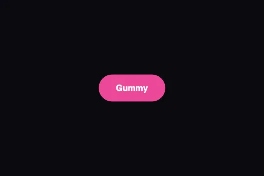
On hover the button grows 10% and rounds off; on press it squashes — an overshooting cubic-bezier curve does all the bounce, no JS.
Updated
This effect is part of Effect.Labs — 840 vanilla effects, some free, some premium. Buttons has 27 effects, including 2 free. Explore the category →
3 usage examples

How it works


Three states, all in CSS: rest (scale(1), border-radius: 12px inherited from .demo-btn), :hover (transform: scale(1.1); border-radius: 30px) and :active (transform: scale(.95); border-radius: 8px). No @keyframes: the motion is nothing but the transition between these states.
The transition: transition: .3s cubic-bezier(.68, -.55, .265, 1.55) on .btn-gummy — property all (the default), 300 ms. The control points outside [0, 1] on Y (−.55 and 1.55) push the curve outside the start → end range: it first pulls back about 9% of the distance (around 60 ms), then overshoots the target by about 9% (around 235 ms) before settling. For scale 1 → 1.1: dip near 0.99, peak near 1.11.
border-radius rides the same curve: 12 → 30 px overshoots to ≈ 31.6 px and comes back; on press, 30 → 8 px. The simultaneous change of shape and size is what reads as rubber — a bounce on scale alone would look like a zoom.
Rule order matters: :active is declared after :hover, so while the mouse button is down the squashed state wins. On release, the button returns to the hover state through the same 300 ms curve — the release bounce costs nothing extra.
Accessibility
- prefers-reduced-motion not handled: add
@media (prefers-reduced-motion: reduce) { .btn-gummy { transition: none } }. Hover and press states still change, but instantly and without overshoot. - Keyboard:
:activeapplies while Space is held in most browsers, but there is no:hoveron the keyboard. Declare.btn-gummy:focus-visible { transform: scale(1.1); border-radius: 30px }to give Tab navigation the same relief as hover. - Contrast: white text on
#ec4899= 3.5:1, below the 4.5:1 AA threshold for 16 px text.#db2777gives 4.6:1 and#be185d6.0:1. Scaling changes nothing about contrast. - The code sets
border: nonewithout touchingoutline: the native focus ring stays and follows the transform (outlineis not clipped byoverflow: hidden). - Touch: on iOS the
:hoverstate sticks after a tap (the button stays at 1.1 until the next touch); wrap the hover rule in@media (hover: hover)to avoid it. Target ≈ 52 px tall, 57 px on hover — above the 44 px minimum.
Browser compatibility
Requires CSS transitions on transform and border-radius with cubic-bezier() — every browser since 2012, overshoot values included. No JavaScript, zero dependencies.
Without transitions, the three states apply instantly: the button stays usable, only the bounce is gone.
The code
HTML structure to paste into your page (the CSS + JS come with Premium):
<button class="demo-btn btn-gummy">Gummy</button>The full HTML + CSS + JS of Gummy Elastic, ready to paste — plus all 840 effects. Or $299 once, lifetime access.
Customize
Options passed to the API or data-* attributes:
| Option / property | Default | Effect |
|---|---|---|
| cubic-bezier(.68, -.55, .265, 1.55) (CSS — transition) | ≈ 9% pull-back then 9% overshoot | Bring the 2nd and 4th parameters toward 0 and 1 to calm the bounce (.68, -.2, .265, 1.2); push them further to exaggerate it (-.8 / 1.8). Too far, border-radius dips below 0 for an instant: square corners. |
| transition-duration (CSS — .btn-gummy) | .3s | Total length of a transition, bounce included. .2s = snappy; .5s = gelatinous. |
| scale(1.1) (CSS — :hover) | 1.1 | Hover growth. Leave room: at 1.1, a 200 px button spills 10 px on each side. |
| scale(.95) (CSS — :active) | .95 | Squash on press. Combine with translateY(2px) for a push-in. |
| border-radius (CSS — 12px rest / 30px hover / 8px press) | 12 / 30 / 8 px | The shape change is what makes it “gummy”. Set hover to 999px for a button that morphs into a pill. |
| transition-property (CSS — implicit) | all | Restrict to transform, border-radius so a color or box-shadow change isn't animated with the same bouncy curve. |
| background (CSS — .btn-gummy) | #ec4899 | Solid color. For AA contrast with white text: #db2777 or darker. |
FAQ
-.55: the value drops below the starting point for roughly the first 60 milliseconds (≈ −9% of the distance, i.e. scale(.99)). It's the anticipation that makes the bounce believable; set that parameter to 0 to remove it.transform: scale() enlarges the text's rasterized rendering during the transition; on arrival the browser re-rasterizes it sharp. Over 300 ms it's rarely noticeable. If it is, keep scale under 1.05 and let border-radius, which doesn't touch the text, carry most of the effect..btn-gummy on an <a> set to display: inline-block (transform has no effect on a pure inline element) and keep :hover / :active. For a lone icon, fix border-radius: 50% in all three states: only the scale bounces.


