Liquid Fill
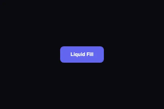


On hover, an indigo fill drops from the top edge and covers the button in 400 ms while the text turns white: outline at rest, solid on hover. One pseudo-element, one transition, no JavaScript.
Updated
This effect is part of Effect.Labs — 840 vanilla effects, some free, some premium. Buttons has 27 effects, including 2 free. Explore the category →
3 usage examples

How it works
.btn-liquid is an outline button: transparent background, text and border: 2px solid in #6366f1, and z-index: 1 which, together with the position: relative from .demo-btn, opens a stacking context. The fill is its ::before: an absolutely positioned box stuck to the top (top: 0; left: 0; width: 100%), zero height, #6366f1 background, and z-index: -1 — inside that context, “−1” places it above the button's background but below its text.
On :hover, height goes from 0 to 100% under transition: height .4s (ease curve). The box is anchored by top: 0, so it grows downward: measured in Chromium, 18 px of 50 at 86 ms, 36 px at 171 ms, full at 400 ms. It is not a rising liquid, despite the name — to make it rise, replace top: 0 with bottom: 0. The overflow: hidden and border-radius: 12px on .demo-btn clip the fill at the corners (inner radius 10 px): the 2 px border frames it cleanly.
The text turns white through .btn-liquid:hover { color: #fff } — but no transition is declared on the button itself: the color flips the instant hover starts, while the fill only reaches the top of the letters at ≈ 80 ms and fully covers them at ≈ 160 ms. During that window the white label sits on your page background: invisible on a light page, harmless on a dark one. On exit, the reverse: the text snaps back to indigo over a still-indigo fill and vanishes for ≈ 80 to 160 ms while the fill retreats. transition: color .15s .15s on .btn-liquid removes both artifacts.
On exit, height returns to 0 in 400 ms: the fill retreats toward the top edge, from the bottom. The motion animates height, a layout property recalculated every frame; the composited version (transform: scaleY() with transform-origin: top) renders the same without touching the main thread (see Customize). No :active rule: clicking adds nothing.
Accessibility
- Insufficient contrast in both states: at rest,
#6366f1on#0a0a0f= 4.42:1; on hover, white on#6366f1= 4.47:1 — both just under the 4.5:1 AA threshold. On that background no single color can pass both (the product of the two ratios caps at 19.75, it would need 20.25): split them. Text and border#818cf8at rest (6.6:1), fill#4f46e5(white at 6.3:1). On a white page,#4f46e5throughout is enough (6.3:1 in both states). - prefers-reduced-motion not handled:
@media (prefers-reduced-motion: reduce) { .btn-liquid::before { transition: none } }— the button turns solid at once on hover; the state remains, only the motion goes. - Unsynchronized color flip: the white label precedes the fill by about 80 ms (see How it works). On a light background that's a text flicker on every hover. Add
transition: color .15s .15sto.btn-liquidso the color waits for the fill, both ways. - Keyboard: no
:hoveron focus. Duplicate both rules with:focus-visible—.btn-liquid:focus-visible { color: #fff }and.btn-liquid:focus-visible::before { height: 100% }— so Tab fills the button like hover does. The code doesn't touchoutline: the native focus ring stays, drawn outside the box and therefore not clipped byoverflow: hidden. - Screen readers:
content: "", nothing is announced; native<button>, accessible name = label. Touch: the fill appears on tap and stays (iOS) —@media (hover: hover)to avoid it. Target 54 px tall (16 + 18 + 16 + 2 × 2), above the 44 px minimum.
Browser compatibility
Requires the CSS transition of height, pseudo-elements and a negative z-index inside a stacking context — every browser since 2012. No JavaScript, zero dependencies.
Without transitions, the button switches from outline to solid instantly on hover, and back; the information is identical, only the motion is missing.
The code
HTML structure to paste into your page (the CSS + JS come with Premium):
<button class="demo-btn btn-liquid">Liquid Fill</button>The full HTML + CSS + JS of Liquid Fill, ready to paste — plus all 840 effects. Or $299 once, lifetime access.
Customize
Options passed to the API or data-* attributes:
| Option / property | Default | Effect |
|---|---|---|
| top: 0 (CSS — ::before) | top: 0 (drops down) | Fill anchor. bottom: 0: it rises. top: 50%; transform: translateY(-50%): it opens from the center toward both edges. |
| transition: height .4s (CSS — ::before) | .4s ease | Duration and curve. .25s: responsive; cubic-bezier(.2, .8, .2, 1): quick start, soft landing, more “fluid”. |
| #6366f1 (CSS — color, border, ::before background) | #6366f1 × 3 | Three occurrences. For AA contrast, split them: #818cf8 for text and border, #4f46e5 for the fill (see Accessibility). |
| transition: color (CSS — to add on .btn-liquid) | absent (instant flip) | transition: color .15s .15s: the text changes color while the fill covers it, not before. Essential on light backgrounds. |
| border: 2px solid (CSS — .btn-liquid) | 2px | 1px: thin outline; 0: the fill reaches the edge with the full 12 px radius — the button has no shape at rest, so give it a light background. |
| transform: scaleY() (CSS — composited alternative) | height 0 → 100% | GPU version: ::before { height: 100%; transform: scaleY(0); transform-origin: top; transition: transform .4s } and :hover::before { transform: scaleY(1) }. Same render, no layout recalculation. |
| z-index: 1 (CSS — .btn-liquid) and -1 (::before) | 1 / -1 | Keep them as they are: z-index: 1 creates the stacking context that holds the ::before under the text but above the page's backgrounds. Without it, the fill slips behind parent containers and can disappear. |
FAQ
bottom: 0 instead of top: 0 on .btn-liquid::before. The height then grows from the bottom edge. Nothing else to touch: the transition, the clipping and the border work identically.transition: color .15s .15s to .btn-liquid: the color starts changing when the fill reaches the text, in both directions.::before background is yours. background: linear-gradient(180deg, #6366f1, #8b5cf6) gives a gradient fill, and an image with background-size: cover works too. Since the box grows from 0 to 100% height, a gradient stretches with it during the 400 ms; to reveal it without stretching, pin its size to the button's — background-size: 100% 50px; background-position: top.


