Morph
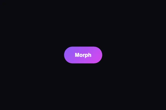
On hover, the purple button grows 10% and goes from 12 px corners to a pill (50 px) in 500 ms on a bouncy curve; its solid color snaps to a purple → fuchsia gradient — pure CSS, no press state.
Updated
This effect is part of Effect.Labs — 840 vanilla effects, some free, some premium. Buttons has 27 effects, including 2 free. Explore the category →
3 usage examples


How it works
Only two states: rest (background: #8b5cf6, border-radius: 12px, scale(1)) and :hover (border-radius: 50px, transform: scale(1.1), background: linear-gradient(135deg, #8b5cf6, #d946ef)). No @keyframes, no :active rule: all the motion is the transition between these two states.
The transition: .5s cubic-bezier(.68, -.55, .265, 1.55) on all properties. The control points outside [0, 1] push the curve beyond the start → end range. Measured in Chromium on scale: pull-back to 0.9925 around 60–100 ms (the button contracts before growing), overshoot to 1.107 around 400 ms, then settling at 1.1 at 500 ms. border-radius rides the same curve: 12 → 50 px with a peak at ≈ 52.7 px.
On a 50 px tall button, border-radius: 50px is a full pill (the radius exceeds half the height, the browser caps it). The change of shape and size is simultaneous: that combination, more than scale alone, is what makes the material seem to deform. The button goes from 113 × 50 px to 124 × 55 px on screen without touching layout (transform doesn't affect neighbors) — it overlaps them by 5 px on each side.
The color, however, doesn't glide: background-image is not an animatable property, and the hover's background shorthand resets background-color to transparent. Measured at +30 ms: the gradient is already in place. So the color switches instantly on hover in and out, while shape and size bounce over 500 ms — see the FAQ for a fade.
Accessibility
- Insufficient contrast as shipped: white text on
#8b5cf6= 4.23:1, just under the 4.5:1 AA threshold for 16 px text; on hover, the fuchsia end of the gradient (#d946ef) drops to 3.46:1. Switch to#7c3aedat rest (5.7:1) andlinear-gradient(135deg, #7c3aed, #c026d3)on hover (5.7:1 → 4.7:1), or raise the label to 18 px bold (3:1 threshold, which the original meets). - prefers-reduced-motion not handled: add
@media (prefers-reduced-motion: reduce) { .btn-morph { transition: none } }. Shape, size and color still change on hover, but with no bounce or glide. - Keyboard: no
:hoverfor Tab navigation. Declare.btn-morph:focus-visible { border-radius: 50px; transform: scale(1.1); background: linear-gradient(135deg, #8b5cf6, #d946ef) }to give focus the same relief, and keep the nativeoutline— the code doesn't remove it. - Screen readers: the effect is purely visual, the button remains a native
<button>with its label as accessible name. Nothing to add. - Touch: on iOS the
:hoverstate sticks after a tap — the button stays an enlarged pill until the next touch; wrap the rule in@media (hover: hover). Target ≈ 50 px tall (55 px on hover), above the 44 px minimum.
Browser compatibility
Requires CSS transitions on transform and border-radius with cubic-bezier() — every browser since 2012, overshoot values included. No JavaScript, zero dependencies.
Without transitions, both states apply instantly: the button jumps from its squared shape to the enlarged pill, and the gradient appears the same way. No browser animates a solid color into a gradient: that color jump is normal behavior, not a fallback.
The code
HTML structure to paste into your page (the CSS + JS come with Premium):
<button class="demo-btn btn-morph">Morph</button>The full HTML + CSS + JS of Morph, ready to paste — plus all 840 effects. Or $299 once, lifetime access.
Customize
Options passed to the API or data-* attributes:
| Option / property | Default | Effect |
|---|---|---|
| cubic-bezier(.68, -.55, .265, 1.55) (CSS — transition) | ≈ 0.75% pull-back then 0.7% overshoot on scale | Bring the 2nd and 4th parameters toward 0 and 1 to calm the bounce (.68, -.2, .265, 1.2); push them further to exaggerate it. Too far, border-radius dips below 0 for an instant: square corners. |
| transition-duration (CSS — .btn-morph) | .5s | Total length, bounce included. .3s = responsive (Gummy Elastic's value); .8s = gelatinous, for a large button only. |
| scale(1.1) (CSS — :hover) | 1.1 | Hover growth. No layout effect: the button overlaps its neighbors by 5% of its width on each side. 1.04 in a tight toolbar. |
| border-radius (CSS — 12px rest / 50px hover) | 12 / 50 px | Start and end shapes. 50px = pill for any button under 100 px tall; 24px = merely stronger rounding; 0 at rest = a square turning into a pebble. |
| background (CSS — :hover) | linear-gradient(135deg, #8b5cf6, #d946ef) | Hovered button color. Switches with no fade (not animatable). A solid color instead (#a855f7) becomes animatable again and glides with the rest. |
| background (CSS — .btn-morph) | #8b5cf6 | Resting color. For AA contrast with white text: #7c3aed or darker. |
| transition-property (CSS — implicit) | all | Restrict to transform, border-radius so the bouncy curve doesn't apply to a shadow or color added later. |
FAQ
linear-gradient, and background-image is not interpolable — no browser fades a color into a gradient. For a fade, keep background: #8b5cf6 on the button, draw the gradient in a pseudo-element (::before { inset: 0; background: linear-gradient(…); opacity: 0; transition: opacity .5s; border-radius: inherit }) and set its opacity to 1 on hover — opacity animates, and border-radius: inherit makes it follow the morph.:active rule. Add one after :hover: .btn-morph:active { transform: scale(.96); border-radius: 30px }. Declared later, it wins while the pointer is down, and release returns to the pill through the same 500 ms curve — exactly Gummy Elastic's construction, only slower.transform doesn't change layout: the hovered button overflows 5% per side onto its surroundings, and a neighbor painted after it covers it. Give the button position: relative; z-index: 1 (or isolation: isolate on its parent) so it paints on top, and leave a gap of at least 10% of its width if you want no overlap at all.


