Neon Glow
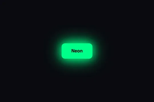
Neon-green (#00ff88) outline and text with a 10 px glow at rest; on hover the button fills with that green, the text turns black and two 30 px and 60 px shadows surround it — 300 ms, pure CSS, no pulsing.
Updated
This effect is part of Effect.Labs — 840 vanilla effects, some free, some premium. Buttons has 27 effects, including 2 free. Explore the category →
3 usage examples

How it works


At rest, .btn-neon is a hollow button: background: transparent, border: 2px solid #0f8, color: #0f8 (i.e. #00ff88) and a text-shadow: 0 0 10px #0f8 that makes the letters glow. The border replaces the border-style: none set by .demo-btn. No box-shadow at rest: the tube is off, only the text glows.
On :hover, four properties change together: background becomes #0f8, color becomes #0a0a0f, text-shadow goes to none and box-shadow adds two halos 0 0 30px #0f8, 0 0 60px #0f8. The second one extends 60 px around the button: leave room for it, and know that a parent with overflow: hidden will cut it off.
transition: .3s (all properties, ease curve) interpolates the four changes. One measurable detail: the text goes from green to black while the background goes from black to green, at the same speed — halfway (≈ 120 ms with ease), text and background share the exact same color #05844b and the label vanishes for a few frames before reappearing in black. See the FAQ to avoid it.
There is neither :active nor @keyframes on .btn-neon: measured in Chromium, no animation runs at rest, the button is still until hovered. Contrary to what “Neon Glow” may suggest, the glow does not pulse — that is the catalog's Neon Pulse variant, which animates the halo continuously.
Accessibility
- Contrast:
#0f8on#0a0a0f= 14.7:1 at rest, and#0a0a0fon#0f8= 14.7:1 on hover — AAA in both states. The weak point is the transition: halfway through, text and background merge (1:1) for about sixty milliseconds. Give the text a shorter transition than the background (transition: background .3s, color .12s, box-shadow .3s, text-shadow .3s) so it switches before the background catches up. - Dark background required: on a light page,
#0f8on white contrasts at only 1.3:1 — the resting text is unreadable. The effect is designed for a background close to#0a0a0f; the hover text color (#0a0a0f) is in fact the catalog's page background. - prefers-reduced-motion: the only movement is a 300 ms transition of colors and shadows, with no displacement — acceptable for most motion-sensitive users;
transition: noneunder the media query costs nothing. - Focus: the 2 px border belongs to the effect,
outlineis untouched — the native focus ring stays visible, but it is close in hue to the tube on Chrome (blue) and reads poorly on the solid green hover state. Declare.btn-neon:focus-visible { outline: 2px solid #fff; outline-offset: 3px }. - Touch: no
:hoverunder a finger; on iOS the hovered state (solid button) sticks after a tap until the next touch — wrap the hover rule in@media (hover: hover). Target ≈ 54 px tall, above the 44 px minimum.
Browser compatibility
Requires CSS transitions on background-color, color, box-shadow and text-shadow, plus multiple shadows — every browser since 2012. No JavaScript, zero dependencies.
Without transitions, the button snaps from outline to solid: the effect stays readable, only the 300 ms fade is gone. Without box-shadow, the text still glows at rest thanks to the text-shadow.
The code
HTML structure to paste into your page (the CSS + JS come with Premium):
<button class="demo-btn btn-neon">Neon</button>The full HTML + CSS + JS of Neon Glow, ready to paste — plus all 840 effects. Or $299 once, lifetime access.
Customize
Options passed to the API or data-* attributes:
| Option / property | Default | Effect |
|---|---|---|
| Neon color #0f8 (CSS — 6 occurrences: color, border, text-shadow, hover background, hover box-shadow ×2) | #0f8 (#00ff88) | Hue of the tube. Change it in all six places, or collapse them into one with currentColor (see FAQ). Keep a saturated, light color: the halo is the color itself, blurred. |
| text-shadow (CSS — .btn-neon) | 0 0 10px #0f8 | Glow of the letters at rest. 0 0 4px = crisp tube; 0 0 18px = hazy letters, less readable. |
| box-shadow (CSS — :hover) | 0 0 30px, 0 0 60px | Halo of the lit button. The second radius sets the footprint: 60 px around the button. Reduce to 16px / 32px inside a card, raise to 40px / 80px in a hero. |
| color (CSS — :hover) | #0a0a0f | Text color on the solid button. It's the catalog's background; match it to your own page background so the text looks “cut out” of the tube. |
| transition (CSS — .btn-neon) | .3s (all properties) | Switch-on duration. .15s = light switch; .5s = tube warming up. Split the properties to avoid the text vanishing halfway. |
| border (CSS — .btn-neon) | 2px solid #0f8 | Tube thickness. 1px = thin filament; 3px = thick sign. The border counts toward the button height (54 px with 2 px). |
| Page background (context — outside the effect's CSS) | #0a0a0f | The effect assumes a dark background: on light, the resting green text drops to 1.3:1 and the halo becomes a pale fringe. For a light theme, switch to a dark shade (#047857) and drop the text-shadow. |
FAQ
#0f8 to #0a0a0f, the background from #0a0a0f to #0f8. Halfway they are both #05844b and the text is invisible for a few frames. Fix: transition: background .3s, color .1s, box-shadow .3s, text-shadow .3s — the text turns black before the background has left the dark — or keep a text-shadow on hover to preserve a readable outline.color carry the color and reuse currentColor: .btn-neon { color: #0f8; border-color: currentColor; text-shadow: 0 0 10px currentColor }. For hover, where color turns dark, go through a variable: .btn-neon { --neon: #0f8 } then background: var(--neon); box-shadow: 0 0 30px var(--neon), 0 0 60px var(--neon). A single declaration recolors the whole tube.overflow: hidden (card, column, carousel container) and clips the 60 px box-shadow, which by definition extends beyond the button. Three options: reserve 60 px of inner padding in the container, reduce the radii to 16px / 32px, or set the container to overflow: visible. The button's own overflow: hidden is not the cause: an element never clips its own shadow.


