Neumorphic
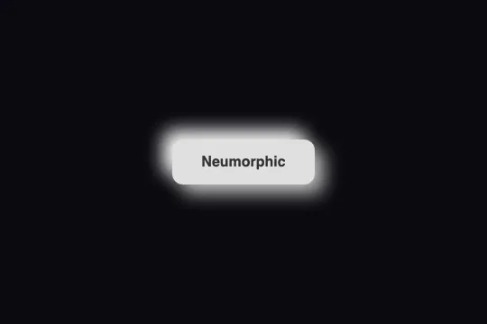
A light-grey button extruded from its surface by two opposite shadows (dark bottom-right, white top-left); pressing inverts them into a hollow.
Updated
This effect is part of Effect.Labs — 840 vanilla effects, some free, some premium. Buttons has 27 effects, including 2 free. Explore the category →
3 usage examples
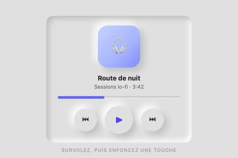
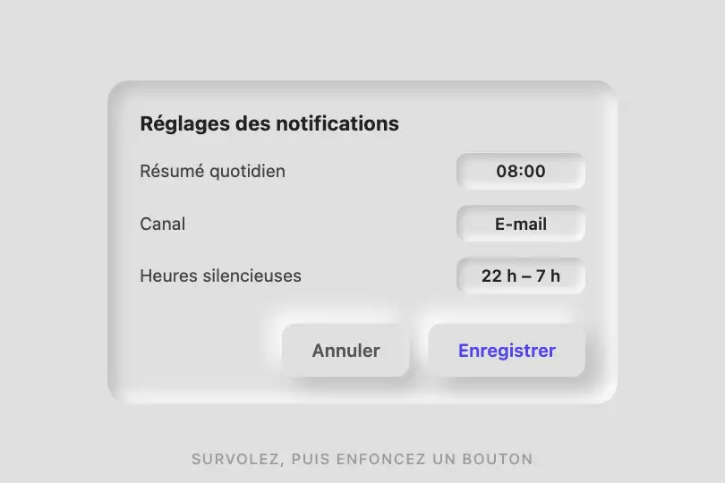
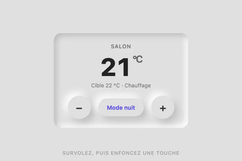
How it works
Two box-shadows at rest: 8px 8px 16px #bebebe (dark, bottom-right) and -8px -8px 16px #fff (white, top-left). They simulate a top-left light source hitting a raised shape. The button's background: #e0e0e0 must be exactly the color of the surface around it: the illusion only holds because button and background are identical, the edge being drawn by the shadows alone.
On :hover, offsets go to 10 px and blur to 20 px: the shape seems to lift a little further. transition: .2s (all properties) smooths the shadow change.
On :active, both shadows switch to inset with the same values: the dark shadow now falls inside at the top-left, the white one inside at the bottom-right — the shape appears pressed into the surface. Same colors, only the inset keyword changes.
#333 text on #e0e0e0, border: none, border-radius: 12px corners inherited from .demo-btn that give the extrusion its shape. No JavaScript.
Accessibility
- Finding the button: its boundary is drawn by shadows only, and
#bebebeon the#e0e0e0surface contrasts at just 1.4:1 — under the 3:1 threshold WCAG 1.4.11 requires for a UI component's boundary. A low-vision user may not see the button at all. Add a 1 px border (#c8c8c8), a colored label or stronger shadows. - Text contrast:
#333on#e0e0e0= 9.6:1, AAA level. Keep a dark label — the light grey common in neumorphic mockups quickly falls under the AA threshold. - prefers-reduced-motion: the only movement is a 200 ms shadow transition, negligible;
transition: noneunder the media query costs nothing. - Focus: the code sets
border: nonewithout touchingoutline, so the native ring stays visible on light grey. If you customize it, useoutline: 2px solid #333; outline-offset: 3px— never a shadow-based focus, which would get lost among the relief shadows. - States: the “pressed” feedback exists only while the pointer is down (
:active), not as a persistent selected state. For a toggle (play/pause, night mode), addaria-pressedand an[aria-pressed="true"]rule reusing theinsetshadows. Touch target ≈ 52 px; on iOS the:hoverlift sticks after a tap.
Browser compatibility
Requires multiple box-shadows with inset and a transition — every browser since 2011. No JavaScript, zero dependencies.
Without transitions, states switch instantly. The only real dependency is the background: on a surface of any color other than #e0e0e0, the relief vanishes and the white shadow reads as a halo.
The code
HTML structure to paste into your page (the CSS + JS come with Premium):
<button class="demo-btn btn-neumorphic">Neumorphic</button>The full HTML + CSS + JS of Neumorphic, ready to paste — plus all 840 effects. Or $299 once, lifetime access.
Customize
Options passed to the API or data-* attributes:
| Option / property | Default | Effect |
|---|---|---|
| background (CSS — .btn-neumorphic) = surface color | #e0e0e0 | Change together with the parent's background: both must be identical. Recompute the shadows: dark ≈ background darkened 15%, light = white (or background lightened 10% on a very light surface). |
| Dark shadow #bebebe (CSS — box-shadow, 3 occurrences) | #bebebe | Bottom-right drop shadow. #b0b0b0 sharpens the relief; reaching 3:1 against the surface would take ≈ #808080, which is no longer neumorphism — for accessibility, add a 1 px border instead. |
| Offset / blur 8px 8px 16px (CSS — rest) | 8px / 16px | Perceived height of the relief. 4px / 8px = flat key; 12px / 24px = thick block. Keep blur = 2 × offset. |
| Hover 10px 10px 20px (CSS — :hover) | +2 px offset, +4 px blur | Amount of lift on hover. Match the rest values to remove the hover effect and keep only the press. |
| inset (CSS — :active) | inset 8px 8px 16px / inset -8px -8px 16px | Depth of the hollow on press. 4px / 8px for a thin key; add transform: translateY(1px) to emphasize the push-in. |
| transition (CSS — .btn-neumorphic) | .2s | Switch speed relief → hollow. .1s = crisp click; .35s = slow foam. |
| border-radius (CSS — .demo-btn) | 12px | 50% gives a player's round keys; 6px, a keyboard key. |
FAQ
#e0e0e0. The neumorphic relief only exists if the button has exactly the color of its surface: on a white background the white shadow disappears and a grey blob is left; on a dark background it becomes a halo. Change the background of button and parent together, then recompute both shadows.#2b2b30, dark shadow #1d1d21 (bottom-right), light shadow #39393f (top-left) — never pure white, which would read as a glow. Text in #e5e5e5 (contrast ≈ 11:1).:active rule under a state selector such as .btn-neumorphic[aria-pressed="true"], and flip the attribute on click (btn.setAttribute('aria-pressed', …)). The hollow becomes the “pressed” state, readable by screen readers too.


