Particle Trail
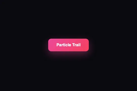
Every cursor move over the button drops a colored dot (4–12 px) that rises and fades out in 800 ms — a trail kept inside the button.
Updated
This effect is part of Effect.Labs — 840 vanilla effects, some free, some premium. Buttons has 27 effects, including 2 free. Explore the category →
3 usage examples

How it works
Every [data-particle-trail] element gets a mousemove listener with a rate limiter: Date.now() is compared with the last emission, and any event arriving less than 30 ms after the previous one is dropped (if (o − t < 30) return). Output is therefore capped at about 33 particles per second, whatever the mouse polling rate.
For each accepted event the script creates a <span class="particle">: diameter d = 4 + 8 × Math.random() (4 to 12 px), a color picked from a five-entry array (#ec4899, #f43f5e, #fb7185, #fda4af, #ffffff), left/top set to the cursor coordinates relative to the button (getBoundingClientRect), and a box-shadow: 0 0 d px in the same color for the glow. The span is appended inside the button.
On the CSS side, .particle is position: absolute (the button is position: relative), round (border-radius: 50%), pointer-events: none so it never intercepts the click, and animated by particleFade (.8s ease-out forwards): opacity 1 → 0 and scale(1) → scale(0) translateY(-20px) — the dot shrinks while rising 20 px. The overflow: hidden on .demo-btn clips the trail to the button's rounded corners.
Cleanup: one setTimeout(() => r.remove(), 800) per particle, matched to the animation length — the DOM never holds more than about thirty spans per button (33/s × 0.8 s). The hover lift is independent of the JS: .btn-particle-trail:hover applies translateY(-2px) and a pink shadow 0 10px 30px rgba(236,72,153,.4) through transition: .3s.
Accessibility
- prefers-reduced-motion not handled: particles and lift animate regardless of the system preference. Add
@media (prefers-reduced-motion: reduce) { .particle { display: none } .btn-particle-trail { transition: none } }— the JS keeps creating spans but they no longer render — or gate the listener onmatchMedia('(prefers-reduced-motion: reduce)').matches. - The effect is mouse-only: no particles on touch or keyboard. The button remains a native
<button>, focusable and activatable with Enter/Space; the trail must never carry information. - Insufficient contrast as shipped: white text on the pink → rose gradient measures 3.5:1 on
#ec4899and 3.7:1 on#f43f5e, below the 4.5:1 AA threshold for 16 px text. Switch to#db2777 → #e11d48(4.6:1 and 4.7:1) or use an 18 px bold label (3:1 threshold). - Screen readers: particles are empty
<span>s inserted into the<button>— with no text they don't change the accessible name. To be safe, addr.setAttribute('aria-hidden', 'true')at creation so the repeated insertions stay invisible to all assistive technology. - The code sets
border: nonewithout touchingoutline: the native focus ring stays. Touch target ≈ 52 px tall (16 px padding + 16 px text), above the 44 px minimum.
Browser compatibility
Requires ES2015 (arrow functions, template literals), getBoundingClientRect, Date.now and a CSS animation on opacity/transform — every browser since 2016. Zero dependencies.
Without JavaScript the button keeps its gradient and its CSS hover lift; only the particles are gone. Without CSS animations (very old browsers), dots appear sharp and are then removed at once after 800 ms.
The code
HTML structure to paste into your page (the CSS + JS come with Premium):
<button class="demo-btn btn-particle-trail" data-particle-trail>Particle Trail</button>The full HTML + CSS + JS of Particle Trail, ready to paste — plus all 840 effects. Or $299 once, lifetime access.
Customize
Options passed to the API or data-* attributes:
| Option / property | Default | Effect |
|---|---|---|
30 ms threshold (JS — if (o - t < 30) return) |
30 | Maximum particle rate (1000 / 30 ≈ 33 per second). 15 ms doubles the density; 60 ms gives spaced-out, more readable dots. |
Diameter 8 * Math.random() + 4 (JS) |
4 to 12 px | Dot size range. The glow (box-shadow) follows the diameter: bigger dots, bigger halo. |
Color array (JS — f = [...]) |
#ec4899, #f43f5e, #fb7185, #fda4af, #ffffff | Palette drawn at random for each dot. A single entry = solid trail; keep white in for sparks. |
Lifetime (JS — setTimeout 800 + CSS — particleFade .8s) |
800 ms / .8s | Both values must stay equal: the setTimeout removes the span, the animation makes it vanish. If the animation is longer, the dot is cut off abruptly. |
Trajectory (CSS — @keyframes particleFade, 100%) |
scale(0) translateY(-20px) | End position of each dot. translateY(20px) makes dots fall; scale(1.6) with no translation gives popping bubbles. |
| overflow (CSS — .demo-btn) | hidden | Set to visible to let the trail escape the button — then leave margin around it, since dots are no longer clipped. |
| Hover (CSS — .btn-particle-trail:hover) | translateY(-2px) + shadow 0 10px 30px rgba(236,72,153,.4) | Lift independent of the JS. Delete the rule for a button that doesn't move: only the trail remains. |
FAQ
opacity and transform — two GPU-composited properties. The real cost is the DOM creation on each accepted event; raise the threshold to 50–60 ms if you have dozens of buttons on one page. On mobile nothing is created, as there is no mousemove.<span> is phrasing content allowed inside a <button>. What isn't allowed there are interactive elements (links, buttons). If your button is actually an <a>, the code works identically — the only requirement is position: relative on the element so the dots' left/top have a reference.left/top place the span's top-left corner under the cursor, not its center: the dot spills by its radius down and to the right (2 to 6 px). To center it, add translate(-50%, -50%) to the transform of both particleFade steps, or subtract d / 2 from the coordinates in the JS.


