Press Feedback
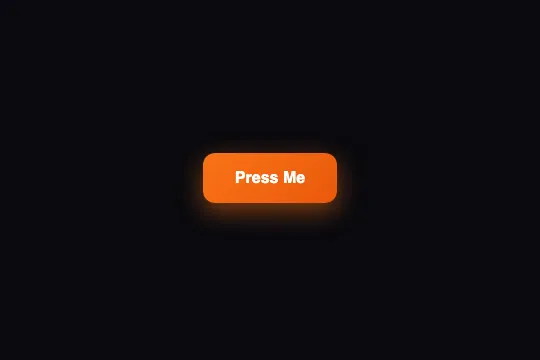
Orange button with a tinted shadow: it lifts 2 px on hover, then on press drops 2 px, squashes to 95% and its content to 98% while the shadow tightens — 150 ms, pure CSS.
Updated
This effect is part of Effect.Labs — 840 vanilla effects, some free, some premium. Buttons has 27 effects, including 2 free. Explore the category →
3 usage examples
How it works



Three states on .btn-press-feedback, a linear-gradient(135deg, #f97316, #ea580c) with a tinted shadow 0 4px 15px rgba(249,115,22,.4) — that orange shadow, rather than a grey one, is what makes the button seem to radiate onto its surface. transition: .15s (all properties, ease curve) links the states.
On :hover: transform: translateY(-2px) and a farther, wider shadow, 0 8px 25px rgba(249,115,22,.5). The button seems to move away from the surface. On :active: translateY(2px) scale(.95) and a flat shadow 0 2px 8px rgba(249,115,22,.3) — it drops below its resting position, shrinks and the shadow hugs it. Measured in Chromium: 134 × 50 px at rest, 128 × 47.5 px during the press, shifted 2 px down.
The label is wrapped in <span class="btn-content">, set to display: flex; align-items: center; gap: 8px — ready to take an icon next to the text — with its own transition: transform .15s. On press, .btn-press-feedback:active .btn-content { transform: scale(.98) }: the content squashes on top of the button, i.e. 0.95 × 0.98 ≈ 0.93 for the text. This double squash makes the label look pushed into the button, not merely shrunk with it.
Everything goes through transform and box-shadow: no layout property changes, neighbors don't move (unlike 3D Press, which relies on a border). The span.btn-content is needed for the inner squash and the icon spacing; without it, the button works but loses those two details.
Accessibility
- Insufficient contrast as shipped: white text on the
#f97316 → #ea580cgradient = 2.8:1 and 3.6:1, below the 4.5:1 AA threshold for 16 px text. Switch tolinear-gradient(135deg, #c2410c, #9a3412)(5.2:1 and 7.3:1), or keep#ea580calone with an 18 px bold label (3:1 threshold). Recolor the shadow along with it (rgba(194,65,12,.4)). - prefers-reduced-motion not handled: the movements are 2 to 4 px over 150 ms. Add
@media (prefers-reduced-motion: reduce) { .btn-press-feedback, .btn-press-feedback .btn-content { transition: none } }— the states switch without gliding. - Keyboard:
:activeapplies while Space is held, so the squash works on the keyboard. The hover lift has no equivalent: add.btn-press-feedback:focus-visible { transform: translateY(-2px); box-shadow: 0 8px 25px rgba(249,115,22,.5) }. The nativeoutlineis preserved, but blue on orange reads poorly —outline: 2px solid #fff; outline-offset: 3pxis crisper. - Touch: one of the few effects in the catalog designed for the finger —
:activefires on touch and the squash is visible under the thumb during the tap. Addtouch-action: manipulationto remove the double-tap delay on iOS. The:hoverstate sticks after the tap (@media (hover: hover)). Target ≈ 50 px tall, above the 44 px minimum. - Screen readers: the
span.btn-contentis a plain container, the accessible name remains the label. If you place an icon inside, set it toaria-hidden="true"so it isn't read.
Browser compatibility
Requires CSS transitions on transform and box-shadow, plus display: flex for the content — every browser since 2012. No JavaScript, zero dependencies.
Without transitions, the three states apply instantly: the button jumps 2 px and squashes at once, the shadow changes with no fade — the press feedback stays readable.
The code
HTML structure to paste into your page (the CSS + JS come with Premium):
<button class="demo-btn btn-press-feedback">
  <span class="btn-content">Press Me</span>
</button>The full HTML + CSS + JS of Press Feedback, ready to paste — plus all 840 effects. Or $299 once, lifetime access.
Customize
Options passed to the API or data-* attributes:
| Option / property | Default | Effect |
|---|---|---|
| transform (CSS — :active) | translateY(2px) scale(.95) | Push-in on press. scale(.97) for a large button (5% of 300 px = 15 px, too visible); translateY(3px) for a franker travel. |
| transform (CSS — :active .btn-content) | scale(.98) | Extra squash of the content (text + icon). 1 cancels it; .94 clearly sinks the text into the button. |
| transform / box-shadow (CSS — :hover) | translateY(-2px) / 0 8px 25px .5 | Hover lift. Remove the rule to keep only the press (the mobile behavior); translateY(-1px) in a tight toolbar. |
| Shadow color rgba(249,115,22,…) (CSS — 3 occurrences) | orange at .4 / .5 / .3 | The shadow is tinted with the button's color: that's what makes it “radiate”. A grey (rgba(0,0,0,.3)) gives a classic shadow; match the hue if you change the gradient. |
| transition (CSS — .btn-press-feedback and .btn-content) | .15s | Duration of all three transitions. .1s = crisper click; .25s = softer, but the feedback then lags behind the finger. |
| background (CSS — .btn-press-feedback) | linear-gradient(135deg, #f97316, #ea580c) | Button color. For AA contrast with white text: #c2410c → #9a3412. Recolor the shadow along with it. |
| gap (CSS — .btn-content) | 8px | Space between the label and an icon placed inside the span. Without an icon, the value has no effect. |
FAQ
:active .btn-content matches nothing without it) and the icon spacing (gap: 8px). A bare <button class="btn-press-feedback">Send</button> lifts and sinks normally. If you add an SVG icon, place it inside the span with aria-hidden="true"; align-items: center aligns it with the text.:active applies during the tap. Two additions: touch-action: manipulation on the button to remove the double-tap detection delay (iOS Safari), and, where the context warrants it, a very short vibration on click via navigator.vibrate(8) (Android only, iOS doesn't expose it). Avoid durations above 150 ms: the finger has already left.


