RGB Split
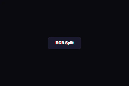



On hover, two ghosts of the label — red shifted 2 px left, cyan 2 px right — appear at once and swap sides once in 300 ms, then stay put — pure CSS, on a midnight-blue button.
Updated
This effect is part of Effect.Labs — 840 vanilla effects, some free, some premium. Buttons has 27 effects, including 2 free. Explore the category →
3 usage examples
How it works
At rest, .btn-rgb-split is a sober button: #1a1a2e (midnight blue) background, white text, border: 1px solid rgba(255,255,255,.2), no shadow. No transition is declared: everything that follows appears and disappears instantly.
On :hover, text-shadow: -2px 0 red, 2px 0 #0ff lays two copies of the text behind the glyphs: a red one (#ff0000) shifted 2 px left, a cyan one shifted 2 px right. White in the middle, red left, cyan right: it's the channel misregistration of a badly aligned image — the “chromatic aberration” of the name.
At the same time rgbShift starts, .3s ease, a single iteration: at 0% and 100% the ghosts are in place (-2px / 2px), at 50% they have swapped sides (2px / -2px). Measured in Chromium: at 80 ms the red has already crossed to the right (+1.4 px), at 150 ms it's at +1.9 px, at 220 ms it's coming back (−1.4 px). So the ghosts cross the text once, in 300 ms, then the static :hover declaration holds them at ±2 px as long as the mouse stays.
On hover out, both shadows vanish with no fade, since there is no transition. The animation only replays on a new hover. Nothing moves at rest, nothing on press (:active isn't defined): it's a strictly hover-driven, lightweight effect — two blur-free text shadows, no layout property.
Accessibility
- Text contrast: white on
#1a1a2e= 17.1:1, AAA. The ghosts are added behind the glyphs without covering them; at 2 px, the red (4.3:1 on the background) and cyan (13.6:1) visually thicken the letters more than they blur them — fine for a short label at weight 600, avoid below 14 px. - Finding the button (WCAG 1.4.11, 3:1 threshold for a component's boundary): the
#1a1a2eface on the catalog's#0a0a0fbackground contrasts at only 1.16:1, and thergba(255,255,255,.2)border (#484859once composited) at 2.2:1. A low-vision user can hardly tell where the button ends. Raise the border torgba(255,255,255,.35)(3.7:1) or lighten the face. - prefers-reduced-motion not handled: the only movement is the 300 ms swap, once per hover. Add
@media (prefers-reduced-motion: reduce) { .btn-rgb-split:hover { animation: none } }— the static ghosts remain, without the crossing. - Keyboard: no
:hoverfor Tab navigation. Duplicate the rule under.btn-rgb-split:focus-visible(shadows and animation); the nativeoutlineis preserved and reads well on midnight blue. - Touch: a mouse-only effect; on iOS the ghosts stay displayed after a tap until the next touch (
@media (hover: hover)). Target ≈ 52 px tall, above the 44 px minimum.
Browser compatibility
Requires multi-shadow text-shadow and unprefixed CSS animations — every browser since 2015. No JavaScript, zero dependencies.
Without CSS animations, both ghosts appear on hover at their final position (red left, cyan right) without the 300 ms swap: the aberration is there, motionless. Without text-shadow, the button remains an ordinary midnight-blue button.
The code
HTML structure to paste into your page (the CSS + JS come with Premium):
<button class="demo-btn btn-rgb-split">RGB Split</button>The full HTML + CSS + JS of RGB Split, ready to paste — plus all 840 effects. Or $299 once, lifetime access.
Customize
Options passed to the API or data-* attributes:
| Option / property | Default | Effect |
|---|---|---|
| text-shadow offset (CSS — :hover and @keyframes rgbShift, 4 occurrences) | −2px / 2px | Aberration amplitude. ±1px = barely visible shiver; ±4px = frankly tripled text, readable only on a short label. Change all four values together. |
| Ghost colors (CSS — red / #0ff) | red / #0ff | Red and cyan are complementary: overlaid on white they give white back, hence the “channels” effect. #f0f / #0f0 (magenta/green) is the other classic pair. |
| animation-duration (CSS — :hover) | .3s | Length of the side swap. .15s = snap; .6s = visible glide of the ghosts through the text. |
| animation-iteration-count (CSS — :hover) | 1 | Number of swaps per hover. infinite keeps the ghosts oscillating while the mouse stays — more “glitch”, more tiring. |
| border (CSS — .btn-rgb-split) | 1px solid rgba(255,255,255,.2) | Button outline, the only landmark on a dark background. .35 reaches 3:1 on #0a0a0f; .5 is crisp. |
| background (CSS — .btn-rgb-split) | #1a1a2e | Midnight-blue face. Any dark color works; the red and cyan ghosts lose their effect on a light background (cyan disappears on white). |
| transition (CSS — to add) | none | transition: text-shadow .2s fades the ghosts in and out instead of snapping; the swap animation keeps control during its 300 ms. |
FAQ
transition: on hover, text-shadow goes from none to its two shadows instantly and the animation takes over for the swap; on hover out, the shadows are removed the same way. Add transition: text-shadow .2s on .btn-rgb-split: appearance and disappearance fade, and since a running animation takes precedence over the transition, the 300 ms swap stays intact.infinite: .btn-rgb-split:hover { animation: rgbShift .3s ease infinite }. The ghosts then oscillate from −2 to +2 px three times a second. It's markedly more aggressive: keep it for a short label, slow it to .6s, and keep the prefers-reduced-motion rule that cuts the animation.text-shadow and the animation don't depend on the tag. On larger text, scale the offset with the font size — 0.06em instead of 2px gives 2 px at 32 px and 4 px at 64 px — and trigger it on hover of the parent block or permanently. On a long paragraph, aberration hurts reading: keep it for headings and labels.


