Slide Reveal
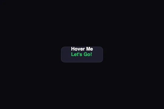
On hover, the label slides up by its own height in 400 ms and a second, green text written in the data-text attribute takes its place. One condition to check: the clip area must be the label's height — in the shipped code, both lines stay visible.
Updated
This effect is part of Effect.Labs — 840 vanilla effects, some free, some premium. Buttons has 27 effects, including 2 free. Explore the category →
3 usage examples


How it works
The HTML carries both labels in a single element: <span class="btn-text" data-text="Let's Go!">Hover Me</span>. The first is the span's text; the second is generated by CSS: .btn-text::after { content: attr(data-text); position: absolute; left: 0; top: 100%; color: #22c55e } — it sits right below the first, one line-height down (18 px measured for 16 px text at line-height: normal), left-aligned. The span is display: inline-block; position: relative to serve as the reference.
On :hover, .btn-text gets transform: translateY(-100%) under transition: transform .4s cubic-bezier(.65, 0, .35, 1) — a symmetric ease-in-out curve (half the distance at half the time). The span rises by its height and carries its ::after along: the green text lands exactly where the white one was. Only transform is animated — composited layer, no layout recalculation. On exit, same trip in reverse.
The swap assumes that whatever leaves the frame is hidden. The code relies on overflow: hidden, declared twice — on .demo-btn and on .btn-slide-reveal. But a button's clip area is its padding box: 16 px above and below the text. The labels only move 18 px. Measured in Chromium on the shipped button (52 px tall): at rest, the green text sits 18 px below the white one, 16 of which are inside the padding — visible; on hover, the white one has moved up into the top padding — visible too. The shipped button reads as two lines, “Hover Me” above “Let's Go!”, at rest and on hover alike: the pair slides 18 px, nothing is revealed.
The clip must be the label's height. Two fixes. CSS only, on the button: padding-top: 0; padding-bottom: 0; line-height: 50px — the span inherits a 50 px line, top: 100% and translateY(-100%) become 50 px, the text stays centered and the button keeps its 52 px including the border. Structurally: a wrapping span display: inline-block; overflow: hidden; vertical-align: top around .btn-text, whose clip follows the text whatever the padding. The scenes on this page use the first; make sure one of the two ships with the code you paste.
Accessibility
- Contrast: white on
#1e1e2e= 16.4:1 and green#22c55eon#1e1e2e= 7.2:1 — AAA for both labels. The fill is opaque: the page color doesn't come into play. Shipped compliant. - The second label is read by screen readers: text generated through
content: attr(data-text)is part of the accessible name in Chrome, Firefox and Safari — the button announces as “Hover Me Let's Go!”, both in a row. Give the button an explicitaria-label(the main label), or make the second text a restatement of the first rather than new information: what only appears on hover doesn't exist for keyboard or touch. - prefers-reduced-motion not handled:
@media (prefers-reduced-motion: reduce) { .btn-slide-reveal .btn-text { transition: none } }— the swap becomes instant, without the slide. - Keyboard: no
:hoveron focus..btn-slide-reveal:focus-visible .btn-text { transform: translateY(-100%) }reproduces the swap when focus arrives. The code doesn't removeoutline: the native ring stays, outside the clipped area. - Touch: no hover; on iOS the second label stays shown after a tap (
@media (hover: hover)). A label that changes on hover must leave the button identifiable by a stable name (WCAG 3.2.4): thearia-labelguarantees it. Target 52 px tall, above the 44 px minimum.
Browser compatibility
Requires the CSS transition of transform, content: attr() on a pseudo-element and overflow: hidden — every browser since 2012. No JavaScript, zero dependencies.
Without transitions, the two labels swap instantly on hover; the information is the same, the slide is missing.
The code
HTML structure to paste into your page (the CSS + JS come with Premium):
<button class="demo-btn btn-slide-reveal">
  <span class="btn-text" data-text="Let's Go!">Hover Me</span>
</button>The full HTML + CSS + JS of Slide Reveal, ready to paste — plus all 840 effects. Or $299 once, lifetime access.
Customize
Options passed to the API or data-* attributes:
| Option / property | Default | Effect |
|---|---|---|
| data-text (HTML — span attribute) | Let's Go! | The second label. Keep it close in length to the first: the ::after is absolute inside the span, its available width is the first text's — a longer text wraps (measured: three lines for “From $9 per month” under “Pricing”). white-space: nowrap prevents that, but it will then spill to the right. |
| color: #22c55e (CSS — ::after) | #22c55e | Color of the second label. inherit for the same white; an accent color to mark the state change. |
| transition: transform .4s cubic-bezier(.65, 0, .35, 1) (CSS — .btn-text) | .4s, ease-in-out | .25s: crisp; cubic-bezier(.34, 1.56, .64, 1): the second text overshoots and comes back — the first then briefly reappears from the top. |
| top: 100% (CSS — ::after) | 100% (below) | top: -100% with translateY(100%) on hover: the second text comes in from the top and the first drops down. |
| left: 0 (CSS — ::after) | left-aligned | left: 0; right: 0; text-align: center centers a shorter second label under the first; without it, it hugs the left. |
| Clip area (CSS — .btn-slide-reveal, fix) | padding 16px 32px (two lines visible) | padding: 0 32px; line-height: 50px: the clip takes the text's height and the swap works (see How it works). Or a wrapping span with overflow: hidden. |
| background: #1e1e2e + border rgba(255,255,255,.1) (CSS — .btn-slide-reveal) | dark blue-gray | Any opaque fill. On a light fill, revisit both text colors: the green #22c55e drops to 2.3:1 on white — #15803d gives 5.0:1. |
FAQ
padding: 0 32px; line-height: 50px on .btn-slide-reveal (the clip then has the line's height), or wrap the span in a container with display: inline-block; overflow: hidden; vertical-align: top.::after is absolutely positioned inside .btn-text: its available width is the first label's. If longer, it wraps its words. Set white-space: nowrap on the ::after and pick labels of similar length; if the second is shorter, center it with left: 0; right: 0; text-align: center.content: attr(data-text) is folded into the button's accessible name by current browsers — “Hover Me Let's Go!”. Two remedies: aria-label="Hover Me" on the button, which pins the name whatever the state; or a second label that restates the first instead of adding information, so the double reading stays coherent.


