Split Text
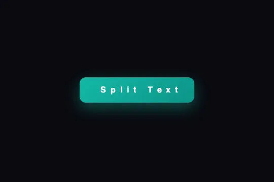
The JS splits the label into one span per letter; on hover, each letter jumps 8 px — odd ones up, even ones down — with a 30 ms stagger between neighbors and a 500 ms bouncy curve.
Updated
This effect is part of Effect.Labs — 840 vanilla effects, some free, some premium. Buttons has 27 effects, including 2 free. Explore the category →
3 usage examples



How it works
The script walks every [data-split-text], reads its textContent, empties the element and re-creates one <span class="split-char"> per character. Spaces become non-breaking spaces (\u00A0) so they don't collapse inside an inline-block, and each span gets style="animation-delay: n × 0.03s" by rank: 0 s for the first letter, 0.27 s for the tenth. “Split Text” yields 10 spans in 136 px.
On the CSS side, .split-char is display: inline-block (required for a transform to apply) and .btn-split-text forces overflow: visible — unlike the catalog's other buttons — so letters can leave the box. On :hover, each span gets a .5s cubic-bezier(.68, -.55, .265, 1.55) animation, one iteration, forwards; :nth-child(2n+1) takes splitTextUp (50%: translateY(-8px) rotate(-5deg)) and :nth-child(2n) takes splitTextDown (50%: translateY(8px) rotate(5deg)). Start and end are at zero: each letter leaves and returns to its place.
The overshooting curve applies to each half of the trip: the letter passes its 8 px then comes back, which makes the bounce. The 30 ms stagger runs a wave along the word: the last letter finishes 0.27 s after the first, the whole thing lasts 0.77 s then freezes (the animation only replays after leaving and re-entering hover). The button itself lifts 2 px with a 0 10px 30px rgba(20,184,166,.4) shadow in .3s.
The script expects a plain-text button. Never apply it to a button already split into spans over several lines (for instance the HTML grabbed after the script has run): it would re-split the line breaks and indentation spaces too. Measured in Chromium on such a button: 63 spans instead of 10, a 323 px width instead of 136 (every indentation space becomes a visible non-breaking space), delays from 0.15 to 1.77 s, and every letter lands on an even rank, so they all go down — no alternation left. A single source: either <button class="demo-btn btn-split-text" data-split-text>Split Text</button> with the script, or a pre-split button without the script.
Accessibility
- Insufficient contrast as shipped: white text on the
#14b8a6 → #0d9488gradient = 2.49:1 and 3.74:1, below the 4.5:1 AA threshold and, for the first shade, below the 3:1 large-text threshold. Switch tolinear-gradient(135deg, #0f766e, #115e59)(5.5:1 and 7.6:1). - Screen readers: a label split into ten inline-block
<span>s is sometimes spelled out or cut into random words (“Spl it Te xt”) by VoiceOver and NVDA. Give the button a whole accessible name: in the script, before emptying the element,t.setAttribute('aria-label', e.trim())— the spans then become purely decorative. - prefers-reduced-motion not handled: add
@media (prefers-reduced-motion: reduce) { .btn-split-text:hover .split-char { animation: none } .btn-split-text { transition: none } }. The button stays identical, with no wave or lift. - Keyboard: no
:hoverfor Tab navigation. Duplicate the three hover rules under.btn-split-text:focus-visible(the span animation and the lift) so focus triggers the same wave. The nativeoutlineis not removed. - Touch: a mouse-only effect; on iOS the hovered state (lifted button) sticks after a tap — wrap the rules in
@media (hover: hover). Target ≈ 50 px tall, above the 44 px minimum.overflow: visiblelets letters overflow by 8 px plus rotation: leave 12 px free above and below.
Browser compatibility
Requires ES2015 (arrow functions), NodeList.forEach, CSS transform animations and :nth-child(an+b) — every browser since 2016. Zero dependencies.
Without JavaScript, a plain-text button remains an ordinary gradient button that lifts on hover: no letter moves. A button pre-split into spans (with its inline animation-delays), however, works with no script at all. Without CSS animations, the letters stay still.
The code
HTML structure to paste into your page (the CSS + JS come with Premium):
<button class="demo-btn btn-split-text" data-split-text>Split Text</button>The full HTML + CSS + JS of Split Text, ready to paste — plus all 840 effects. Or $299 once, lifetime access.
Customize
Options passed to the API or data-* attributes:
| Option / property | Default | Effect |
|---|---|---|
Stagger between letters (JS — .03 * n) |
0.03s | Speed of the wave. 0.015s = letters jump almost together; 0.08s = slow Mexican wave, lasting 0.7 s across ten letters before the bounce even ends. |
| animation-duration (CSS — :hover .split-char) | .5s | Length of each letter's jump. .35s = snappy; .8s = soft. Total wave = duration + stagger × (letter count − 1). |
| translateY (CSS — @keyframes splitTextUp / splitTextDown, 50%) | −8px / +8px | Jump amplitude. ±4px = a shiver; ±14px = letters leave the box, leave room (overflow: visible). |
| rotate (CSS — @keyframes, 50%) | −5deg / +5deg | Tilt at the top of the jump. 0deg = pure vertical bounce; ±12deg = tumbling letters, less readable for 0.25 s. |
| cubic-bezier(.68, -.55, .265, 1.55) (CSS — animation) | overshooting curve | Applied to each half of the jump: the letter passes its 8 px then returns. ease-in-out instead gives a clean jump with no bounce. |
| Alternation (CSS — :nth-child(2n+1) / :nth-child(2n)) | up / down | Direction by rank. Set splitTextUp on both selectors for an all-upward wave; :nth-child(3n) for every third letter. |
| background (CSS — .btn-split-text) | linear-gradient(135deg, #14b8a6, #0d9488) | Button color. For AA contrast with white text: #0f766e → #115e59. Recolor the hover shadow (rgba(20,184,166,.4)) along with it. |
FAQ
textContent, which contains the line breaks and indentation spaces, and creates one span per character — including one for each space, turned into a visible non-breaking space. Measured result: 63 spans, a button 2.4 times wider, and every letter on an even rank (hence splitTextDown for all). Start again from a plain-text button: <button class="demo-btn btn-split-text" data-split-text>Your text</button>, and let the script do the splitting.animation declaration and the two animation-name rules from .btn-split-text:hover .split-char to .btn-split-text .split-char. For a loop, replace 1 with infinite and add a pause between waves by stretching the keyframes (the jump between 0% and 30%, still until 100%). Then think about prefers-reduced-motion: a permanent wave is far more intrusive than a hover wave.[data-split-text] element and re-creates text only: an SVG icon or a child <span> would vanish. Put data-split-text not on the button but on a <span> wrapping only the label, and place the icon next to it: <button class="btn-split-text"><span data-split-text>Play</span> ▶</button>. Then adapt the CSS selectors (.btn-split-text:hover .split-char works as is, since the spans remain descendants).


