Accordion Single


Only one panel open at a time — clicking a header automatically closes the active one. Pure CSS + vanilla JS exclusive behaviour, zero dependency.
Updated
This effect is part of Effect.Labs — 840 vanilla effects, some free, some premium. Navigation has 37 effects, including 4 free. Explore the category →
3 usage examples
How it works
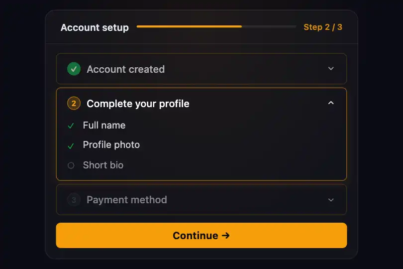

The exclusive toggle relies on toggleAccordion(btn, mode), called via onclick on each header button. It walks the DOM two levels up: btn.parentElement gives the current .accordion-item, another .parentElement gives the .accordion container. When mode === 'single', it strips active from every sibling .accordion-item before toggling (classList.toggle) the class on the clicked item.
Opening and closing are entirely CSS-driven: the content panel (.accordion-content) starts at max-height: 0; overflow: hidden. When the parent item holds the active class, .accordion-item.active .accordion-content sets max-height to 200px. The max-height .4s transition animates the reveal — even if the actual content is shorter, the animation stays smooth.
The SVG chevron (.accordion-icon) rotates 180° via transform: rotate(180deg) on .accordion-item.active .accordion-icon, driven by a transform .3s transition. The active item also gets a stronger indigo border (rgba(99,102,241,.5)) and a diffuse box-shadow — extra visual cues without a fill-color change.
The DOM traversal (parentElement) enforces group isolation: each .accordion-single container is self-contained. Multiple accordions on the same page operate independently, sharing no state or identifier.
Accessibility
- prefers-reduced-motion absent — the
max-height .4stransition and chevron rotation fire regardless of OS preference. For WCAG 2.3 compliance add:@media (prefers-reduced-motion: reduce) { .accordion-content, .accordion-icon { transition: none; } }. - Buttons are native
<button>elements, keyboard-navigable (Tab · Enter · Space) with no extra code. - No
aria-expandedon buttons — a screen reader will not announce open/closed state. Add it insidetoggleAccordion:btn.setAttribute('aria-expanded', c.classList.contains('active')). - Contrast: header text (white on ~
#0a0a0f) > 10:1 — WCAG AAA. Body text atrgba(255,255,255,.6): ratio ~4.9:1 — WCAG AA. - No
role="region"oraria-labelledbyon.accordion-contentpanels — the button/panel association is not explicit for assistive technology.
Browser compatibility
Requires classList and CSS transitions — supported in all modern browsers. Zero external dependencies.
Without JS, panels remain in their HTML-initial state (the first carries class="accordion-item active"). The CSS still renders the open state correctly — content stays accessible.
The code
HTML structure to paste into your page (the CSS + JS come with Premium):
<div class="accordion accordion-single">
  <div class="accordion-item active">
    <button class="accordion-header" onclick="toggleAccordion(this, 'single')">
      Section title
      <svg class="accordion-icon" width="16" height="16" viewBox="0 0 24 24" fill="none" stroke="currentColor" stroke-width="2">
        <path d="M6 9l6 6 6-6"></path>
      </svg>
    </button>
    <div class="accordion-content">
      <div class="accordion-body">Section content.</div>
    </div>
  </div>
  <!-- Repeat .accordion-item for each additional entry -->
</div>The full HTML + CSS + JS of Accordion Single, ready to paste — plus all 840 effects. Or $299 once, lifetime access.
Customize
Options passed to the API or data-* attributes:
| Option / property | Default | Effect |
|---|---|---|
| --primary | #6366f1 | Color of the active border and glow (rgba(--primary,.2/.5)). Swap for your brand color — border and box-shadow adapt automatically. |
| --text-primary | #ffffff | Text color for section headers. Change for a light theme or a custom palette. |
| .accordion max-width | 350px | Maximum width of the accordion container. Set to 480px for desktop layouts or 100% for a fluid container. |
| .accordion-item.active .accordion-content max-height | 200px | Maximum height of the open panel. Increase for longer content — 400px for long text, 1000px for dynamic unknown-length content. |
| transition: max-height .4s (.accordion-content) | .4s | Open/close animation duration. Reduce to .25s for more responsiveness, increase to .6s for a fuller feel. |
| transition: transform .3s (.accordion-icon) | .3s | Chevron SVG rotation duration. Align with the max-height duration for a consistent animation. |
| mode 'single' vs other | 'single' | Second argument of onclick="toggleAccordion(this, 'single')". Any value other than 'single' disables the exclusive behaviour and allows multiple panels open simultaneously. |
| .accordion-header padding | 16px 20px | Inner padding of header buttons. Reduce to 12px 16px for a dense UI, increase to 20px 24px for an airy layout. |
FAQ
'single' with any other value in each button's onclick attribute (e.g. toggleAccordion(this, 'multi')). In single mode the function strips active from siblings first; with another value it skips that step and allows multiple panels open.max-height: 200px on .accordion-item.active .accordion-content. Set it to a large value (e.g. 1000px) — the transition always animates from 0 to the target value; the visual feel stays smooth even when content is much shorter.toggleAccordion walks up the DOM from the clicked button (btn → .accordion-item → .accordion) and closes only siblings within the same container. Two distinct .accordion-single groups on the page are fully independent, sharing no state or identifier.


