Background Fill
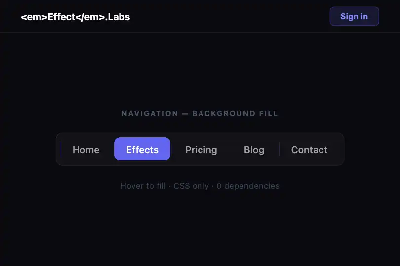
A colored background slides left on hover using an offset 200%-wide CSS gradient — no JS, no pseudo-element.
Updated

This effect is part of Effect.Labs — 840 vanilla effects, some free, some premium. Navigation has 37 effects, including 4 free. Explore the category →
3 usage examples

How it works
The effect relies entirely on one CSS property: background. A horizontal linear gradient is declared at 200% width (background-size: 200% 100%) — the left half is the fill color (#6366f1), the right half is transparent. By default, background-position: right center shows only the transparent half, so the element appears unfilled.
On hover, background-position switches to left center. The 0.4 s CSS transition animates this shift: the colored half slides in from the left, creating the illusion of a progressive fill. No color interpolation, no ::before pseudo-element, no JS — just a background pan.
The text color is also animated by the same transition — it shifts from var(--text-secondary) (#a1a1aa) to #fff in sync with the fill, keeping WCAG AA legibility (ratio ≈ 7.7:1, white on indigo). The border-radius: var(--radius-md) rounds each item into a capsule shape.
The code is 100% CSS with no dependencies: no JavaScript, no pseudo-element adding DOM complexity. The link-bg-fill class applies directly to the host element, paired with nav-link-demo which handles base spacing and typography.
Accessibility
- No prefers-reduced-motion guard: the 0.4 s transition always runs regardless of OS settings. Add
@media (prefers-reduced-motion: reduce) { .link-bg-fill { transition: none } }manually to disable the slide. - The demo uses non-focusable
<span>elements — in production, replace with<a href>or<button>so the effect also fires on keyboard focus. CSS:hoveralone does not cover:focus. - To show the fill on keyboard focus, add
.link-bg-fill:focus-visible { background-position: left center; color: #fff; }. - White
#ffftext on#6366f1fill on hover: contrast ratio ≈ 7.7:1 — WCAG AA ✔. - Text
#a1a1aaon#0a0a0fat rest: ratio ≈ 4.7:1 — WCAG AA ✔.
Browser compatibility
Uses only background, background-position, and transition — supported in all modern browsers since 2015.
Without CSS transition support, the fill switches instantly on hover — still functional, just without the slide animation.
The code
HTML structure to paste into your page (the CSS + JS come with Premium):
<nav class="nav-demo">
  <a class="nav-link-demo link-bg-fill" href="#">Home</a>
  <a class="nav-link-demo link-bg-fill" href="#">Services</a>
  <a class="nav-link-demo link-bg-fill" href="#">Contact</a>
</nav>The full HTML + CSS + JS of Background Fill, ready to paste — plus all 840 effects. Or $299 once, lifetime access.
Customize
Options passed to the API or data-* attributes:
| Option / property | Default | Effect |
|---|---|---|
| Fill color | #6366f1 | Replace #6366f1 in the gradient with any CSS color. Both occurrences in linear-gradient(90deg, #6366f1 50%, transparent 50%) must match. |
| Transition duration | .4s | Edit transition: .4s on .link-bg-fill. Use .2s for snappiness, .6s for a cinematic slide. |
| Border radius | var(--radius-md) = 0.5rem | Edit --radius-md or set border-radius directly on the class. Use 100px for a pill shape. |
| Inner padding | 0.5rem 1rem | Adjust padding: var(--space-2) var(--space-4) — increase horizontal padding for a larger click target. |
| Text color at rest | #a1a1aa | Edit --text-secondary for your background. The transition animates it simultaneously with the fill. |
| Text color on hover | #fff | Edit color: #fff in .link-bg-fill:hover. Use a dark color if your fill is light (e.g. pale yellow). |
| Gap between items | 2rem | Edit --space-8 in :root, or set gap directly on the .nav-demo container. |
FAQ
class="nav-link-demo link-bg-fill" to your <a> tags. The transition works identically. Add text-decoration: none and declare .link-bg-fill:focus-visible { background-position: left center; color: #fff; } for keyboard accessibility.active class in JavaScript on the current item and declare .link-bg-fill.active { background-position: left center; color: #fff; } in your CSS. The transition applies on class add/remove with no extra JS.:hover typically fires on the first tap (persistent until the next tap). For more predictable mobile behavior, also style :active, or manage activation via a JS class on touchstart.