Hamburger Menu
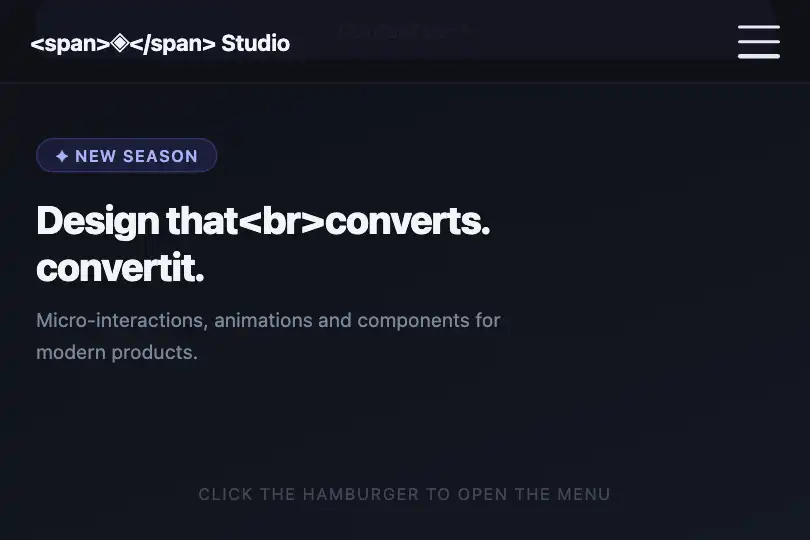
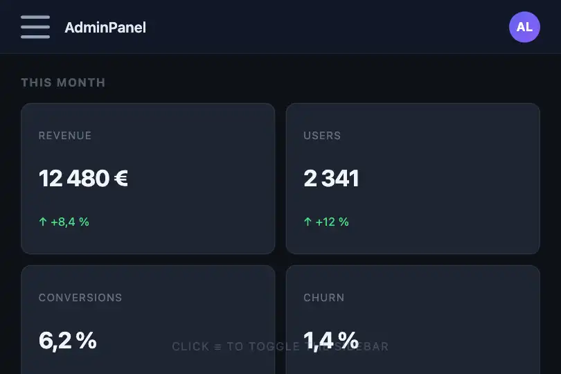
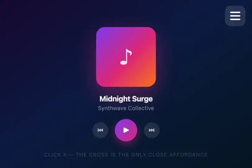
Three CSS bars slide and rotate in 300 ms to form a close cross — no dependencies, a single class toggle.
Updated

This effect is part of Effect.Labs — 840 vanilla effects, some free, some premium. Navigation has 37 effects, including 4 free. Explore the category →
3 usage examples
How it works
Three <span> elements are absolute-positioned inside a 30×24 px relative container. By default: bar 1 at top:0, bar 2 centered via translateY(-50%), bar 3 at bottom:0. The entire animation is produced by transition: .3s on CSS properties — no JavaScript calculation involved.
Adding the .active class to the container triggers three simultaneous transitions: bar 1 rises to top:50%; transform: translateY(-50%) rotate(45deg), bar 2 disappears (opacity:0) while sliding left (translateX(-20px)), and bar 3 moves up to bottom:50%; transform: translateY(50%) rotate(-45deg). The two remaining bars cross exactly at the center to form an X.
The included JavaScript handles the site's mobile navigation (opening .mobile-menu, Escape key close, active-link highlighting) and theme switching — the hamburger's visual logic is purely CSS. In any integration, a single classList.toggle('active') is enough to drive the animation.
Accessibility
- prefers-reduced-motion absent: the 300 ms transition runs regardless. To comply with WCAG 2.3.3, add
@media (prefers-reduced-motion: reduce) { .hamburger span { transition: none; } }. - The container is a
<div>withcursor:pointer— withoutrole="button"ortabindex="0", it is invisible to keyboard users and screen readers. In production, use a native<button>element. aria-expandedis absent: the open/closed state of the menu is not communicated to assistive technology. Add it to the trigger element and update it in JavaScript.- Bar contrast: white
#fffon#0a0a0fbackground → ratio > 15:1, WCAG AA and AAA compliant. - The Escape key closes the mobile menu via the provided JS (targets
.mobile-menu) — adapt this if your menu uses a different element.
Browser compatibility
Requires CSS Transitions (level 3) — supported in all modern browsers since 2012. Zero external dependencies.
Without CSS Transitions (IE 9-), bars snap instantly to the X position — the closed state remains legible, without animation.
The code
HTML structure to paste into your page (the CSS + JS come with Premium):
<button class="hamburger" type="button" aria-expanded="false" aria-label="Menu">
  <span></span>
  <span></span>
  <span></span>
</button>The full HTML + CSS + JS of Hamburger Menu, ready to paste — plus all 840 effects. Or $299 once, lifetime access.
Customize
Options passed to the API or data-* attributes:
| Option / property | Default | Effect |
|---|---|---|
| width / height on .hamburger | 30 px / 24 px | Container size. Keep a 5:4 ratio so bars stay evenly spaced. |
| height on .hamburger span | 3 px | Bar thickness. 2 px = thin and elegant, 4–5 px = bold and assertive. |
| background on .hamburger span | #fff | Bar color. Replace with your brand color or a CSS custom property. |
| transition on .hamburger span | .3s | Duration and easing. .2s = snappy, .5s = cinematic. Example: .3s ease-in-out. |
| border-radius on .hamburger span | 2 px | Corner rounding on bar ends. 0 = sharp square, 100px = pill capsule. |
| translateX(-20px) in .active span:nth-child(2) | -20 px | Lateral slide distance of the middle bar before disappearing. Increase to -40 px for a more dramatic exit. |
FAQ
.active class on the .hamburger element: document.querySelector('.hamburger').classList.toggle('active'). No library needed.transition property on .hamburger span. Example: transition: .2s ease-in for a snappy close, or transition: .5s cubic-bezier(.68,-.55,.27,1.55) for a spring-back effect.isOpen) in your component: className={isOpen ? 'hamburger active' : 'hamburger'} (React) or :class="{'active': isOpen}" (Vue). No additional JavaScript adaptation needed.


