Breadcrumb Animated
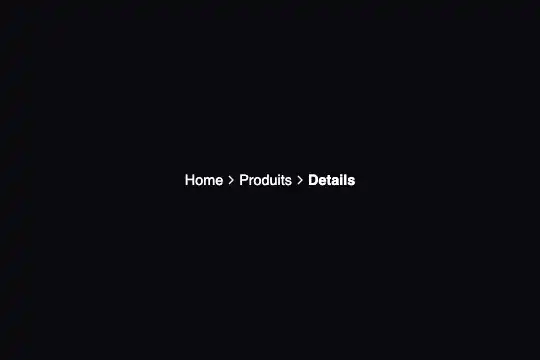
Pure CSS breadcrumb: SVG chevrons pulse in opacity and slide 3 px when the preceding item is hovered — chevronPulse keyframe + adjacent sibling selector, zero JS.
Updated
This effect is part of Effect.Labs — 840 vanilla effects, some free, some premium. Navigation has 37 effects, including 4 free. Explore the category →
3 usage examples
How it works
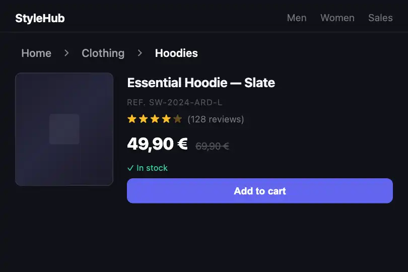
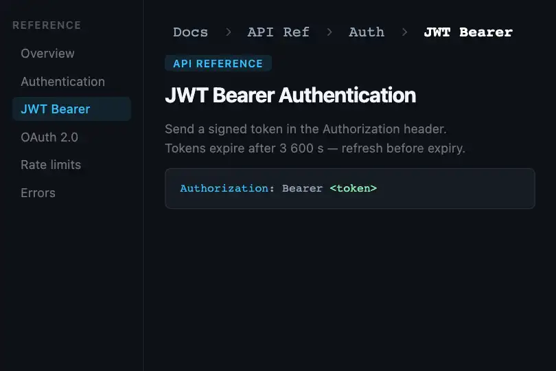
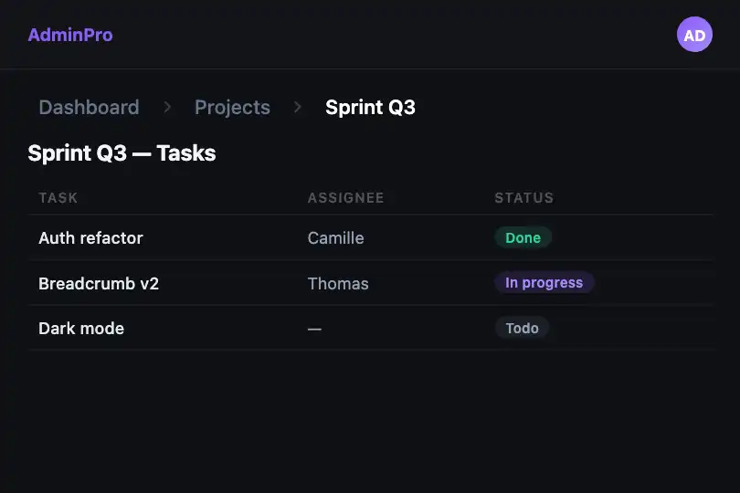
The effect is entirely CSS-driven, with no JavaScript whatsoever. The <nav class="breadcrumb-animated"> acts as the trigger scope: when a pointer enters the nav, the rule .breadcrumb-animated:hover .breadcrumb-chevron fires and starts the chevronPulse animation on all chevrons simultaneously.
@keyframes chevronPulse oscillates opacity from 0.5 to 1 (50% → 100% → 50%) over 1.5 s ease-in-out infinite. This pulse draws the eye toward the hierarchy structure without distracting from reading — it stops the moment the pointer leaves the nav.
The adjacent sibling selector .breadcrumb-item:hover + .breadcrumb-chevron adds a second interaction layer: the chevron immediately after the hovered item slides 3 px to the right (translateX(3px)) and takes the indigo tint #6366f1, in sync with the item's hover background. This visually 'pushes' the progression through the hierarchy.
CSS custom properties (--text-secondary, --text-primary, --text-muted, --radius-sm, --space-1, --space-2) let you align the component with any design system by overriding the variables on :root or directly on the .breadcrumb-animated element.
Accessibility
<nav>is an HTML5 landmark element natively recognised by screen readers — addaria-label="Breadcrumb"if the page has multiple<nav>elements.- No
prefers-reduced-motionis implemented: thechevronPulseanimation and the slide transition run regardless of system preference. Add manually:@media (prefers-reduced-motion: reduce) { .breadcrumb-chevron { animation: none; transition: none } }. - The current item carries class
.currentbut noaria-current="page"attribute — add it so screen readers announce the active page. - Items are
<span>elements withcursor: pointerbut no role or keyboard handler: for full keyboard navigation, replace them with<a href="…">anchors. - Inactive text
#a1a1aaon background#0a0a0f: contrast ratio ≈ 4.8:1 (WCAG AA ✓); current item#ffffff: ratio ≈ 21:1 (WCAG AAA ✓).
Browser compatibility
Requires CSS transitions, keyframes, and custom properties — supported in all modern browsers since 2018.
Without CSS custom property support (IE 11 and older), items render in default grey — structure remains readable, no animation.
The code
HTML structure to paste into your page (the CSS + JS come with Premium):
<nav class="breadcrumb-animated" aria-label="Breadcrumb">
  <span class="breadcrumb-item">Level 1</span>
  <span class="breadcrumb-chevron">
    <svg width="16" height="16" viewBox="0 0 24 24" fill="none" stroke="currentColor" stroke-width="2">
      <path d="M9 18l6-6-6-6"></path>
    </svg>
  </span>
  <span class="breadcrumb-item">Level 2</span>
  <span class="breadcrumb-chevron">
    <svg width="16" height="16" viewBox="0 0 24 24" fill="none" stroke="currentColor" stroke-width="2">
      <path d="M9 18l6-6-6-6"></path>
    </svg>
  </span>
  <span class="breadcrumb-item current">Current page</span>
</nav>The full HTML + CSS + JS of Breadcrumb Animated, ready to paste — plus all 840 effects. Or $299 once, lifetime access.
Customize
Options passed to the API or data-* attributes:
| Option / property | Default | Effect |
|---|---|---|
| --text-secondary | #a1a1aa | Color of inactive item text. Replace with your `text-muted` or `text-secondary` design-system token. |
| --text-primary | #ffffff | Color of the current item (`.current` class). Adapt to your primary text color. |
| --text-muted | #8b8b93 | Chevron color at rest. Slightly darker than `--text-secondary` for a hierarchical contrast. |
| --radius-sm | 0.375rem | Border-radius of the item hover background. `0` for a square background, `999px` for pill-shaped capsules. |
| --space-2 | 0.5rem | Horizontal padding of each item. Increase to `0.75rem` for more spacious items on wide screens. |
| Hover accent color | #6366f1 | Indigo tint applied to the hover background and active chevrons. Replace both occurrences of `#6366f1` in `.breadcrumb-item:hover` and `.breadcrumb-item:hover + .breadcrumb-chevron` with your primary color. |
| Pulse duration | 1.5s | Speed of the chevron pulse in `animation: 1.5s ease-in-out infinite`. `0.8s` for a snappy pulse, `3s` for a very gentle rhythm. |
| Chevron slide offset | 3px | How far the adjacent chevron slides right on item hover. Change `translateX(3px)` in `.breadcrumb-item:hover + .breadcrumb-chevron`. `0` to disable, `6px` for a stronger effect. |
FAQ
@keyframes, CSS transitions, and the adjacent sibling combinator +. Zero dependencies, zero JS to load — compatible with SSR, Astro, Hugo, or any static generator with no client-side JS.<span class="breadcrumb-item">Level</span> + <span class="breadcrumb-chevron"><svg…></svg></span> pair before the .current item. The adjacent selector .breadcrumb-item:hover + .breadcrumb-chevron applies automatically to the new chevron.chevronPulse animation and CSS transitions run even when the OS signals a preference for reduced motion. To fix this, add: @media (prefers-reduced-motion: reduce) { .breadcrumb-chevron { animation: none; transition: none } }.


