Dropdown Animated
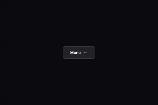
Animated dropdown menu with a CSS stagger reveal: each item slides in from the left with a 50 ms delay — single class toggle, no dependencies.
Updated
This effect is part of Effect.Labs — 840 vanilla effects, some free, some premium. Navigation has 37 effects, including 4 free. Explore the category →
3 usage examples
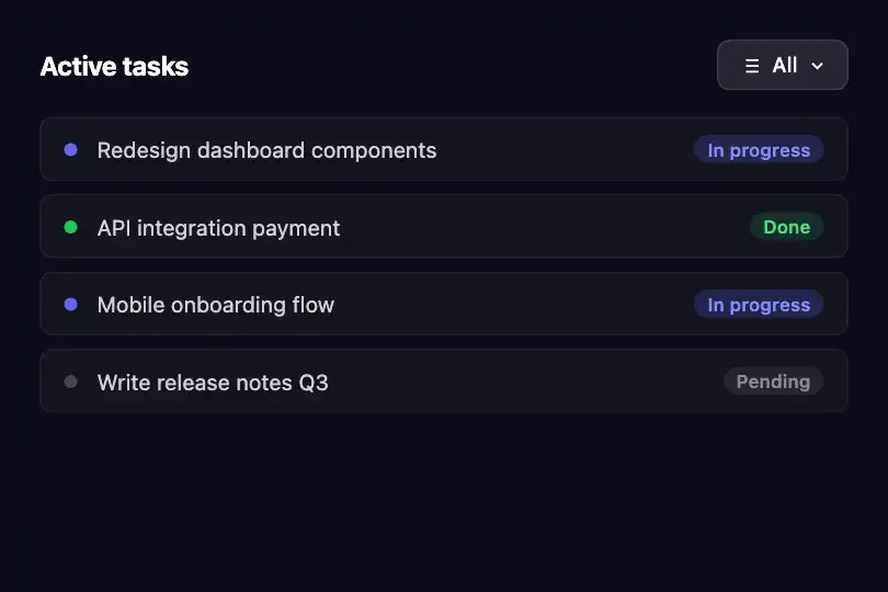

How it works
Opening relies on a CSS class toggle: the JS function toggleDropdown() adds or removes the class active on the .anim-dropdown-container wrapper. No animation library is involved — all rendering is driven by the browser's native transition engine.

The .anim-dropdown-menu panel transitions simultaneously from opacity: 0 to 1, from visibility: hidden to visible, and from transform: translateY(-10px) to translateY(0) over 0.3 s. Using visibility (instead of display: none) preserves transition continuity while blocking clicks and focus when the menu is invisible.
The stagger effect is entirely declarative CSS: each .anim-dropdown-item starts at opacity: 0; transform: translateX(-10px) and transitions to opacity: 1; translateX(0). The :nth-child(1…4) rules assign transition-delay values of 0.05 s / 0.10 s / 0.15 s / 0.20 s respectively — the last item arrives 200 ms after opening begins. Adding more items only requires one extra :nth-child(N) rule.
Closing is triggered three ways: re-clicking the trigger button, clicking outside the container (a document click listener checks contains(e.target)), or pressing Escape. The chevron icon rotates 180° via transform: rotate(180deg) on .anim-dropdown-container.active .anim-dropdown-icon.
Accessibility
- prefers-reduced-motion not handled: the code contains no
matchMedia('(prefers-reduced-motion: reduce)')check — CSS transitions run regardless of OS settings. Add@media (prefers-reduced-motion: reduce) { .anim-dropdown-menu, .anim-dropdown-item { transition: none } }manually for motion-sensitive users. - The trigger is a native
<button>: keyboard activation (Enter / Space) works without extra code. The Escape key closes the menu (handled in JS via akeydownlistener). - aria-expanded and aria-haspopup are missing from the provided code: add them manually on the
<button>(aria-expanded="false"toggled to"true"on open,aria-haspopup="menu") so screen readers announce the menu state. - Menu items are non-focusable
<div>elements: they are not reachable via Tab or arrow keys. For full keyboard navigation, replace them with<button>or<a>elements. - Contrast:
rgba(255,255,255,.7)text onrgba(30,30,45,.98)background — ratio exceeds 4.5:1 WCAG AA. The indigo hover (rgba(99,102,241,.2)) does not degrade the white text.
Browser compatibility
Uses only CSS Transitions and classList — available in all modern browsers without vendor prefixes. Zero external dependencies.
Without JS, the button is visible but the menu won't open. A pure-HTML fallback is possible by replacing the container with a native <details>/<summary> element — no animation, but fully functional without script.
The code
HTML structure to paste into your page (the CSS + JS come with Premium):
<div class="anim-dropdown-container" id="dropdown">
  <button class="anim-dropdown-trigger" onclick="toggleDropdown()">
    Label
    <svg class="anim-dropdown-icon" width="16" height="16" viewBox="0 0 24 24" fill="none" stroke="currentColor" stroke-width="2">
      <path d="M6 9l6 6 6-6"></path>
    </svg>
  </button>
  <div class="anim-dropdown-menu">
    <div class="anim-dropdown-item">
      <svg class="anim-dropdown-item-icon" viewBox="0 0 24 24" fill="none" stroke="currentColor" stroke-width="2">…</svg>
      Item 1
    </div>
    <!-- For each extra item, add to CSS:
         .anim-dropdown-container.active .anim-dropdown-item:nth-child(N) { transition-delay: Xs } -->
  </div>
</div>The full HTML + CSS + JS of Dropdown Animated, ready to paste — plus all 840 effects. Or $299 once, lifetime access.
Customize
Options passed to the API or data-* attributes:
| Option / property | Default | Effect |
|---|---|---|
| transition-delay :nth-child(N) | 0.05 s per item | Stagger delay per item — CSS rules .active .anim-dropdown-item:nth-child(1…4). Increase to 0.08 s for a more pronounced stagger, reduce to 0.02 s for near-simultaneous reveal. |
| transition: opacity .3s … (panel) | 0.3 s | Opening duration of the whole panel — 0.2 s for a snappy feel, 0.45 s for a softer render. |
| transform: translateY(-10px) (panel) | -10px | Vertical offset of the panel when closed. Increase to -20 px for a more pronounced drop, or swap for scaleY(0.92) for a fold-open effect. |
| transform: translateX(-10px) (items) | -10px | Horizontal offset of each item before reveal. Replace with translateY(8px) for a bottom-up entrance. |
| .anim-dropdown-item:hover background | rgba(99,102,241,.2) | Item hover color (indigo by default) — swap for your interface's primary tint. |
| min-width on .anim-dropdown-menu | 200px | Panel minimum width — increase to 260 px for long labels or a two-column layout. |
| Additional items | 4 items | For each extra item, declare .anim-dropdown-container.active .anim-dropdown-item:nth-child(N) { transition-delay: Xs } with Xs = 0.05 × N. |
FAQ
getElementById('dropdown') and a global toggleDropdown() function — one instance per page. For multiple menus, update the function to accept an id: function toggleDropdown(id) { document.getElementById(id).classList.toggle('active'); }, then call onclick="toggleDropdown('menu-1')" on each trigger with its matching id.isOpen via useState and set className conditionally. In Vue, use :class="{ active: isOpen }" on the container. In Svelte, class:active={isOpen} is enough. The CSS stagger stays unchanged — only the class management differs.active is removed. For a different close (e.g. fast fade without slide), temporarily add a closing class via JS before removing active and define .closing .anim-dropdown-menu { transition: opacity .15s; } — then remove closing after the delay with setTimeout.


