Dropdown Reveal
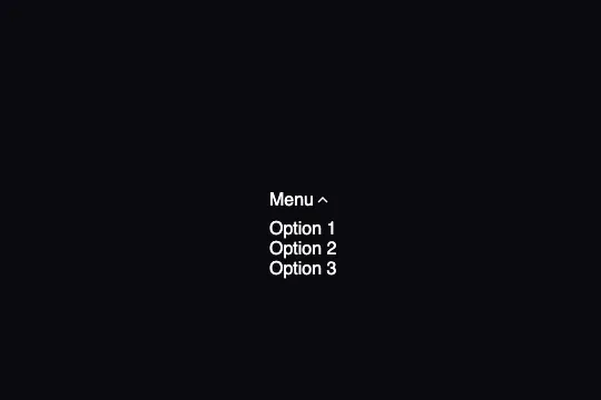
Pure CSS dropdown: opacity, visibility, and translateY(-10px) all animate on container hover — chevron included, zero JavaScript.
Updated
This effect is part of Effect.Labs — 840 vanilla effects, some free, some premium. Navigation has 37 effects, including 4 free. Explore the category →
3 usage examples
How it works



Hovering .dropdown-container transitions three CSS properties simultaneously on .dropdown-menu via transition: .3s: opacity (0 → 1), visibility (hidden → visible), and transform: translateY(-10px → 0). The selector .dropdown-container:hover .dropdown-menu drives the whole interaction from the parent element — no JavaScript involved.
The opacity + visibility pair is intentional: display:none cancels CSS transitions entirely. opacity:0 alone hides the element visually but keeps click areas active. visibility:hidden removes the element from interactions and accepts a transition — it waits until opacity reaches 0 before hiding, preserving the close animation.
The SVG chevron inside .dropdown-trigger has its own transition rule (transition: transform .3s). The rule .dropdown-container:hover .dropdown-trigger svg { transform: rotate(180deg) } rotates it at the same moment the panel opens — one parent hover synchronizes both animations.
Eight CSS variables on :root centralize the theme: --bg-card (trigger and menu background), --border (outline), --space-2/3/4 (padding scale), and --radius-sm/md/lg (border-radius scale). Changing a variable propagates across the whole component.
Accessibility
- prefers-reduced-motion absent — the code includes no
@media (prefers-reduced-motion: reduce)query. Transitions fire regardless of the OS preference. Minimal fix:@media (prefers-reduced-motion: reduce) { .dropdown-menu, .dropdown-trigger svg { transition: none; } }. <div>trigger is not focusable — the trigger is a<div>, not a<button>; without additional JS it is not reachable by keyboard (Tab, Enter, Space).- No ARIA attributes — the code contains no
aria-expanded,aria-haspopup,role="menu", orrole="menuitem". - Hover-only — the menu opens on CSS
:hoveronly; it does not open via keyboard or touch without aclickhandler added in JS. - Text contrast — white
#ffffffon--bg-card: #12121a, ratio ≈ 19.3:1, WCAG AAA compliant.
Browser compatibility
Uses only opacity, visibility, transform, and transition — universal CSS properties since IE 10. Zero JavaScript, zero dependencies.
If CSS transitions are not supported, the menu appears and hides instantly on hover — functional behavior without animation.
The code
HTML structure to paste into your page (the CSS + JS come with Premium):
<div class="dropdown-container">
  <div class="dropdown-trigger">
    Label
    <svg width="16" height="16" viewBox="0 0 24 24" fill="none" stroke="currentColor" stroke-width="2">
      <path d="M6 9l6 6 6-6"></path>
    </svg>
  </div>
  <div class="dropdown-menu">
    <div class="dropdown-item">Item 1</div>
    <div class="dropdown-item">Item 2</div>
    <div class="dropdown-item">Item 3</div>
  </div>
</div>The full HTML + CSS + JS of Dropdown Reveal, ready to paste — plus all 840 effects. Or $299 once, lifetime access.
Customize
Options passed to the API or data-* attributes:
| Option / property | Default | Effect |
|---|---|---|
| --bg-card | #12121a | Background of the trigger and dropdown menu. Set to #ffffff for a light theme. |
| --border | rgba(255,255,255,0.08) | Border color of trigger and menu. Increase opacity for a more visible outline. |
| --radius-lg | 0.75rem | Border-radius of the dropdown panel (.dropdown-menu). |
| --radius-md | 0.5rem | Border-radius of the trigger (.dropdown-trigger). |
| transition (.dropdown-menu) | .3s | Animation duration for all three properties (opacity, visibility, transform). .15s = snappy, .5s = silky. |
| translateY (.dropdown-menu closed) | -10px | Vertical offset at start. -20px = pronounced slide, 0 = pure fade with no movement. |
| hover color (.dropdown-item) | rgba(99,102,241,.1) | Item hover background. Replace with your accent color. |
| min-width (.dropdown-menu) | 180px | Minimum panel width. Increase for longer labels. |
| top (.dropdown-menu) | calc(100% + 8px) | Vertical gap between the trigger and the dropdown panel. |
FAQ
<div class="dropdown-trigger"> with a <button>, handle keydown in JS (Enter/Space to open, Escape to close), and add aria-expanded on the button plus role="menu" and role="menuitem" on the items. The effect CSS does not need to change — drive a .open class alongside the :hover rule..dropdown-container.open .dropdown-menu { opacity:1; visibility:visible; transform:translateY(0); }. The existing transition: .3s applies without modification.


