Floating Action Labels
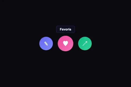
Pure CSS labels that pop above action buttons on hover with a micro-translation — anchored via normal flow, they reposition on scroll without JavaScript.
Updated
This effect is part of Effect.Labs — 840 vanilla effects, some free, some premium. Navigation has 37 effects, including 4 free. Explore the category →
3 usage examples
How it works
The .floating-label is positioned with position: absolute; top: -36px; left: 50% inside the .label-target (position: relative) — it always appears 36 px above the button, regardless of where on the page the button sits. Horizontal centering relies on left: 50%; transform: translateX(-50%) : white-space: nowrap keeps labels of varying lengths centered without any JS measurement.
On hover, two CSS properties transition simultaneously: opacity goes from 0 to 1 and translateY from 6 px to 0 over 0.25 s. The parent button also receives a transform: scale(1.15) via a cubic-bezier(.34, 1.56, .64, 1) — this over-damped curve produces a slight elastic bounce that makes the hover feel lively without any animation library.
The caret pointing toward the button is a pure CSS triangle: the ::after element is placed at top: 100% of the label and uses the transparent-border trick (border-color: rgba(15,15,30,.92) transparent transparent) to form the downward triangle. If you change the label background color, update the top border of ::after accordingly.
Scroll repositioning is implicit and requires no JavaScript: .floating-label is in position: absolute within the flow of .label-target, which itself is in the normal page flow. The label mechanically follows the button on scroll — unlike position: fixed tooltips that need a getBoundingClientRect() on every scroll event.
Accessibility
- prefers-reduced-motion absent — the source code contains no
@media (prefers-reduced-motion)block. Add@media (prefers-reduced-motion: reduce) { .floating-label, .label-target { transition: none } }for motion-sensitive users. - Keyboard accessibility absent —
:hoverdoes not trigger on keyboard navigation. Add.label-target:focus-within .floating-label { opacity: 1; transform: translateX(-50%) translateY(0) }to match keyboard and mouse behavior. - Label contrast —
#e0e7fftext onrgba(15, 15, 30, .92)background: ratio ≈ 9:1, compliant with WCAG AA and AAA. - Icon-only buttons — the demo buttons carry no
aria-label. Addaria-label="Edit"(or equivalent) to each button for screen reader users. - Semantics — replace
<div class="label-target">elements with native<button type="button" aria-label="…">for keyboard navigation without extra JavaScript.
Browser compatibility
Requires CSS position: absolute, opacity, and transform — supported in all browsers since 2015. Zero JavaScript dependencies.
On mobile and touch screens, :hover does not fire on tap: labels stay invisible. Add a click or touchstart handler that toggles a .label-visible class to work around the absence of hover.
The code
HTML structure to paste into your page (the CSS + JS come with Premium):
<div class="anchor-demo">
  <div class="labels-scene">
    <button type="button" class="label-target label-target-1" aria-label="Edit">
      <span aria-hidden="true">✎</span>
      <span class="floating-label">Edit</span>
    </button>
    <button type="button" class="label-target label-target-2" aria-label="Favorites">
      <span aria-hidden="true">♥</span>
      <span class="floating-label">Favorites</span>
    </button>
    <button type="button" class="label-target label-target-3" aria-label="Share">
      <span aria-hidden="true">↗</span>
      <span class="floating-label">Share</span>
    </button>
  </div>
</div>The full HTML + CSS + JS of Floating Action Labels, ready to paste — plus all 840 effects. Or $299 once, lifetime access.
Customize
Options passed to the API or data-* attributes:
| Option / property | Default | Effect |
|---|---|---|
| top: -36px | -36px | Distance of the label above the button (on .floating-label). Increase for larger buttons, reduce to compact. Must remain negative to display above. |
| translateY(6px) | 6px | Micro-translation travel on hover entry. Drop to 3 px for a subtle effect, raise to 10 px for a more pronounced glide. |
| transition: opacity .25s, transform .25s | .25s | Label show/hide duration. .15s for snappy productivity tools, .4s for a softer consumer UI. |
| background: rgba(15, 15, 30, .92) | rgba(15,15,30,.92) | Label background color and opacity. Adapt to your theme — remember to update the ::after border-color accordingly. |
| border: 1px solid rgba(99, 102, 241, .3) | rgba(99,102,241,.3) | Accent border of the label. Change the color to your brand hue, or remove it for a borderless label. |
| font-size: .72rem | .72rem | Label text size. .65rem for dense interfaces, .8rem for better legibility. |
| transform: scale(1.15) | 1.15 | Button scale factor on hover. scale(1.05) for subtlety, scale(1.25) for more expressiveness. |
| cubic-bezier(.34, 1.56, .64, 1) | elastic | Spring curve on the button hover. Replace with ease-out to remove the bounce, or adjust the 2nd parameter (>1 = over-damped) to calibrate elasticity. |
FAQ
:hover, which does not fire on tap on iOS and Android. For touch surfaces, add a click or touchstart handler that toggles a .label-visible class on the button, and replace .label-target:hover .floating-label with .label-target.label-visible .floating-label..floating-label position: for below, switch to top: calc(100% + 8px) and reverse the ::after (border-color: transparent transparent rgba(15,15,30,.92), bottom: 100%). For the right side, use left: calc(100% + 8px); top: 50%; transform: translateY(-50%) and adapt the caret..floating-label is position: absolute inside its .label-target parent (normal flow), it mechanically follows the button on scroll. JavaScript (getBoundingClientRect, ResizeObserver) is only needed if you switch to position: fixed for a tooltip that stays visible on screen at all times.


