Footnote Popover
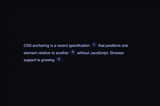
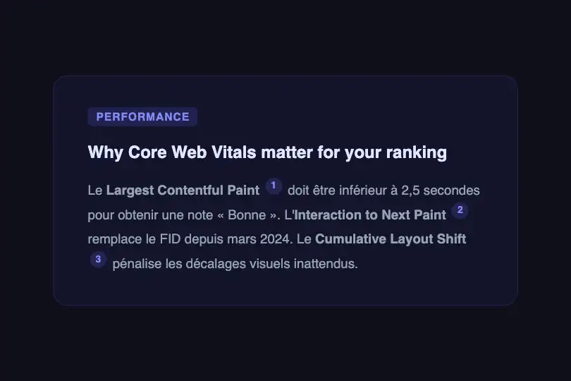
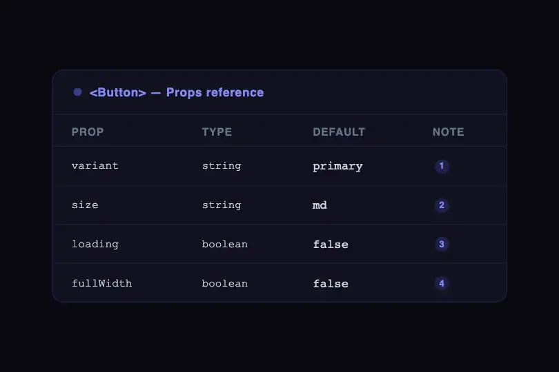
Superscript reference markers reveal a content bubble anchored above the marker, animated with opacity and scale — pure CSS, zero JavaScript.
Updated
This effect is part of Effect.Labs — 840 vanilla effects, some free, some premium. Navigation has 37 effects, including 4 free. Explore the category →
3 usage examples

How it works
The effect is entirely CSS-driven, with no JavaScript. Each .fn-ref marker is an inline-flex badge in position: relative, and its .fn-popover child is position: absolute with bottom: calc(100% + 10px) — anchoring it exactly 10 px above the badge, centered horizontally via left: 50%; transform: translateX(-50%).
Visibility is controlled by the descendant selector .fn-ref:hover .fn-popover: at rest, the popover has opacity: 0, transform: translateX(-50%) scale(0.95), and pointer-events: none; on hover, it switches to opacity: 1, scale(1), and pointer-events: auto — the dual CSS transition (opacity .2s, transform .2s) produces a fade-and-scale entrance with no RAF or JS.
The arrow pointing at the marker is drawn by the .fn-popover::after pseudo-element using the border trick: a zero-size square whose borders form an isosceles triangle (border-color: #1e1b4b transparent transparent), placed at top: 100% and centered. The popover background (#1e1b4b) and the triangle color are identical, visually aligning the arrow with the bubble.
The badge gets a background of rgba(99,102,241,.2) rising to rgba(99,102,241,.4) on hover (transition: background .2s), and uses vertical-align: super to sit naturally in text flow like a superscript. The popover is declared pointer-events: none at rest to avoid hover conflicts on adjacent areas.
Accessibility
- prefers-reduced-motion not handled: the code includes no
@media (prefers-reduced-motion: reduce)block — opacity and scale CSS transitions fire even when the OS signals a reduced-motion preference. Add the block if deploying on a public-facing site. - Keyboard interaction not covered: the popover is triggered only by CSS
:hover— keyboard users (Tab navigation) cannot see the content. To cover the keyboard, addtabindex="0"to.fn-refand use the:focus-withinselector. - No
aria-attributes on markers or popovers — note content is invisible to screen readers. Addrole="button",aria-describedby, oraria-haspopupif the content is essential. - Text contrast: popover text color (
#c7d2feon#1e1b4bbackground) exceeds the WCAG AA 4.5:1 ratio — secondary text remains readable. - The badge (
#818cf8onrgba(99,102,241,.2)) is decorative (short numeral); its translucent background falls below the AA ratio, but a single digit is not critical content.
Browser compatibility
Uses only CSS2/CSS3 selectors and transitions — no polyfill required.
If CSS transitions are unsupported, the popover appears and hides instantly on hover — no errors, content remains accessible.
The code
HTML structure to paste into your page (the CSS + JS come with Premium):
<div class="anchor-demo">
  <div class="footnote-scene">
    <div class="footnote-text">
      Text with reference
      <span class="fn-ref">1
        <span class="fn-popover">
          <span class="fn-num">[1]</span> Note content.
        </span>
      </span>
      rest of text.
    </div>
  </div>
</div>The full HTML + CSS + JS of Footnote Popover, ready to paste — plus all 840 effects. Or $299 once, lifetime access.
Customize
Options passed to the API or data-* attributes:
| Option / property | Default | Effect |
|---|---|---|
| .fn-popover { width } | 220px | Bubble width — increase for longer notes, decrease for short definitions. Recommended range: 180–300px. |
| .fn-popover { bottom } | calc(100% + 10px) | Vertical gap between the bottom of the popover and the top of the badge. Increase the offset (e.g. 14px) if your font is large and popovers overlap. |
| .fn-popover (background) | #1e1b4b | Bubble background color. Must match the ::after triangle color to avoid a visual seam. |
| .fn-popover::after (border-color) | #1e1b4b transparent transparent | Triangle color pointing to the badge — keep it identical to the popover background. |
| .fn-ref (background / hover background) | rgba(99,102,241,.2) / .4 | Badge background at rest and on hover. Adjust opacity or color to match your brand palette. |
| .fn-popover (transition) | opacity .2s, transform .2s | Duration and easing of the enter/exit animations. Switch to .15s for a snappier appearance, or .3s ease-in-out for a softer fade. |
| .fn-popover (font-size) | .72rem | Font size of popover content. Keeps text discreet — do not exceed .85rem to stay within the typographic hierarchy. |
| .fn-ref { transform: scale } | scale(0.95) → scale(1) | Scale animation amplitude on entry. Reduce to scale(0.98) for a subtler effect, or remove the transform property entirely to disable the scale animation. |
FAQ
tabindex="0" to each .fn-ref and extend the CSS selector: .fn-ref:hover .fn-popover, .fn-ref:focus-within .fn-popover { opacity: 1; transform: translateX(-50%) scale(1); pointer-events: auto; }. For screen readers, add role="button" to .fn-ref and aria-describedby pointing to the popover's id.left: 50%; transform: translateX(-50%) with right: 0; transform: translateX(0) (or left: 0 for the left edge), and move the ::after arrow with left: auto; right: 8px. For automatic handling, a short JS snippet reading getBoundingClientRect() and toggling a CSS class is enough.position: absolute popover is clipped by any ancestor with overflow: hidden or overflow: clip. The simplest fix is to set the container to overflow: visible. If that is not possible (e.g. carousel, scrolling table), move the popover out of the flow with position: fixed and reposition it via JavaScript using the badge's getBoundingClientRect() coordinates.


