Guided Tour Spotlight
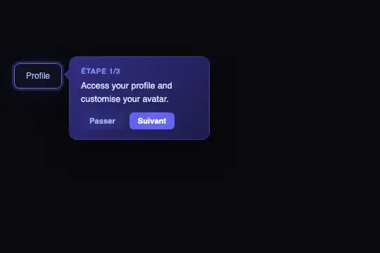
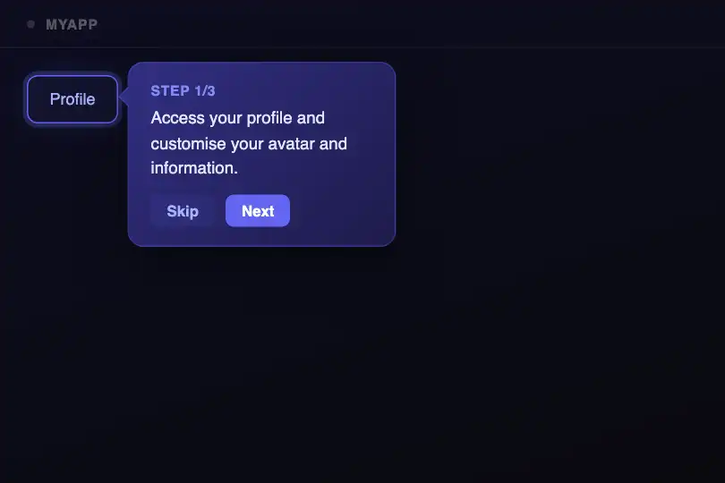

Tooltip dynamically anchored to each UI element, auto-flipped arrow and CSS spotlight — step-by-step user onboarding with no external library.
Updated
This effect is part of Effect.Labs — 840 vanilla effects, some free, some premium. Navigation has 37 effects, including 4 free. Explore the category →
3 usage examples
How it works
The spotlight is pure CSS: the .tour-active class applies a two-layer box-shadow to the target element — a 3 px indigo ring (rgba(99,102,241,.25) 0 0 0 3px) and a 30 px diffuse glow (rgba(99,102,241,.15) 0 0 30px). No semi-transparent overlay, no SVG mask: the highlight is a border effect that leaves the page's z-index and flow entirely untouched. The transition: .3s on .tour-element smoothly animates between highlighted elements.
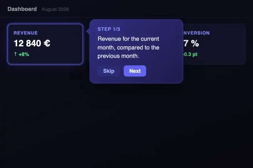
The tooltip is positioned on every step by showStep(t) via two getBoundingClientRect() calls — one on the active element, one on the .tour-scene container. Coordinates are computed in pixels relative to the container: r = element.right − scene.left + 14 (horizontal offset) and l = element.top − scene.top − 10 (vertical alignment). Assigning directly to tooltip.style.left and tooltip.style.top repositions the tooltip without a full page reflow.
An auto-flip mechanism detects overflow before each render: if r + 210 > scene.width, the tooltip switches to the left side of the element (r = element.left − scene.left − 214) and the arrow is re-oriented via style.cssText — 135° rotation with a right anchor. As soon as space is sufficient on the right, the arrow-left class is restored and the arrow points back toward the highlighted element.
The tooltip's appearance relies on a two-part CSS transition on .tour-tooltip.visible: opacity 0→1 and translateY(6px→0) over 0.3 s. The visible class is added on each showStep call. The step text (.tour-text) and progress label (.tour-step, format “Step N/3”) are updated by direct textContent assignment — no DOM nodes are created per step.
Accessibility
- prefers-reduced-motion not handled — CSS transitions (
opacity,transform,borderon.tour-element) remain active regardless of system settings. Recommended fix:@media (prefers-reduced-motion: reduce) { .tour-element, .tour-tooltip { transition: none !important; } } - The Next and Skip buttons are real
<button>elements — keyboard-accessible (Tab + Enter/Space) and correctly announced by screen readers without extra code. - No
aria-liveon the tooltip: screen readers don't automatically announce step changes. Recommendation: addaria-live="polite"on.tour-text. - Text contrast: white (#e0e7ff) on gradient background #312e81 → ratio ≈ 6.3:1, WCAG AA compliant. The progress label (#818cf8) on #312e81 → ratio ≈ 2.8:1, below WCAG AA for normal text — reinforce if strict accessibility is required.
- No
roleoraria-labelon the tour container. Recommended:role="dialog"andaria-label="Guided tour"on.tour-scene, plusaria-modal="true"if the tour blocks interaction with the rest of the page.
Browser compatibility
Relies only on getBoundingClientRect(), classList.toggle(), and CSS transitions — no experimental APIs, no external dependencies.
Without JavaScript, the tooltip remains hidden (opacity: 0) and no element receives .tour-active — the underlying UI stays fully functional with no console errors.
The code
HTML structure to paste into your page (the CSS + JS come with Premium):
<div class="tour-scene" id="tourScene">
  <div class="tour-ui">
    <div class="tour-element tour-active" id="tourEl1">Element 1</div>
    <div class="tour-element" id="tourEl2">Element 2</div>
    <div class="tour-element" id="tourEl3">Element 3</div>
  </div>
  <div class="tour-tooltip" id="tourTooltip">
    <div class="tour-arrow arrow-left"></div>
    <div class="tour-step" id="tourStepLabel">Step 1/3</div>
    <div class="tour-text" id="tourStepText">Step description.</div>
    <div class="tour-nav">
      <button class="tour-skip" id="tourSkip">Skip</button>
      <button class="tour-next" id="tourNext">Next</button>
    </div>
  </div>
</div>The full HTML + CSS + JS of Guided Tour Spotlight, ready to paste — plus all 840 effects. Or $299 once, lifetime access.
Customize
Options passed to the API or data-* attributes:
| Option / property | Default | Effect |
|---|---|---|
| elements (JS array) | — | Array of DOM nodes to highlight in turn. Example: [document.getElementById('step1'), document.getElementById('step2')]. Any node inside .tour-scene is accepted — buttons, cards, form fields, nav items. |
| steps (JS array) | — | Array of objects { text: '…' }, one per step. The text field populates #tourStepText. Note: the progress label and the final button condition are hardcoded for 3 steps in showStep — update "Étape " + (t+1) + "/3" and 2 === t if your tour has a different number of steps. |
| .tour-tooltip { width } | 200px | Tooltip width. Increase to 240–260 px for longer step texts; also adjust the auto-flip threshold in showStep (r + 210 > o.width → replace 210 with your-width + 10). |
| .tour-element.tour-active { border-color } | #6366f1 | Spotlight color. Replace with your brand color; also update box-shadow, the tooltip background, and the Next button color for a consistent theme. |
| .tour-element.tour-active { box-shadow } | rgba(99,102,241,.25) 0 0 0 3px, rgba(99,102,241,.15) 0 0 30px | Halo intensity. Increase the radius (30px→50px) for a more dramatic spotlight, reduce opacities for a subtle effect on a dense UI. |
| .tour-tooltip { background } | linear-gradient(135deg, #312e81, #1e1b4b) | Tooltip background. Replace with a flat color or brand gradient. Verify #e0e7ff text contrast on your new background before shipping. |
| .tour-nav .tour-next { background } | #6366f1 | Next/Finish button color. Match it with the active element's border-color. The hover color (.tour-next:hover { background: #818cf8 }) should be updated in parallel. |
FAQ
getBoundingClientRect(), classList.toggle(), and pure CSS transitions. Zero npm dependencies. Compatible with Angular, React, Vue, and Svelte — wrap the logic in a component or service; the effect only touches the DOM nodes you pass in elements.scene, tooltip, elements, steps). For multiple concurrent instances, wrap each tour in a factory function (IIFE or closure) that declares its own local copies of all those variables and showStep — no CSS changes required, the classes are shared.showStep call: if r + 210 > scene.width, the tooltip switches to the left. On very narrow screens (≤360 px), reduce width to 160–180 px in CSS and update the threshold to r + 170 > o.width in showStep. Elements at the far right of the scene trigger the left flip automatically.


