Modal Slide
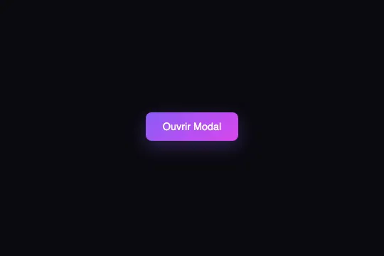
Modal panel that slides up from the bottom of the screen in 0.4 s — semi-transparent overlay with backdrop-filter: blur, cubic-bezier transition, zero dependencies.
Updated
This effect is part of Effect.Labs — 840 vanilla effects, some free, some premium. Navigation has 37 effects, including 4 free. Explore the category →
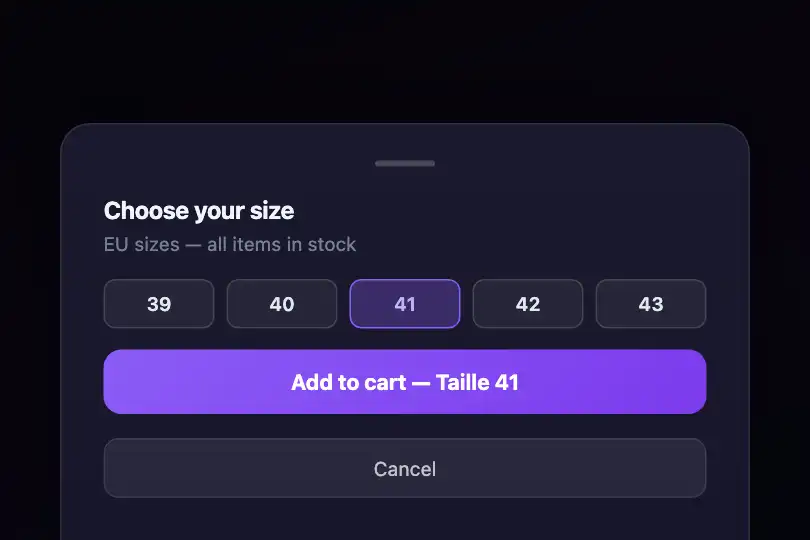


3 usage examples
How it works
The trigger is a <button class="modal-trigger"> that calls openModal() via onclick. The function adds the .active class to two static DOM elements — #modalOverlay (the full-screen overlay) and #modal (the sliding panel) — then locks page scroll with document.body.style.overflow = 'hidden'.
#modalOverlay is a position: fixed <div> covering the full viewport. Default state: opacity: 0; visibility: hidden. The .active class makes it visible via a 0.3 s ease CSS transition. backdrop-filter: blur(4px) applies a Gaussian blur over all content behind the overlay without touching the underlying elements — a GPU filter on the compositing layer.
#modal sits at the bottom of the screen (position: fixed; bottom: 0), centered with left: 50%; transform: translateX(-50%). A second translateY(100%) hides it below the viewport edge at rest. The .active class moves it to translateY(0) — the panel slides up over 0.4 s with the cubic-bezier(0.4, 0, 0.2, 1) curve: fast out of the gate, slow to settle, mimicking a mechanical drawer.
The .modal-handle grip (40 × 4 px, semi-transparent) is purely decorative — no native swipe-to-close behaviour is included. closeModal() is not defined in the provided code: it is the developer's responsibility (remove .active from both elements, restore body.overflow = '').
Accessibility
- prefers-reduced-motion: absent from the code — the slide transition fires regardless of OS preference. Add manually:
@media (prefers-reduced-motion: reduce) { .modal, .modal-overlay { transition: none; } }. - The
#modalpanel has norole="dialog", noaria-modal="true", and noaria-labelledby— screen readers do not announce a dialog is open. - No focus management: keyboard focus is neither moved into the modal on open nor returned to the trigger on close. Implement with
panel.querySelector('[autofocus], button, input').focus()insideopenModal(). - No
Escapekey listener to close the modal — keyboard-only navigation is incomplete. - The trigger button is a native
<button>: keyboard-focusable and activatable by default, with no modification required.
Browser compatibility
Requires position: fixed, backdrop-filter, transform, CSS transitions and the classList API — available in all modern browsers.
Without backdrop-filter support (Firefox < 103): the overlay renders as a solid rgba(0,0,0,0.7) background without blur — the panel slide animation is unaffected.
The code
HTML structure to paste into your page (the CSS + JS come with Premium):
<button class="modal-trigger" onclick="openModal()">
  Open Modal
</button>

<!-- Blurred overlay (full screen, fixed) -->
<div class="modal-overlay" id="modalOverlay"></div>

<!-- Modal panel (slides from the bottom) -->
<div class="modal" id="modal">
  <div class="modal-handle"></div>
  <h3 class="modal-title">Modal title</h3>
  <p class="modal-content">Customisable content.</p>
  <button class="modal-close" onclick="closeModal()">Close</button>
</div>The full HTML + CSS + JS of Modal Slide, ready to paste — plus all 840 effects. Or $299 once, lifetime access.
Customize
Options passed to the API or data-* attributes:
| Option / property | Default | Effect |
|---|---|---|
| .modal transition | 0.4s cubic-bezier(0.4, 0, 0.2, 1) | Slide duration and curve. Use 0.25 s for a snappy feel; cubic-bezier(0.34, 1.56, 0.64, 1) for an elastic spring with overshoot. |
| .modal-overlay backdrop-filter | blur(4px) | Gaussian blur intensity on the background. 8–12 px for a pronounced effect; remove the property for a flat overlay with no blur. |
| .modal-overlay background | rgba(0, 0, 0, 0.7) | Overlay colour and opacity. 0.4–0.5 for a light veil that keeps context readable; 0.85 to fully isolate the panel from the background. |
| .modal border-radius | 20px 20px 0 0 | Top-corner rounding on the panel. 28 px for a pronounced iOS look; 0 for a full-width panel with no rounded corners. |
| .modal max-width | 500px | Maximum panel width. 100% for full-width on desktop; 640 px for a more spacious form layout. |
| .modal background | linear-gradient(180deg, #1a1a2e 0%, #16162a 100%) | Panel background. Replace with a brand colour or a gradient matching your design system. |
| closeModal() | not provided | Implement close yourself: remove .active from #modalOverlay and #modal, then set document.body.style.overflow = ''. |
FAQ
openModal() is provided. Minimal implementation: function closeModal() { document.getElementById('modalOverlay').classList.remove('active'); document.getElementById('modal').classList.remove('active'); document.body.style.overflow = ''; }. To also close on overlay click, add: document.getElementById('modalOverlay').addEventListener('click', closeModal).function openModal(ovId, panId) { var ov = document.getElementById(ovId || 'modalOverlay'); var p = document.getElementById(panId || 'modal'); if (ov && p) { ov.classList.add('active'); p.classList.add('active'); } }. Give each overlay/panel pair its own IDs.transform: translateY(), a GPU-composited property that runs at 60 fps on all modern mobile browsers. Swipe-to-close is not included; add it with a touchstart/touchmove/touchend listener on the panel and call closeModal() when the downward delta exceeds ~80 px.


