Tab Slider
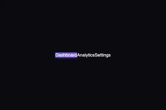
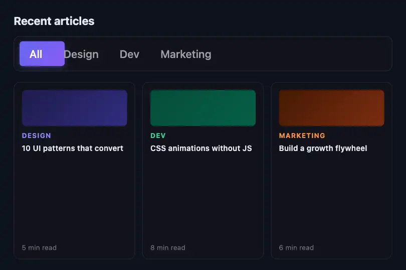
Tab rail with sliding indicator — positioned via getBoundingClientRect, animated by a cubic-bezier transition, adapts to any tab width.
Updated
This effect is part of Effect.Labs — 840 vanilla effects, some free, some premium. Navigation has 37 effects, including 4 free. Explore the category →
3 usage examples


How it works
On click, the JS reads the exact rectangle of the clicked <span class="tab-slider-item"> via getBoundingClientRect() and subtracts the container's rectangle to get a relative left offset in pixels. It then sets indicator.style.width and indicator.style.left simultaneously: the indicator takes the exact width and position of the clicked tab, regardless of label length.
A CSS transition 0.35s cubic-bezier(0.4, 0, 0.2, 1) (Material Design standard-ease) is applied to the indicator <div>. Because width and left change at the same time, the indicator shrinks or stretches en route when tabs have different widths — producing a natural glide rather than a plain rigid translation.
The indicator is position: absolute inside the rail, anchored at top: 6px and height: calc(100% - 12px) for a 6 px inset. It carries a background: linear-gradient(135deg, #6366f1 → #8b5cf6) and an indigo box-shadow glow. The <span> tabs sit in front via z-index: 1.
There is no prefers-reduced-motion handling in the delivered code: the transition always runs. To support motion-sensitive users, add @media (prefers-reduced-motion: reduce) { .tab-slider-indicator { transition: none } }.
Accessibility
- No prefers-reduced-motion handling: the indicator transition runs at all times. Add
@media (prefers-reduced-motion: reduce) { .tab-slider-indicator { transition: none } }manually to disable it. - Tabs are
<span>elements, not natively keyboard-focusable. For keyboard navigation, convert them to<button>or addtabindex="0"with akeydownhandler for Enter and Space. - No ARIA roles are declared: the container is not announced as a
tablist, items carry neitherrole="tab"noraria-selected. The full WAI-ARIA Tabs pattern requires these attributes. - Active tab contrast (white on indigo
#6366f1): ratio ≈ 4.1:1 — below the WCAG AA threshold of 4.5:1 for normal text. Use a darker indigo or font size ≥ 18 px to meet AA for large text. - Inactive tab contrast (
#a1a1aaon#12121a): ratio ≈ 7.6:1 — WCAG AA and AAA met.
Browser compatibility
Requires only getBoundingClientRect, classList, and querySelectorAll — DOM APIs available in all modern browsers and IE11.
Without JavaScript, the indicator stays at its initial position (set by the inline style attribute) and tabs render without interaction — no fatal error, the layout stays readable.
The code
HTML structure to paste into your page (the CSS + JS come with Premium):
<div class="tab-slider-container" id="tabSlider">
  <div class="tab-slider-indicator" id="tabSliderIndicator"></div>
  <span class="tab-slider-item active" data-index="0">Tab 1</span>
  <span class="tab-slider-item" data-index="1">Tab 2</span>
  <span class="tab-slider-item" data-index="2">Tab 3</span>
</div>The full HTML + CSS + JS of Tab Slider, ready to paste — plus all 840 effects. Or $299 once, lifetime access.
Customize
Options passed to the API or data-* attributes:
| Option / property | Default | Effect |
|---|---|---|
| --bg-card | #12121a | Background color of the tab rail. Set to transparent or a brand color to integrate the component over any background. |
| --border | rgba(255,255,255,0.08) | Color and opacity of the container border. Increase opacity for a more visible edge; transparent to remove the outline. |
| --radius-lg | 0.75rem | Rail corner radius. 100px = pill look; 0 = sharp corners. |
| --radius-md | 0.5rem | Indicator corner radius. Keep slightly smaller than --radius-lg to preserve the visual inset. |
| --text-secondary | #a1a1aa | Inactive tab color. #64748b suits a light background; #6b7280 suits a mid-tone background. |
| Indicator gradient | linear-gradient(135deg, #6366f1 0, #8b5cf6 100%) | Edit the two hex colors in .tab-slider-indicator { background: … } to match your brand. The adjacent box-shadow carries the same indigo tint. |
| Indicator transition | .35s cubic-bezier(.4,0,.2,1) | In .tab-slider-indicator { transition: … }: shorten to .2s ease for snappier response, or 0s to disable animation (reduced-motion mode). |
FAQ
<div>, <span> tabs, and roughly 15 lines of JS. Zero npm dependencies, no CSS framework needed. Drop the HTML into Angular, React, or Vue by wrapping it in a component and calling the init after mount.<span class="tab-slider-item"> elements inside the container. The initial call r(o[0]) automatically positions the indicator on the first tab at load. No index to configure — each tab's width is measured on the fly via getBoundingClientRect.getBoundingClientRect calculation only runs on click. For fluid layouts where tab widths change on resize, add window.addEventListener('resize', () => r(activeTab)) (keeping a reference to the current active tab element) to recalculate the indicator position.


