Tabs Animated
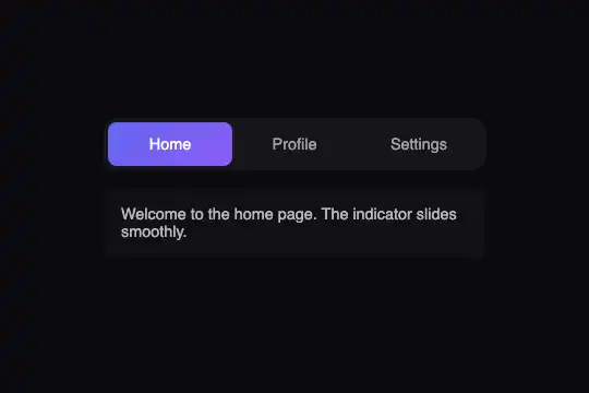
A gradient pill indicator slides between tabs via translateX — click selection, panels fade in over 0.3 s, zero external dependencies.
Updated
This effect is part of Effect.Labs — 840 vanilla effects, some free, some premium. Navigation has 37 effects, including 4 free. Explore the category →
3 usage examples
How it works
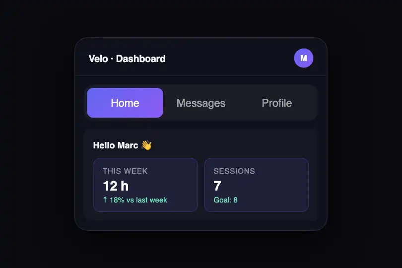


The sliding indicator is a <div class="tab-indicator"> positioned absolute inside the position: relative header. Its width is calc(33.333% - 2.67px) — exactly one third of the container, since buttons are flex: 1 1 0%. It carries a gradient linear-gradient(135deg, #6366f1, #8b5cf6) and a border-radius: 8px.
Movement is driven by a single JS statement: indicator.style.transform = 'translateX(' + 100 * index + '%)'. The value 100% equals 100% of the indicator's own width — which is exactly one tab's width. The browser interpolates the motion via transition: transform .3s cubic-bezier(.4, 0, .2, 1) (Material Design standard ease), with no absolute coordinate calculations.
On tab change, classList.toggle('active', bool) marks the matching button and panel active and unchecks the others. The active panel switches from display: none to display: block and triggers the CSS fadeIn animation (opacity 0→1, translateY 10→0 px, 0.3 s duration). Inactive buttons transition from rgba(255,255,255,.6) to #fff via transition: color .3s.
Buttons at flex: 1 1 0% all occupy strictly the same width regardless of label length — the indicator always lands precisely under the right tab without any extra calculation. The switchTab(n) function is exposed in the global scope and can be called programmatically from any external script.
Accessibility
- prefers-reduced-motion not implemented — the code contains no
prefers-reduced-motionmedia query: the indicator transition and fadeIn run even when the OS requests reduced motion. Add manually:@media (prefers-reduced-motion: reduce) { .tab-indicator, .tab-panel { transition: none; animation: none; } }. - Tabs are native
<button>elements — keyboard-focusable (Tab / Shift+Tab) and announced by screen readers without extra configuration. - No ARIA Tabs pattern roles (
role="tablist",role="tab",aria-selected,role="tabpanel",aria-controls) — add them if WCAG 1.3.1 compliance is required. - Inactive panels are hidden via
display: none— removed from the accessibility tree natively, without explicitaria-hidden. - Active text contrast:
#fffon the indigo gradient (#6366f1) — ratio > 4.5:1, WCAG AA compliant.
Browser compatibility
CSS transition, transform, flexbox, and linear-gradient — supported in all modern browsers. Zero external dependencies.
Without JS, tabs remain visible but the indicator does not slide and panels do not switch — the first tab panel stays displayed statically. Without flexbox support, buttons stack vertically but remain functional.
The code
HTML structure to paste into your page (the CSS + JS come with Premium):
<div class="tabs-container">
  <div class="tabs-header">
    <div class="tab-indicator" id="tabIndicator"></div>
    <button class="tab-btn active" onclick="switchTab(0)">Tab 1</button>
    <button class="tab-btn" onclick="switchTab(1)">Tab 2</button>
    <button class="tab-btn" onclick="switchTab(2)">Tab 3</button>
  </div>
  <div class="tabs-content">
    <div class="tab-panel active" data-tab="0">Tab 1 content</div>
    <div class="tab-panel" data-tab="1">Tab 2 content</div>
    <div class="tab-panel" data-tab="2">Tab 3 content</div>
  </div>
</div>The full HTML + CSS + JS of Tabs Animated, ready to paste — plus all 840 effects. Or $299 once, lifetime access.
Customize
Options passed to the API or data-* attributes:
| Option / property | Default | Effect |
|---|---|---|
| --primary (CSS :root) | #6366f1 | Accent color used by .tab-btn.active { color } — set on :root or directly on .tabs-container for a narrower scope. |
| .tab-indicator background | linear-gradient(135deg, #6366f1, #8b5cf6) | Indicator pill gradient — replace with a solid color (#3b82f6) or your brand palette. |
| .tab-indicator transition | transform .3s cubic-bezier(.4,0,.2,1) | Slide duration and easing — .15s ease for an instant data response, .5s ease-in-out for a softer editorial feel. |
| .tabs-container max-width | 350px | Maximum block width — remove or set to 100% for a full-width bar in a fluid layout. |
| .tab-btn color (inactive) | rgba(255,255,255,.6) | Opacity of inactive tab text — raise to rgba(255,255,255,.85) for better readability on light backgrounds. |
| .tab-panel animation | fadeIn .3s ease | Content animation on tab switch — shorten to fadeIn .1s ease for near-instant display, or remove animation for a plain swap. |
| switchTab(n) — global JS | — | Programmatic tab switch without user click — switchTab(2) activates the 3rd tab. Trigger from a timer, a business event, or an external link. |
FAQ
width: calc(33.333% - 2.67px) with calc(100% / N - gap) (e.g. calc(25% - 3px) for 4 tabs). The JS offset stays translateX(100 * index %) — nothing else needs to change on the logic side.flex: 1 1 0%: they share the container width in strictly equal portions, regardless of text. The indicator inherits this fixed width and always lands exactly under the right tab.onclick="switchTab(n)" with onClick={() => switchTab(n)} and trigger switchTab(defaultTab) inside useEffect(() => {}, []) on the client side. In Vue, use @click="switchTab(n)" and mounted() { switchTab(0); }. The effect does not touch the DOM outside its own container.


