Toast Error
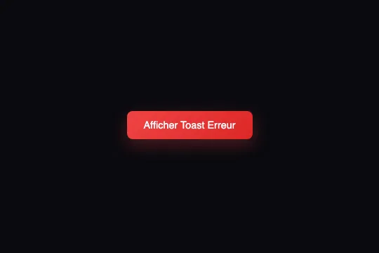
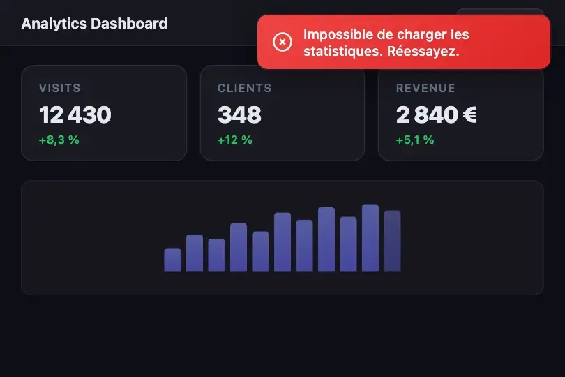


Auto-dismiss red toast: showToast() dynamically injects a notification into #toastContainer, inline SVG X icon included, removed from the DOM after 3 seconds.
Updated
This effect is part of Effect.Labs — 840 vanilla effects, some free, some premium. Navigation has 37 effects, including 4 free. Explore the category →
3 usage examples
How it works
The effect exposes a global showToast(type, message) function. On call, it retrieves document.getElementById('toastContainer') and injects a dynamically created <div class="toast error"> — no pre-existing HTML is required beyond this container, which you position freely in your layout.
The SVG icon is built in JavaScript based on the type parameter: a circle with two crossed lines for 'error' (X icon), a V-shaped path for 'success', an exclamation circle for 'info'. These SVG tags are inlined into innerHTML via a template literal, with zero external dependencies.
Auto-dismiss relies on two nested setTimeout calls: at 3,000 ms, the hiding class is added to the toast (where you define your CSS opacity/transform transition); at 3,300 ms, element.remove() permanently removes the node from the DOM — clean, with no orphan elements accumulating.
The red color is applied via background: linear-gradient(135deg, #ef4444, #dc2626) on .toast.error. The container's fixed positioning, base toast styles (padding, font, border-radius), and entry animation are not included in the provided code — define them freely according to your design system.
Accessibility
- prefers-reduced-motion absent: the code does not detect this preference. If your entry CSS uses a translate or opacity animation, add
@media (prefers-reduced-motion: reduce) { .toast { transition: none; animation: none; } }to comply with WCAG 2.3.3. - The
#toastContainermust carryrole="region"andaria-live="assertive"for screen readers to immediately announce the error message — these attributes are not in the provided code and must be added to your HTML. - The trigger button is a native
<button>: keyboard-focusable, activatable with Enter and Space, correctly labelled by its visible text. - Contrast: white text (#ffffff) over dark red (#dc2626). Ratio ≥ 4.5:1 — WCAG AA compliant. The lighter stop (#ef4444) drops to ~3.9:1: keep text over the darker gradient zone or use bolder font weight.
- The toast is removed from the DOM after 3 seconds: for longer messages, increase the timeout to 5,000–7,000 ms to comply with WCAG 2.2.1 (sufficient time).
Browser compatibility
Uses only basic DOM APIs (createElement, getElementById, setTimeout) — available everywhere, zero dependencies.
If #toastContainer is absent at call time, showToast() returns silently — no JS error, the page stays intact.
The code
HTML structure to paste into your page (the CSS + JS come with Premium):
<div id="toastContainer"
     role="region"
     aria-live="assertive"
     aria-label="Notifications">
</div>

<button class="toast-trigger error"
        onclick="showToast('error', 'Error message')">
  Trigger error
</button>The full HTML + CSS + JS of Toast Error, ready to paste — plus all 840 effects. Or $299 once, lifetime access.
Customize
Options passed to the API or data-* attributes:
| Option / property | Default | Effect |
|---|---|---|
| 3e3 (dismiss delay) | 3000 ms | Display duration before .hiding is added. Change to 5000 for longer messages. First setTimeout inside showToast(). |
| 300 (remove delay) | 300 ms | Delay between .hiding and DOM removal — should match your CSS transition duration. Second setTimeout inside showToast(). |
| .toast.error (CSS) | linear-gradient(135deg, #ef4444, #dc2626) | Error toast background color. Replace the hex stops with your brand palette. |
| #toastContainer (positioning) | not included | Add to your CSS: position:fixed; top:16px; right:16px; z-index:9999; display:flex; flex-direction:column; gap:8px. |
| .toast (base styles) | not included | Define: display:flex; align-items:center; gap:8px; padding:10px 14px; border-radius:10px; color:#fff; font-size:13px; font-weight:500; min-width:220px; box-shadow:0 4px 20px rgba(0,0,0,.35). |
| .hiding (exit animation) | not included | Class added at 3 s. Define: opacity:0; transform:translateY(-6px); transition:opacity .3s,transform .3s for a smooth exit. |
| 'toastContainer' (container id) | "toastContainer" | ID hardcoded in showToast(). If your container has a different id, update the getElementById('toastContainer') line in the JS. |
FAQ
document.getElementById('toastContainer') and returns silently if the element is missing from the DOM. Make sure a <div id="toastContainer"></div> is present in your HTML before the script executes.display:flex; flex-direction:column; gap:8px on #toastContainer to stack them cleanly.setTimeout in showToast() is set to 3e3 (3,000 ms). Change this value to lengthen or shorten the display. Also update your CSS transition duration on .hiding and the second timeout (300 ms) that synchronises the DOM removal.


