Toast Success
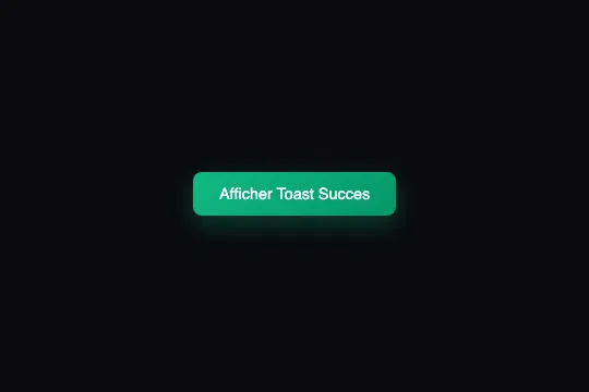

A green notification slides in from the right, stays 3 seconds and disappears — instant, non-blocking success feedback.
Updated
This effect is part of Effect.Labs — 840 vanilla effects, some free, some premium. Navigation has 37 effects, including 4 free. Explore the category →
3 usage examples
How it works
The global function showToast(type, message) targets #toastContainer via getElementById, creates a <div class="toast {type}"> and injects it into the container. The SVG icon (checkmark, cross, or info dot) is generated inline based on the type parameter — no external resource is loaded.
The toastSlideIn entry animation slides the toast from translateX(100%) to its resting position in 0.4 s using cubic-bezier(0.4, 0, 0.2, 1) — a Material Design-inspired easing that accelerates then decelerates. After 3,000 ms a setTimeout adds the .hiding class which triggers toastSlideOut (0.3 s ease to translateX(100%)). A second 300 ms setTimeout then removes the node from the DOM via toast.remove().

The .toast-container is position: fixed; top: 20px; right: 20px; z-index: 9999 — anchored to the top-right corner regardless of scroll. Successive calls to showToast() stack toasts vertically via flex-direction: column; gap: 10px; each manages its own dismissal timer independently.
Accessibility
- No prefers-reduced-motion support:
toastSlideInandtoastSlideOutalways run. Add@media (prefers-reduced-motion: reduce) { .toast { animation: none; } }to disable them. - The
#toastContainerhas noaria-liveattribute in the provided code — toasts are not announced to screen readers. Addaria-live="polite" aria-atomic="true"to the container to fix this. - White text on green background (
#059669): contrast ratio ≥ 4.5:1, WCAG AA compliant. - No keyboard dismiss mechanism — no Close button and no Escape key handler in the provided JS.
- Inline SVG icons carry neither
aria-hiddennoraria-label— addaria-hidden="true"to each SVG to prevent screen readers from verbalising them.
Browser compatibility
Requires createElement, classList, and CSS animations — supported in all modern browsers.
Without CSS the toast renders as plain text in the flow — no JS errors. If getElementById('toastContainer') finds no container, the function returns silently.
The code
HTML structure to paste into your page (the CSS + JS come with Premium):
<div class="toast-container" id="toastContainer"></div>

<!-- Trigger button (place it anywhere in your UI) -->
<button class="toast-trigger" onclick="showToast('success', 'Action completed!')">
  Trigger toast
</button>The full HTML + CSS + JS of Toast Success, ready to paste — plus all 840 effects. Or $299 once, lifetime access.
Customize
Options passed to the API or data-* attributes:
| Option / property | Default | Effect |
|---|---|---|
| .toast.success background | linear-gradient(135deg, #10b981, #059669) | Toast background color — swap in your brand gradient. |
| .toast-container top / right | 20px / 20px | Container anchor position. To move to bottom-right: top: auto; bottom: 20px;. |
| .toast min-width | 280px | Minimum toast width — increase to 320–360 px for longer messages without line breaks. |
| .toast border-radius | 12px | Corner rounding. 0 for a square look, 24 px for a pill style. |
| setTimeout delay (3e3) | 3000 ms | Display duration before dismissal — edit the constant inside showToast. |
| toastSlideIn duration | 0.4s | Entry animation speed — lower to 0.2 s for snappier feedback. |
| .toast font-size / font-weight | 0.95rem / 500 | Message text size and weight — adjust to match your typography. |
| .toast gap | 12px | Spacing between the SVG icon and the message text. |
FAQ
showToast() adds a new <div> to #toastContainer — they stack vertically via flex-direction: column; gap: 10px. Add a JS counter and skip the call if a cap is reached to avoid visual overload..toast-container properties: top: auto; bottom: 20px; right: auto; left: 20px;. For a left-side slide, also swap translateX(100%) to translateX(-100%) in both toastSlideIn and toastSlideOut keyframes.aria-live="polite" aria-atomic="true" to the <div id="toastContainer"> element so assistive technologies automatically read each message as it is inserted into the DOM.


