Tooltip Fade
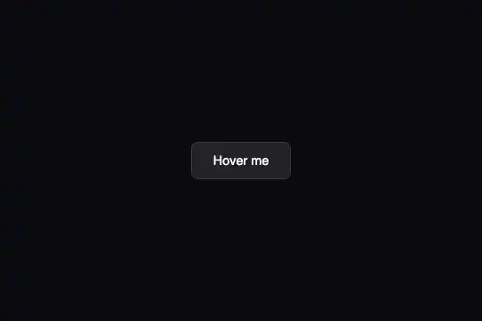
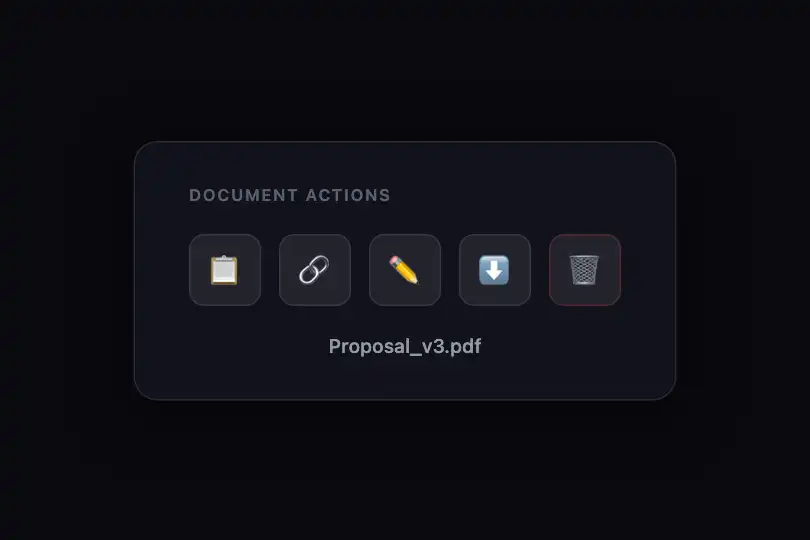
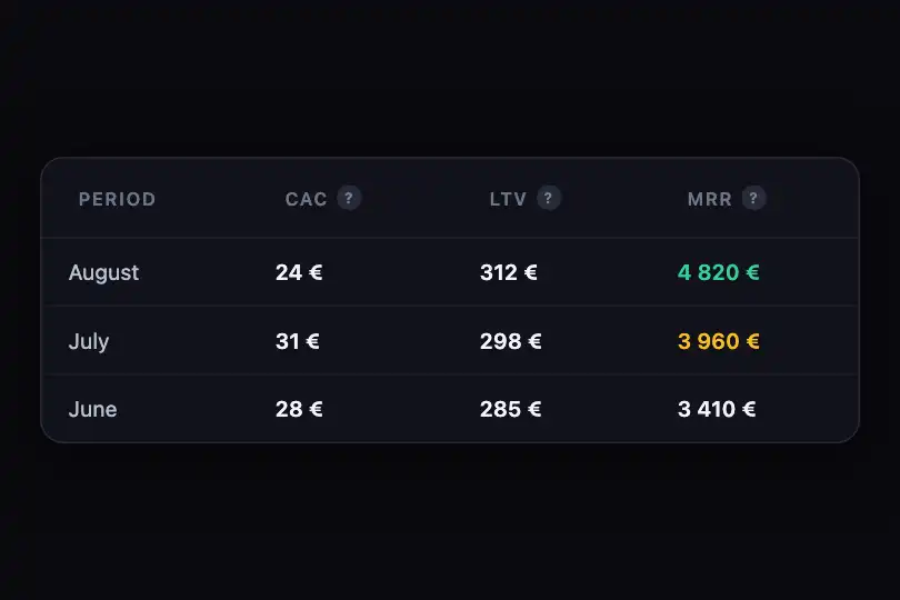
Tooltip positioned above its trigger that fades in on hover — two variants: neutral dark background or indigo gradient with a CSS arrow.
Updated
This effect is part of Effect.Labs — 840 vanilla effects, some free, some premium. Navigation has 37 effects, including 4 free. Explore the category →
3 usage examples

How it works
The effect is entirely CSS-driven — zero JavaScript. The .tooltip-trigger element is a position: relative anchor. The child .tooltip is positioned with position: absolute; bottom: calc(100% + 10px), floating directly above the trigger, horizontally centered by left: 50%; transform: translateX(-50%).
Show and hide are handled by the opacity + visibility dual-property pattern: opacity: 0; visibility: hidden at rest, opacity: 1; visibility: visible on :hover, both in transition: opacity .3s, visibility .3s. visibility hides the element from pointer events and screen readers when invisible — using opacity alone would leave the tooltip clickable even at zero opacity.
The .tooltip-arrow variant adds an indigo-violet gradient (linear-gradient(135deg, #6366f1, #8b5cf6)), a tinted box-shadow, and a CSS triangle arrow via the ::after pseudo-element (the border-color trick: border-color: #8b5cf6 transparent transparent). It also animates transform with a 5 px upward shift on appearance (translateY(-5px)) for extra lightness.
To display multiple tooltips side by side, the .tooltip-scene class provides a display: flex; gap: 32px; flex-wrap: wrap container — each button is self-contained, no JS coordination needed.
Accessibility
- prefers-reduced-motion not implemented: the code includes no
@media (prefers-reduced-motion: reduce)rule. The 0.3 s transition runs even when the user has disabled animations — addtransition: none !importantmanually if needed. - The tooltip is not triggered on keyboard focus — only
:hoveris handled. Keyboard users will never see the content. For full accessibility, add.tooltip-trigger:focus-within .tooltip { opacity: 1; visibility: visible; }or usearia-describedbypointing to an always-visible element. - White text on the
.tooltipdark background (rgba(30,30,40,.95)) is near-black — excellent contrast, well above 7:1 WCAG AAA. - White text on the indigo gradient of
.tooltip-arrow(base color#6366f1) reaches approximately 5.9:1 — WCAG AA compliant (threshold 4.5:1). - The tooltip has no explicit ARIA role in the delivered code. For full accessibility, add
role="tooltip"on the<span>andaria-describedbyon the trigger.
Browser compatibility
100% CSS effect — no JavaScript. Works everywhere CSS Transitions are available.
On mobile (no hover), the tooltip stays hidden. For touch devices, trigger visibility on click or focus with a small JS toggle.
The code
HTML structure to paste into your page (the CSS + JS come with Premium):
<div class="tooltip-scene">
  <!-- Standard variant: neutral dark background -->
  <button class="tooltip-trigger">
    Label
    <span class="tooltip">Tooltip text</span>
  </button>

  <!-- Arrow + gradient variant -->
  <button class="tooltip-trigger">
    Label
    <span class="tooltip-arrow">Styled text</span>
  </button>
</div>The full HTML + CSS + JS of Tooltip Fade, ready to paste — plus all 840 effects. Or $299 once, lifetime access.
Customize
Options passed to the API or data-* attributes:
| Option / property | Default | Effect |
|---|---|---|
| transition: opacity .3s | 0.3s | Fade duration — reduce to 0.15s for instant response, increase to 0.5s for a softer feel. |
| bottom: calc(100% + 10px) | 10px gap | Vertical distance between the tooltip and its trigger. Increase to 16px for more breathing room, reduce to 6px for a tighter layout. |
| background (tooltip) | rgba(30,30,40,.95) | Background color of the standard variant — swap for any brand color (e.g. rgba(15,23,42,.95) for navy). |
| linear-gradient(135deg, #6366f1, #8b5cf6) | Indigo → Violet | Gradient of the .tooltip-arrow variant — replace both hex stops to match your design system (e.g. #0ea5e9, #06b6d4 for a cyan theme). |
| border-color: #8b5cf6 | #8b5cf6 | Color of the CSS arrow (::after) — must match the gradient end color for a seamless look. |
| translateY(-5px) | -5px | Rise height on .tooltip-arrow appearance — set to -8px for more dynamism, 0px to remove the movement. |
| font-size: .85rem | .85rem | Text size in both variants. Use .8rem for dense table tooltips or .9rem for explanatory tooltips. |
FAQ
white-space: nowrap forces a single line. To allow wrapping, remove that rule and add max-width: 220px to .tooltip or .tooltip-arrow — the browser handles line breaks automatically.:hover is handled. For keyboard support, add .tooltip-trigger:focus-within .tooltip { opacity: 1; visibility: visible; }. For full accessibility, also add role="tooltip" on the <span> and aria-describedby on the trigger button.:hover doesn't fire on a plain tap on iOS/Android. The lightest JS fix: on click on the trigger, toggle an is-visible class that applies opacity: 1; visibility: visible to the tooltip, and close it on the next click. No external dependency needed.


